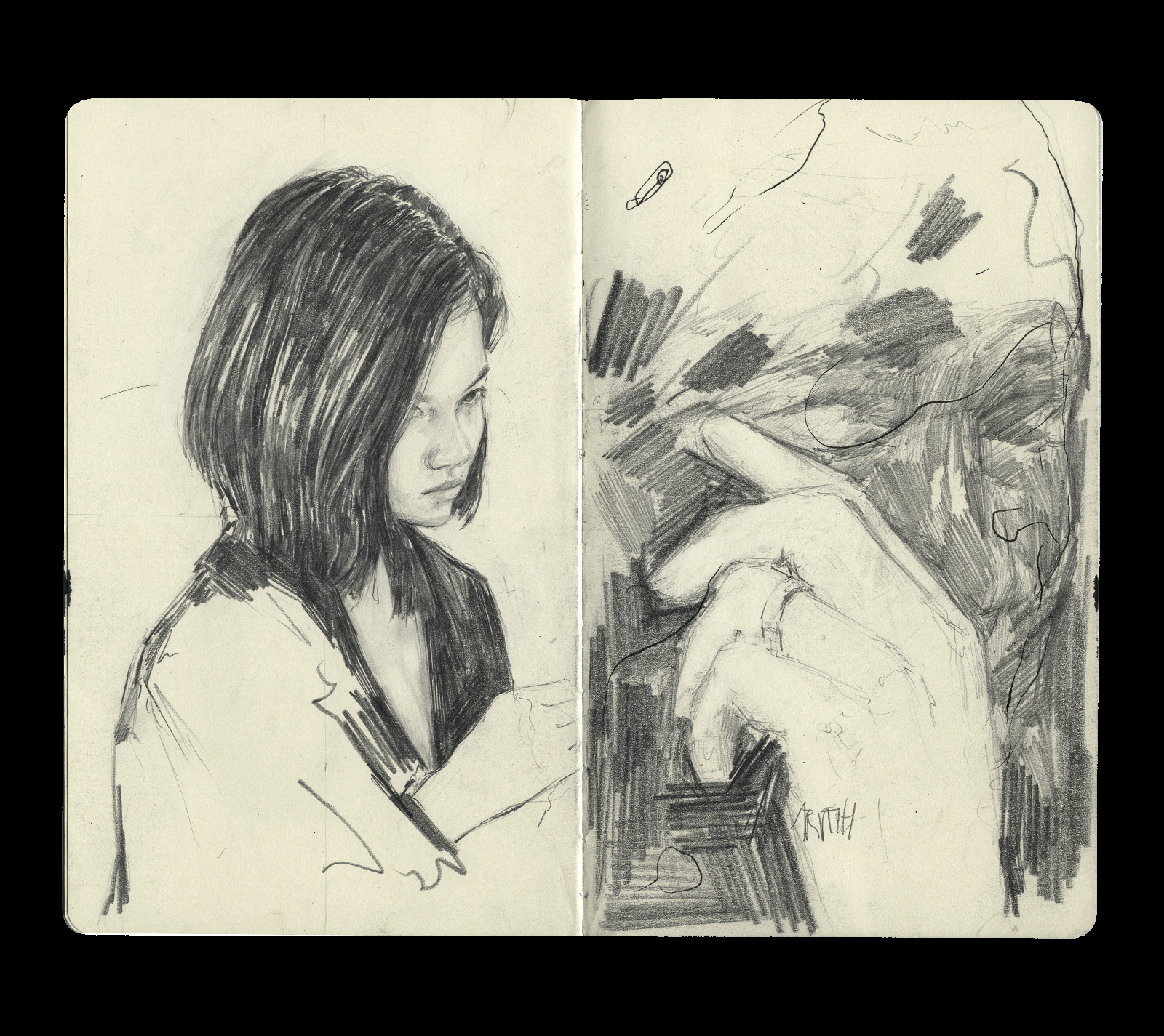
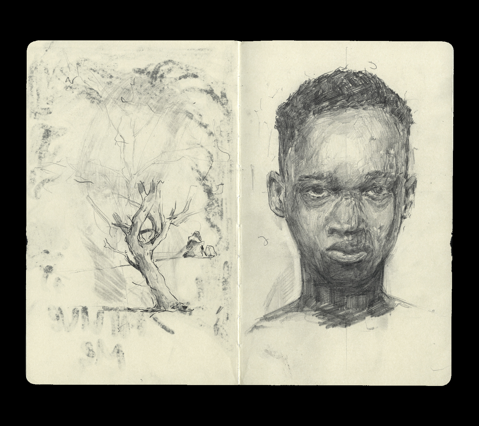
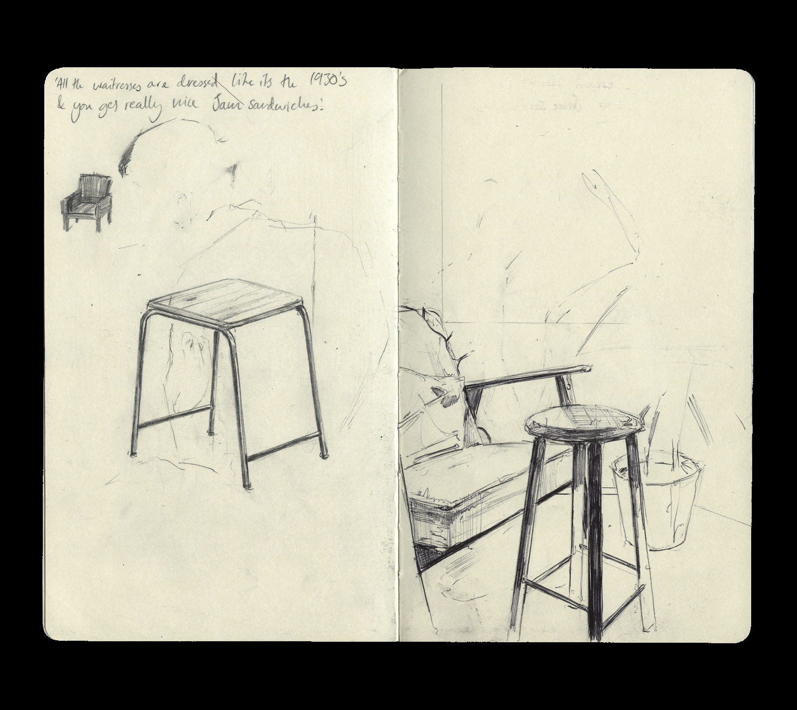
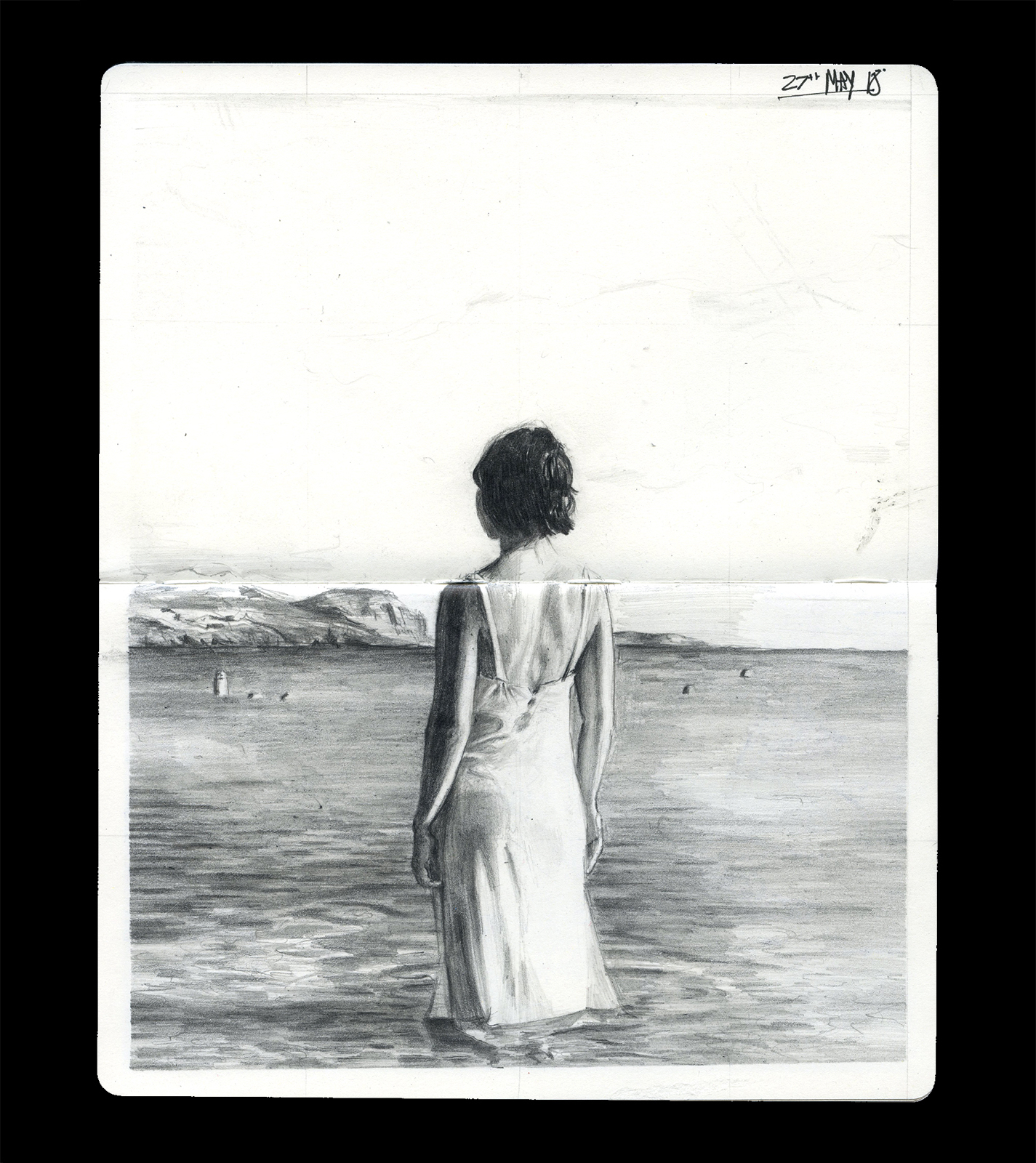
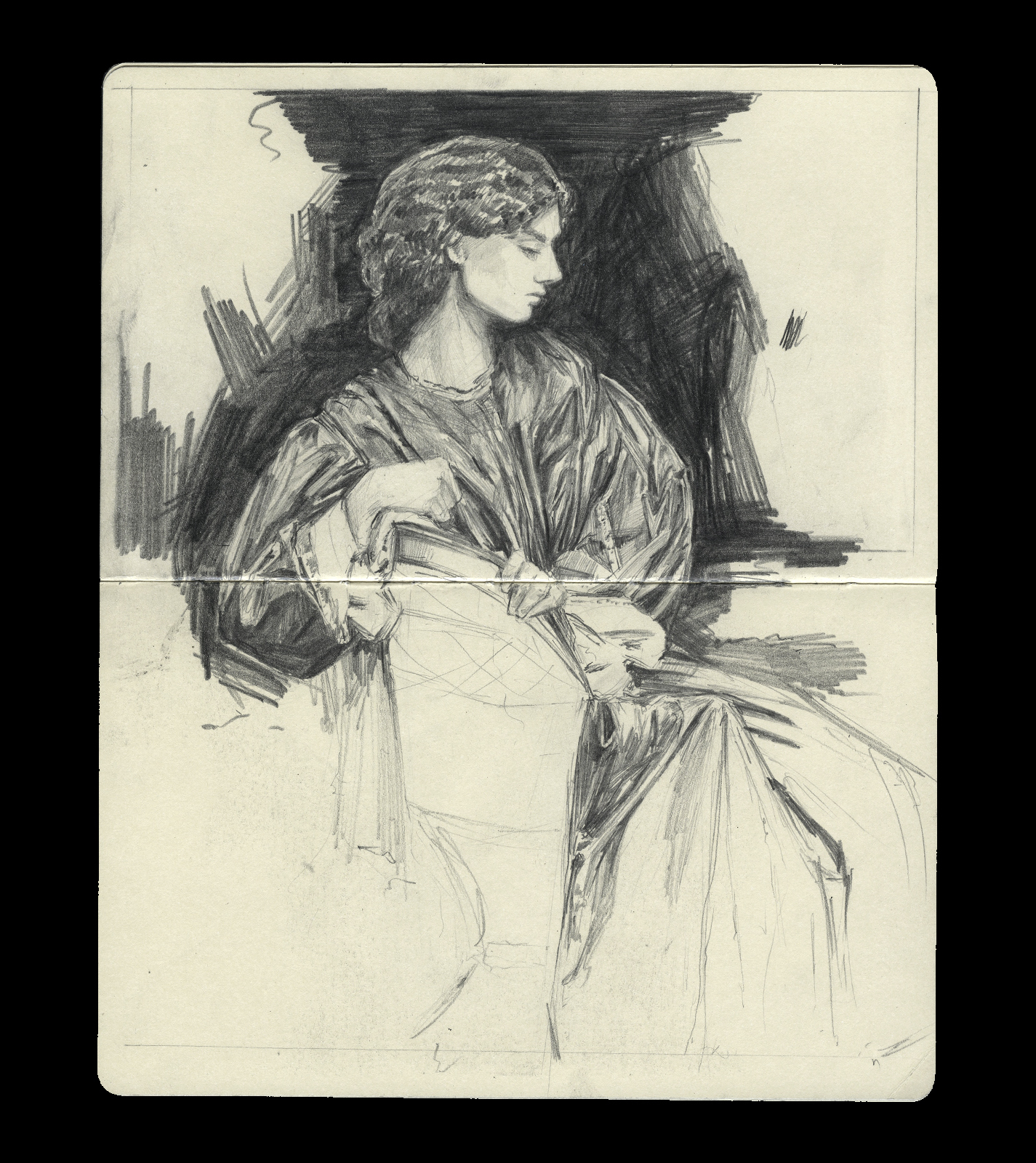
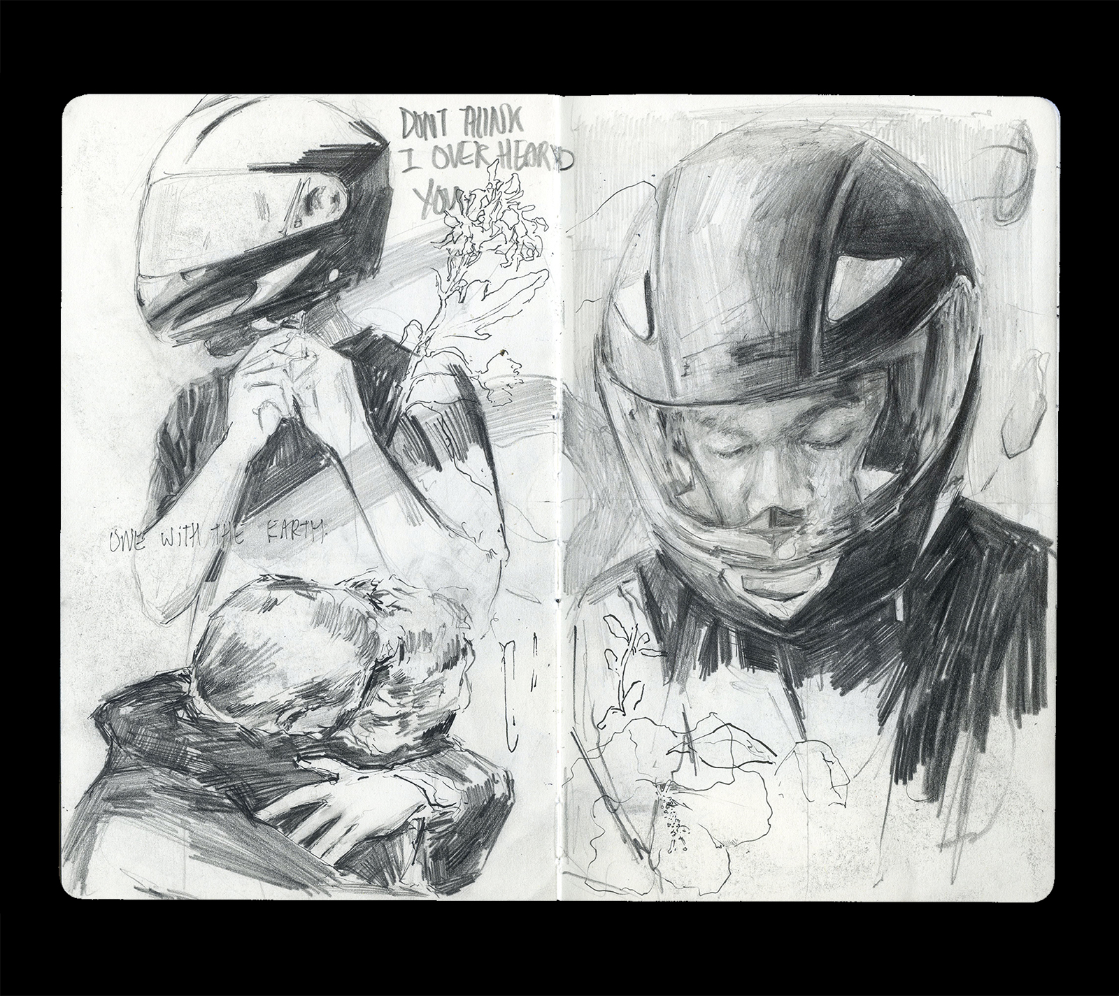
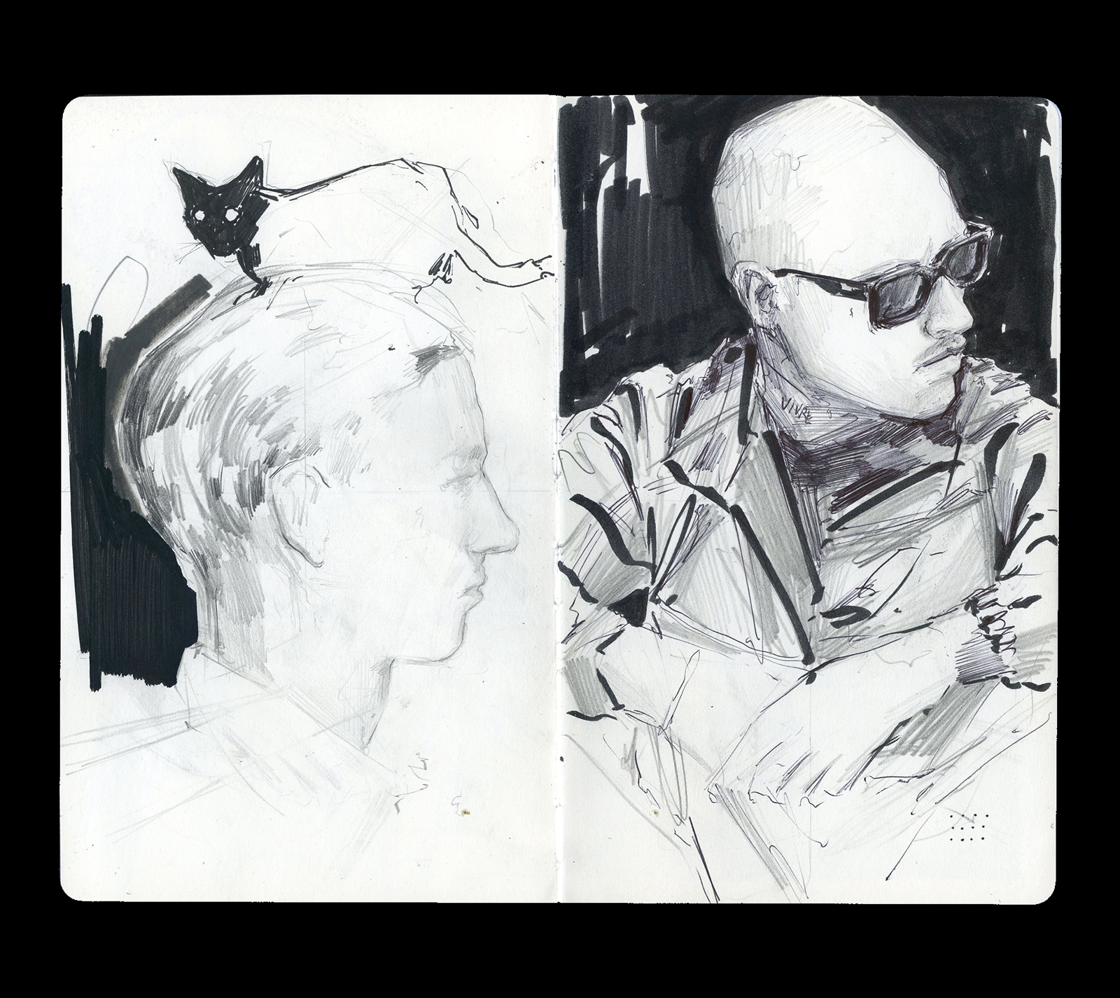
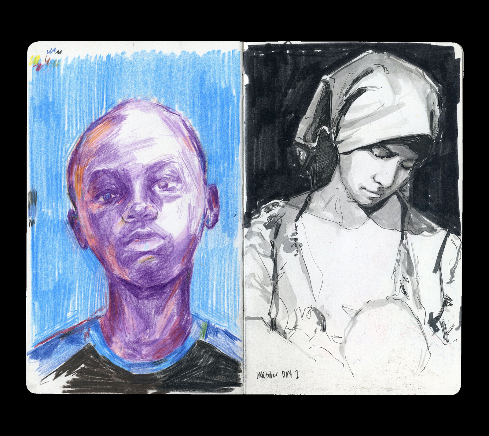
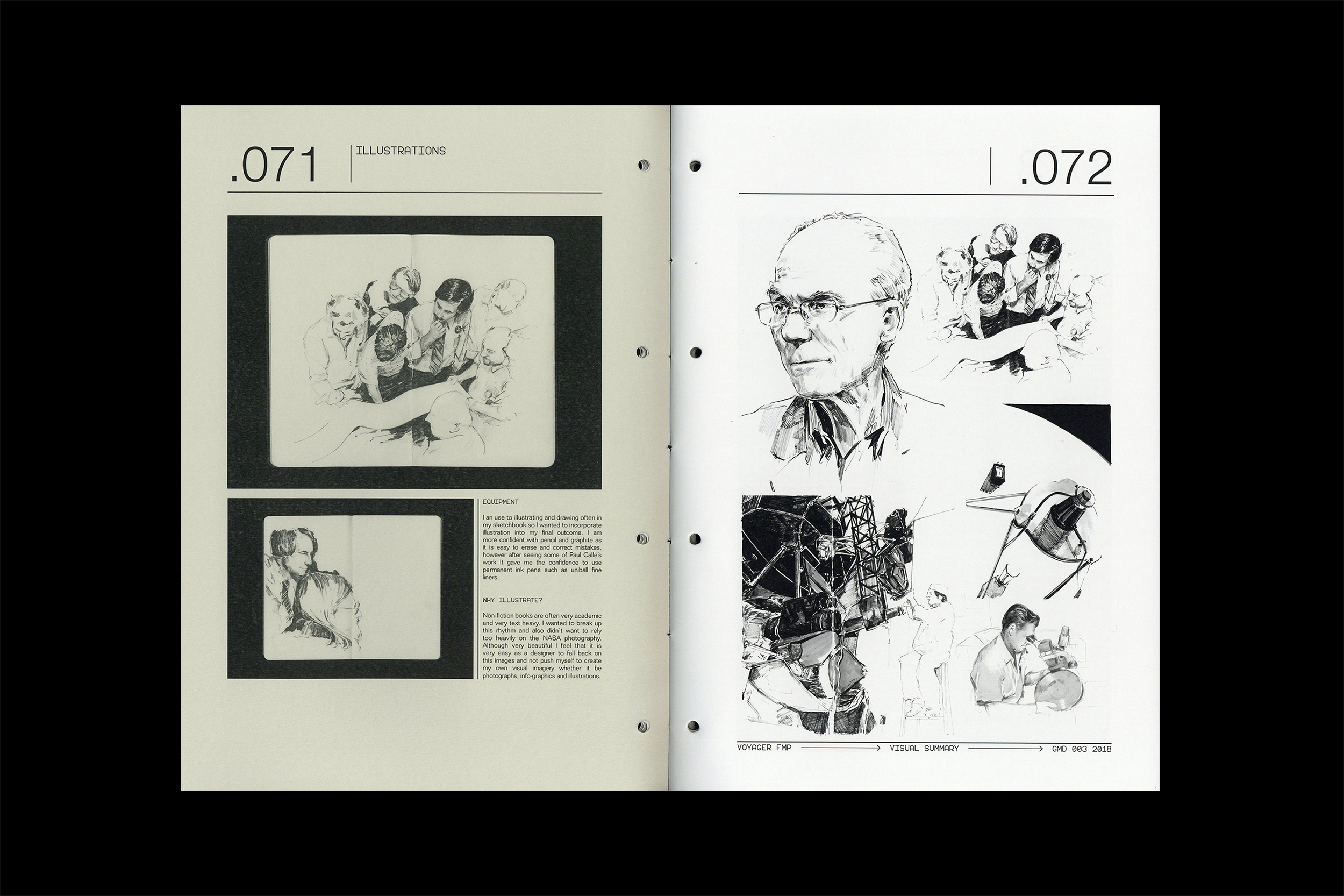
MODE—DRAWING. 2015 - PRESENT
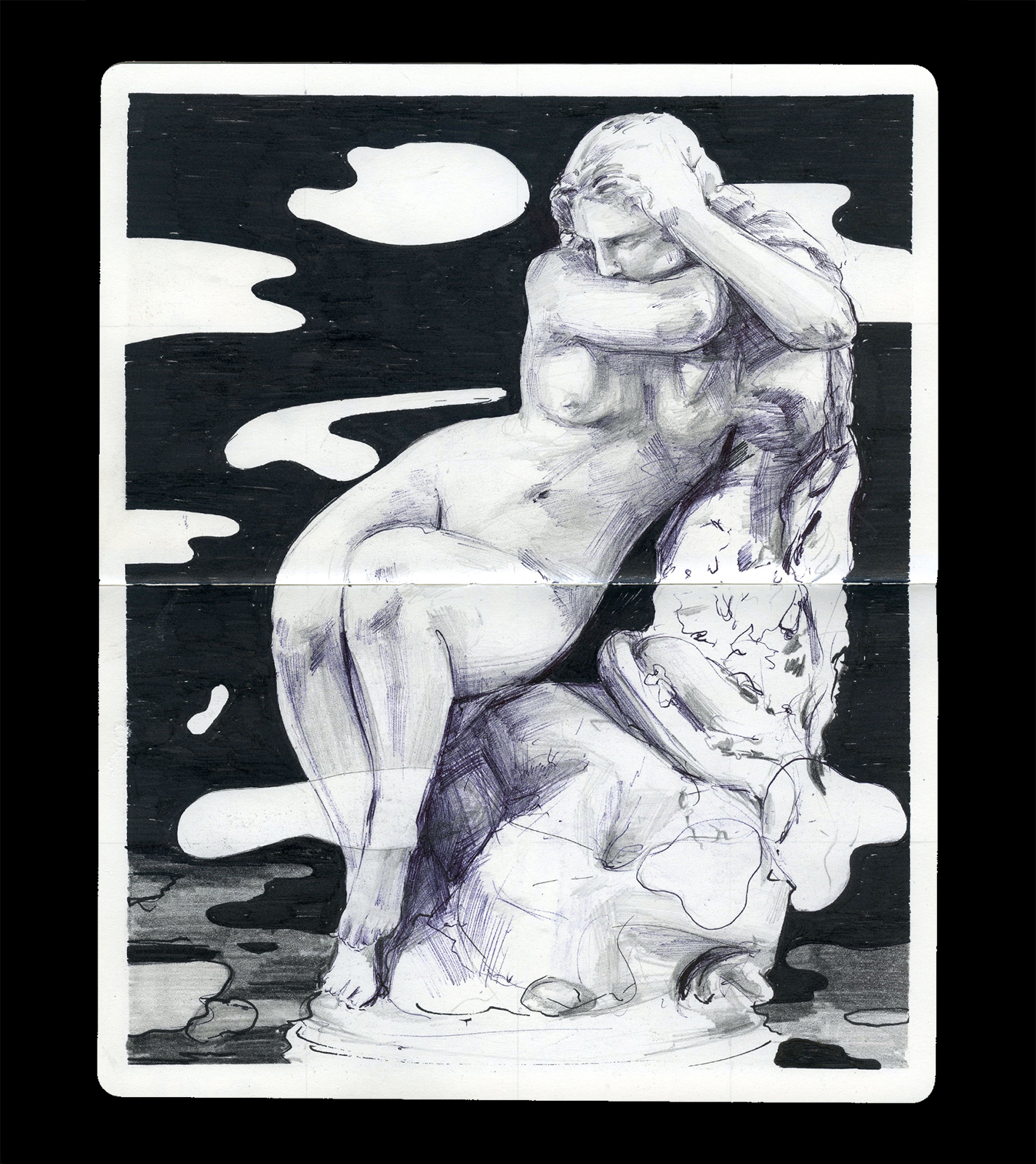
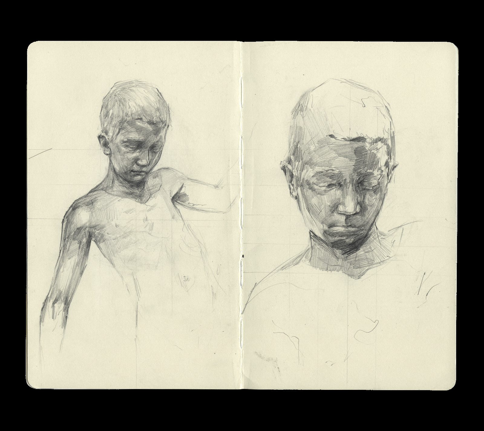
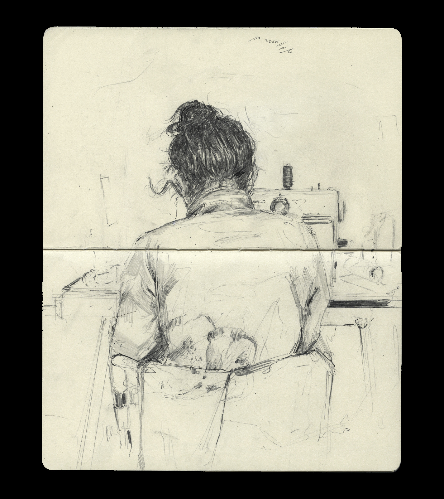
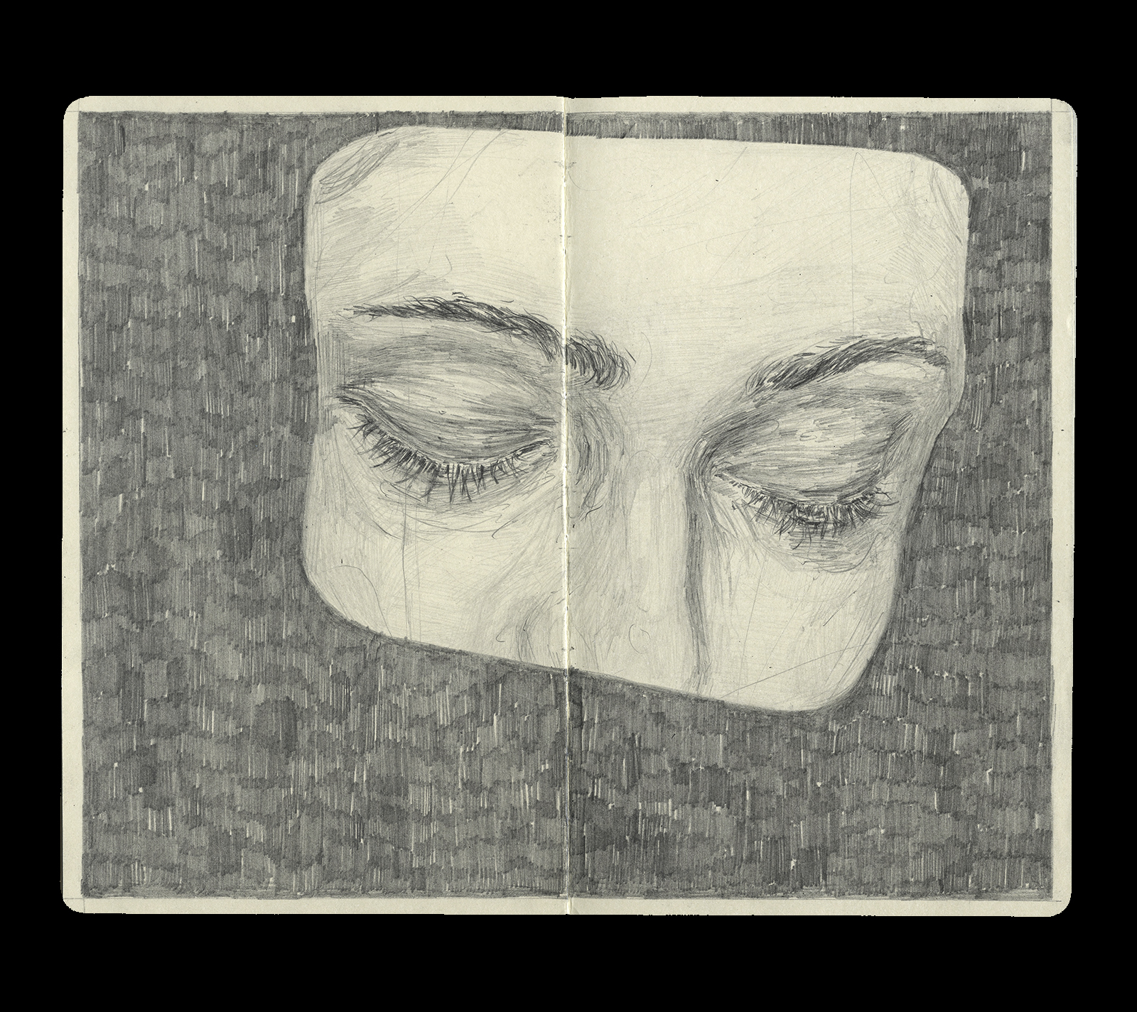
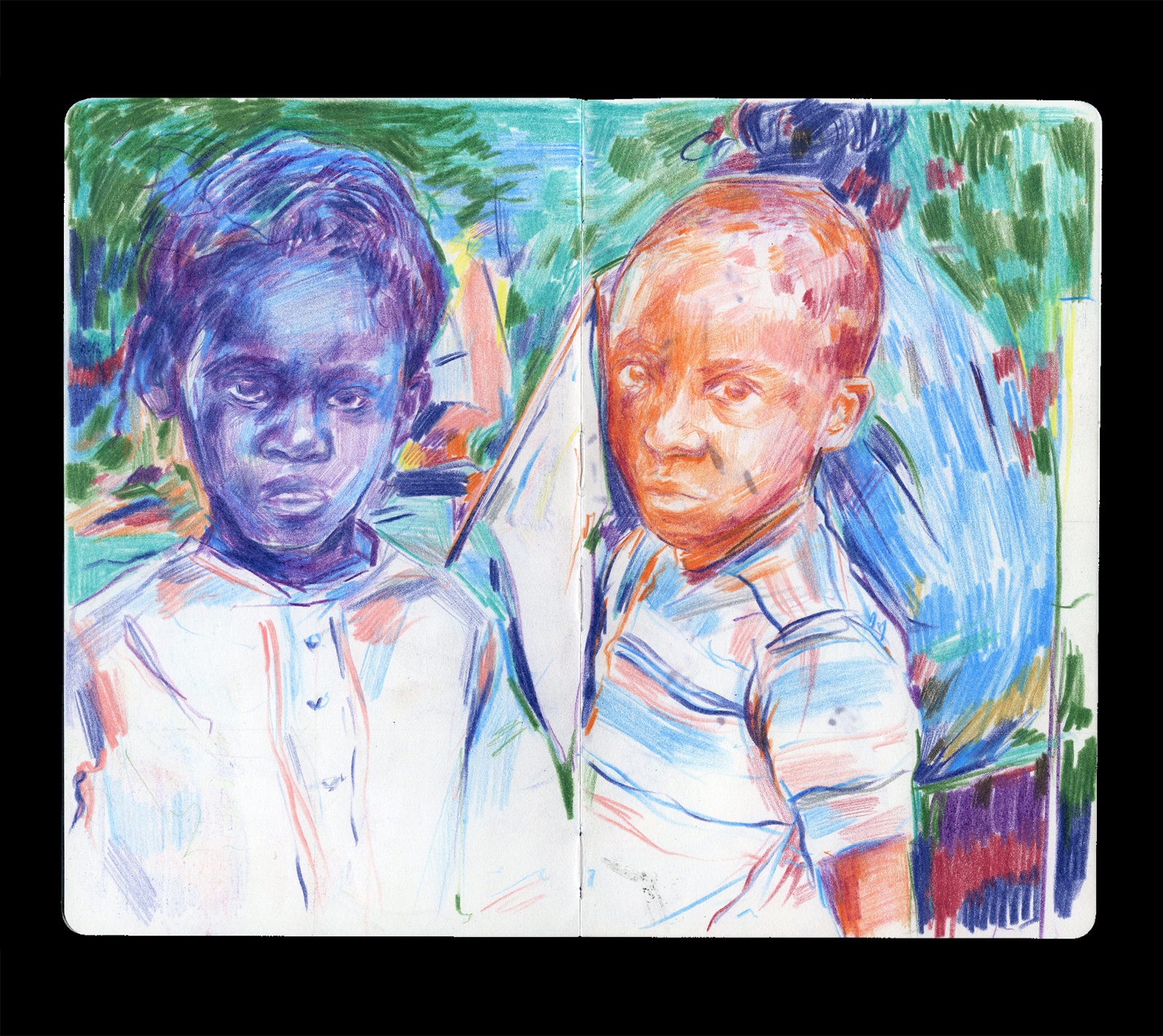
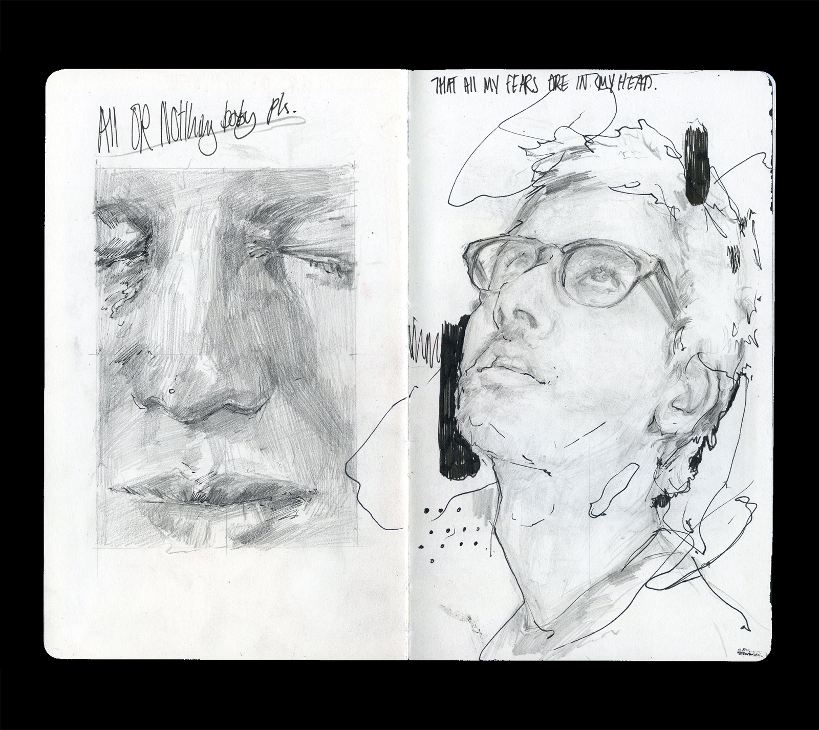
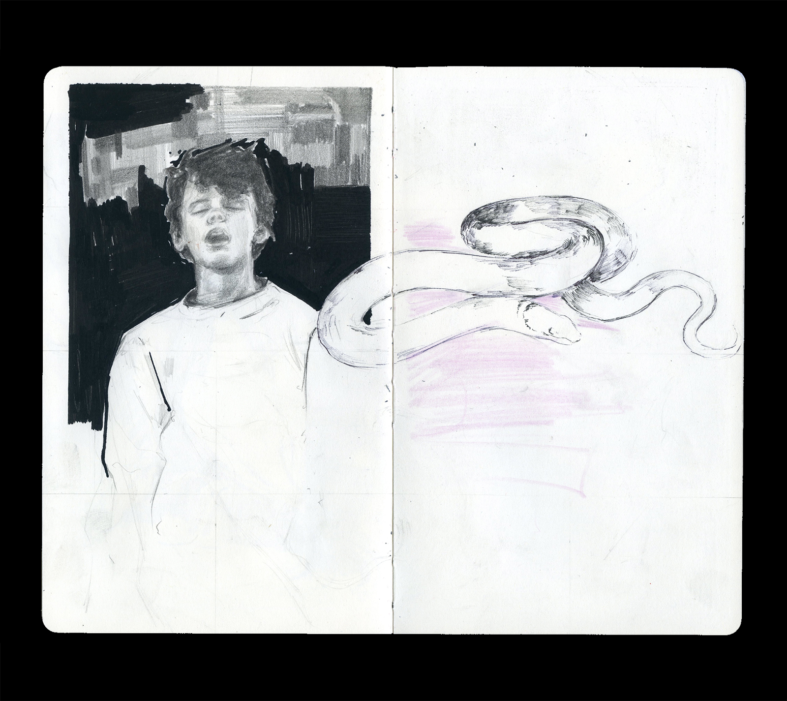
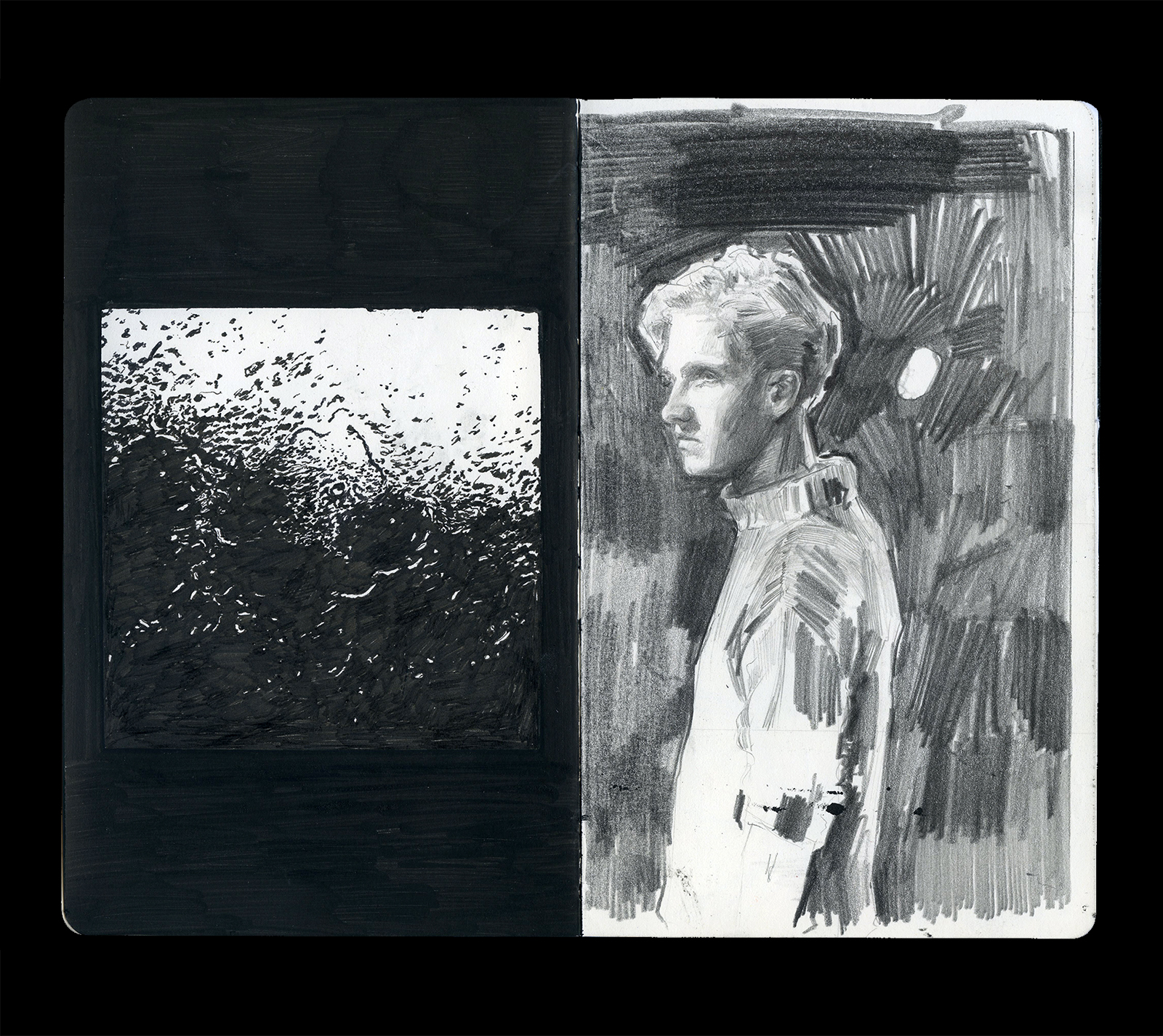
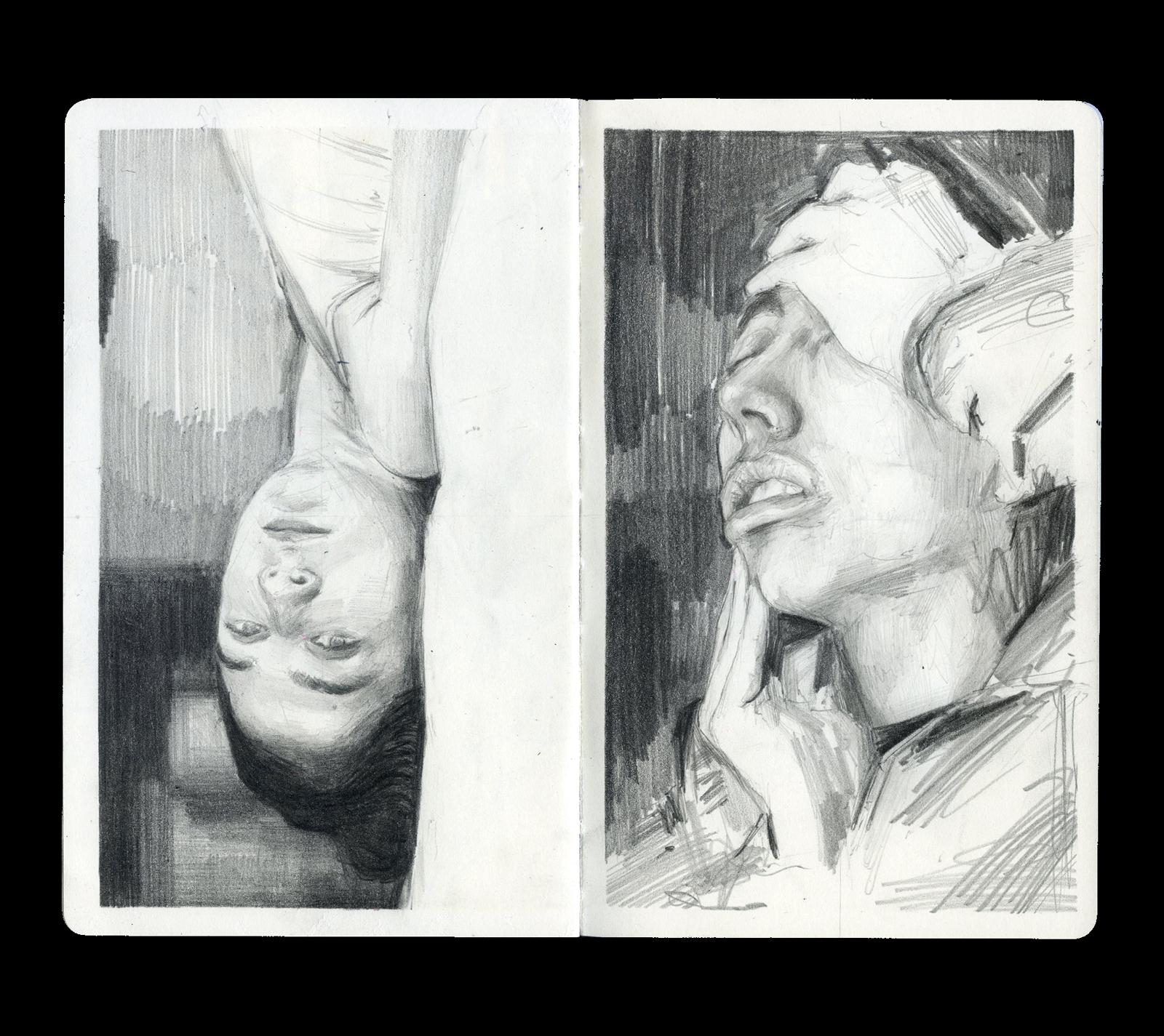
SKETCHBOOK
Over the past 5 years I have been drawing frequently in moleskine sketchbooks. Whether it be from life or reference online, drawing regularly and still practicing traditional methods of art help keep me in a constant creative practice and improves my ablity to communicate ideas and thoughts.


MODE—EDITORIAL. 002018
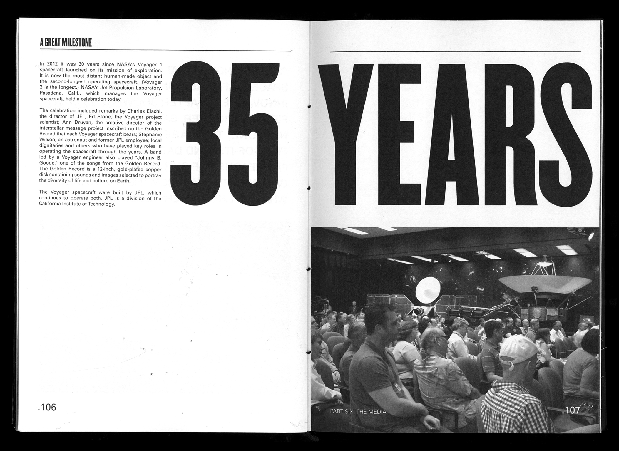
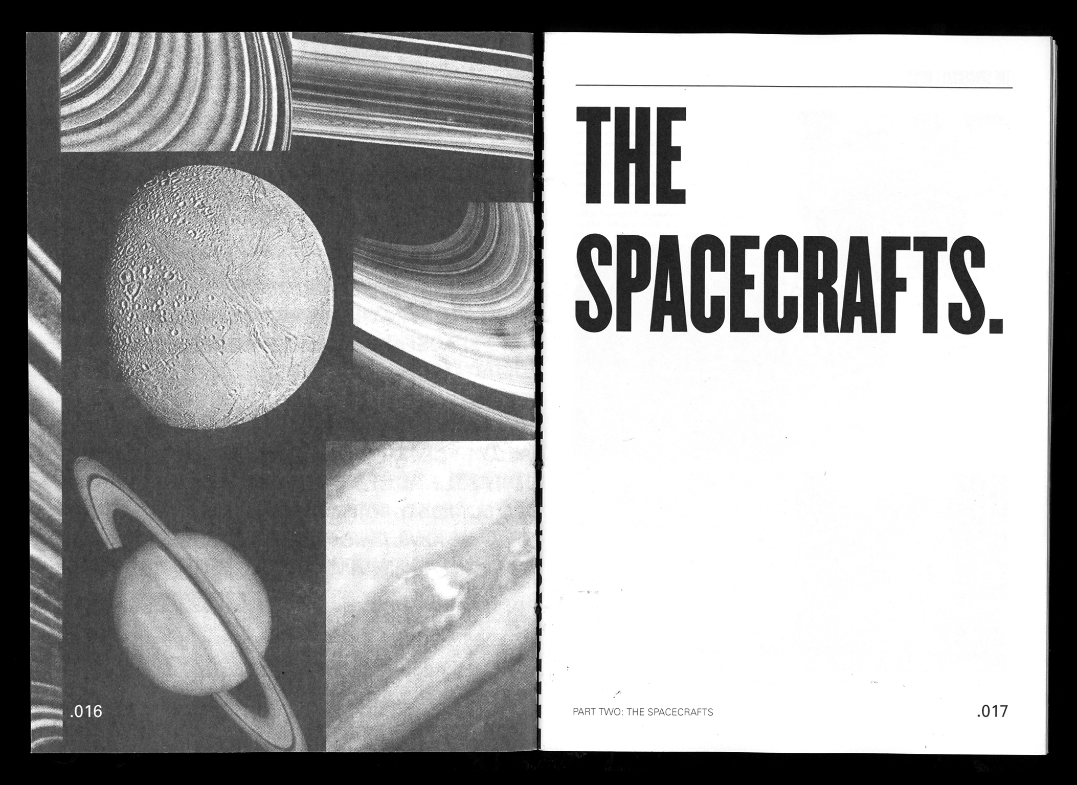
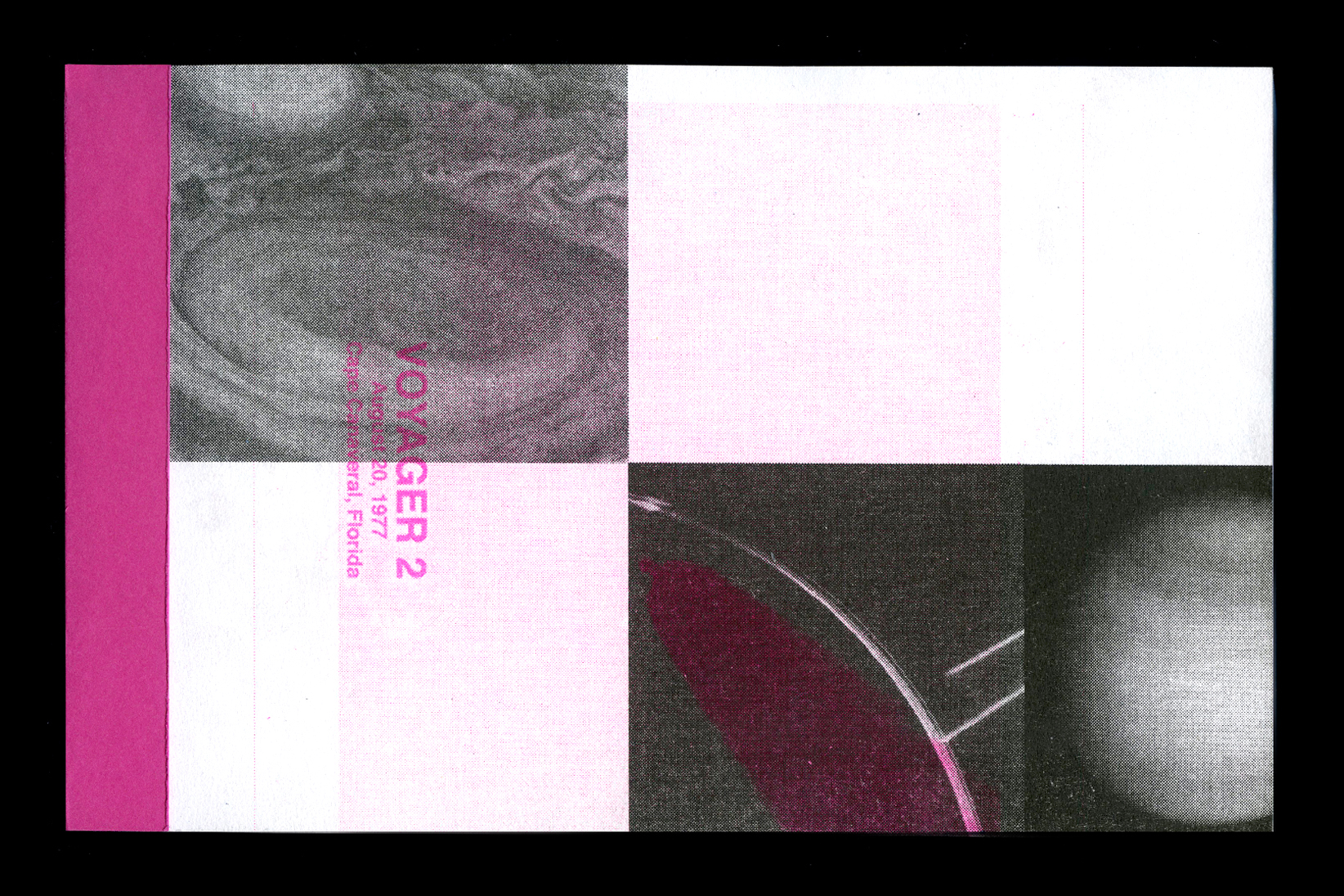
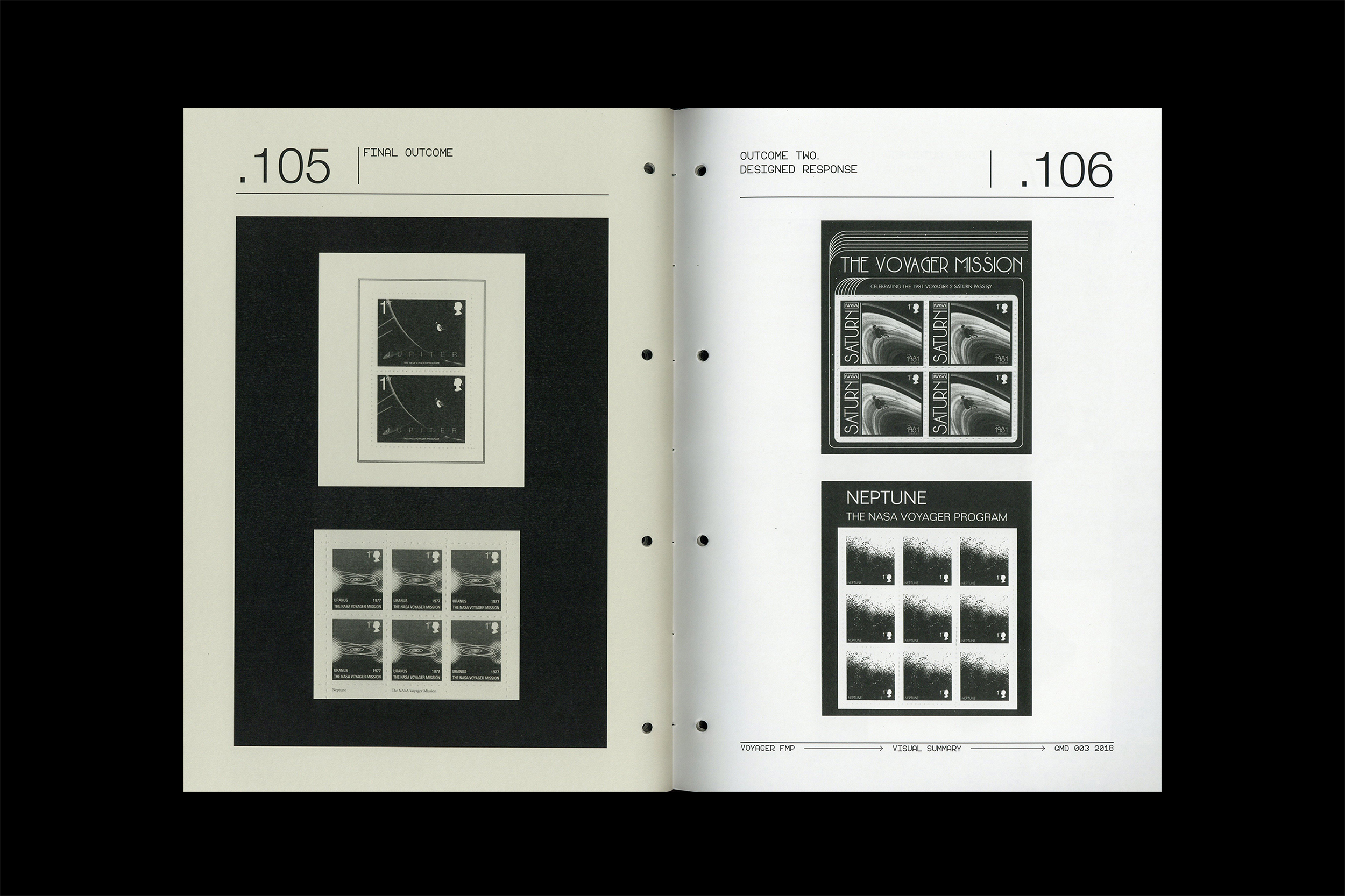
VOYAGER
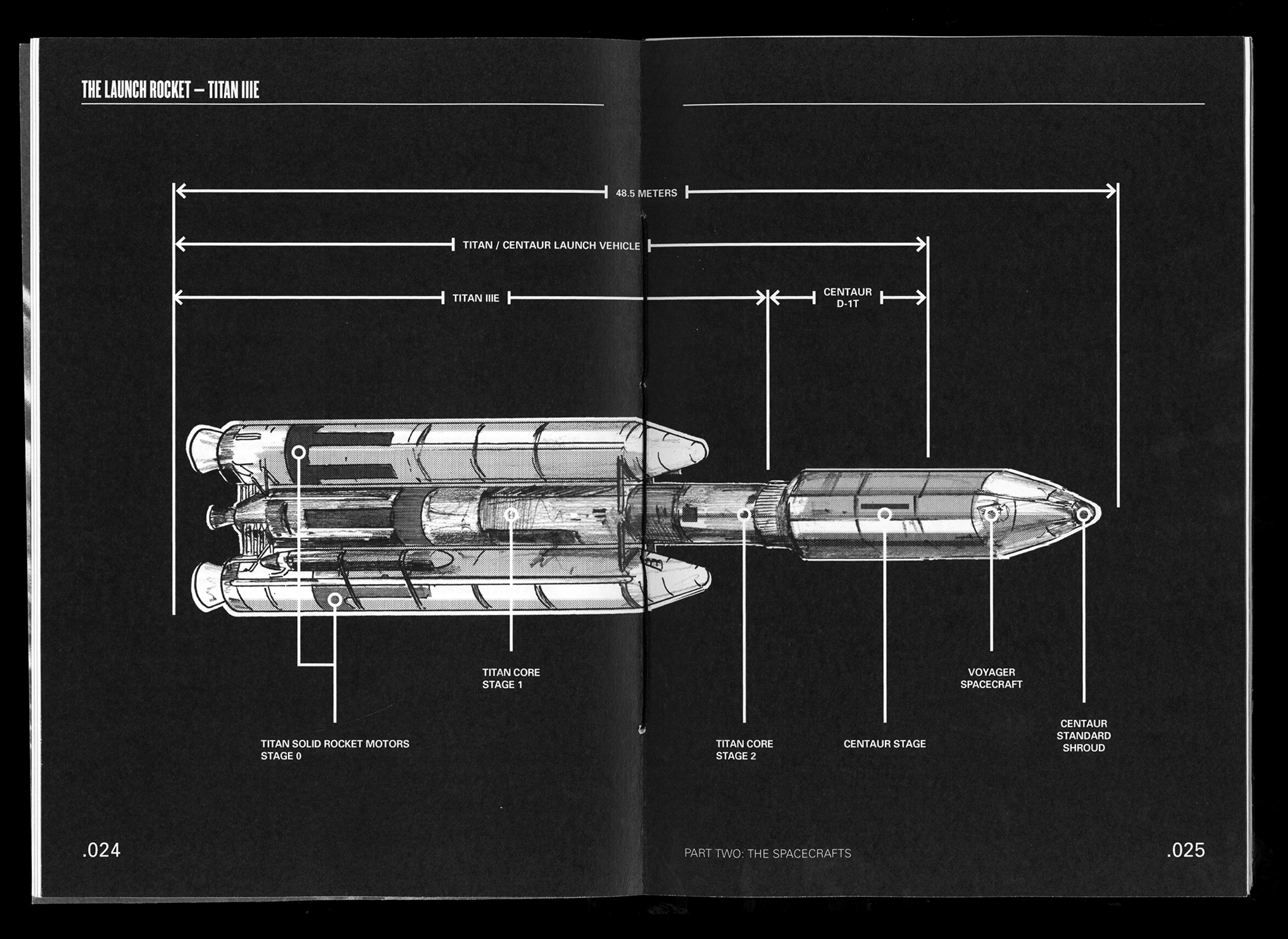
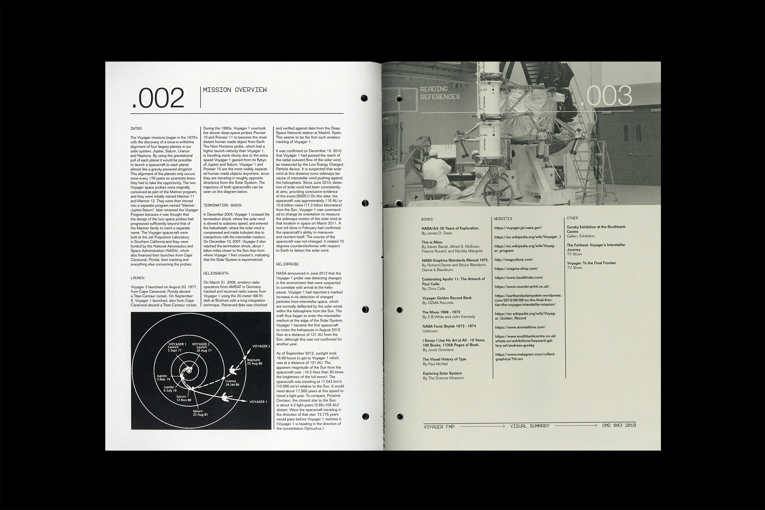
In 1977 the Jet
Propulsion Laboratory launched the Titan IIIE rocket from Cape Canaveral,
Florida. On board the rocket were two of the most advanced spacecrafts ever
built, each carrying an important message from Earth. The mission was set to be
one of the greatest space missions ever, taking advantage of the once in a
lifetime alignment of Jupiter, Saturn, Uranus and Neptune. The planetary
mission soon became an interstellar mission as both spacecrafts journeyed
deeper into the unknown boundaries outside our solar system.
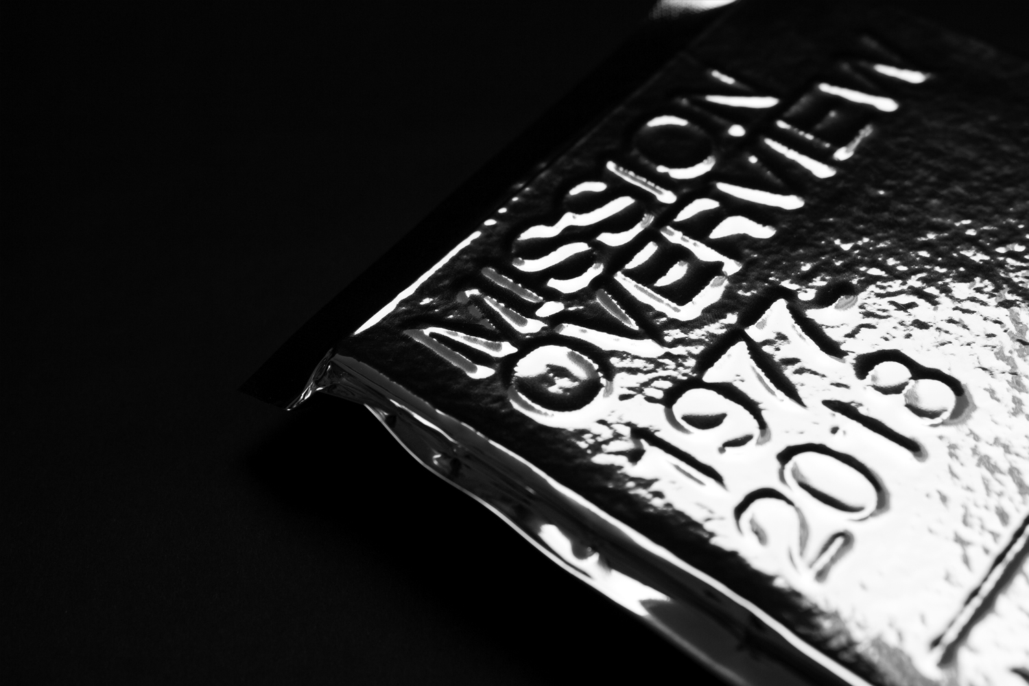
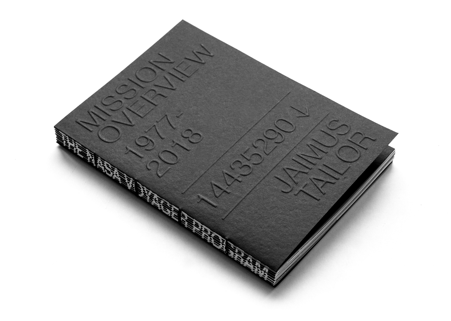
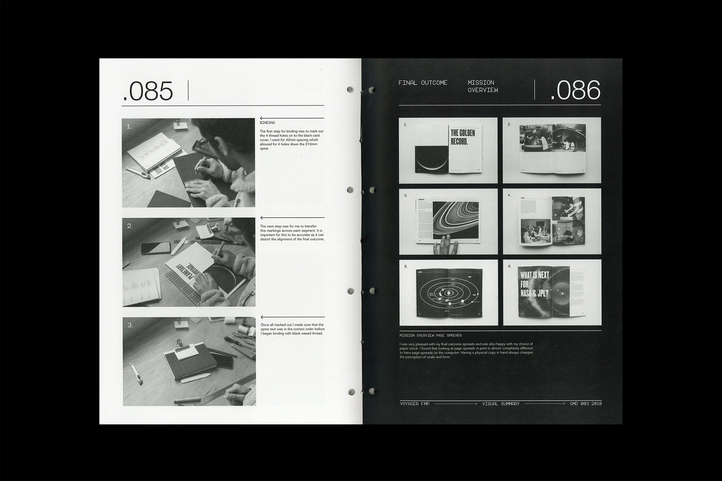
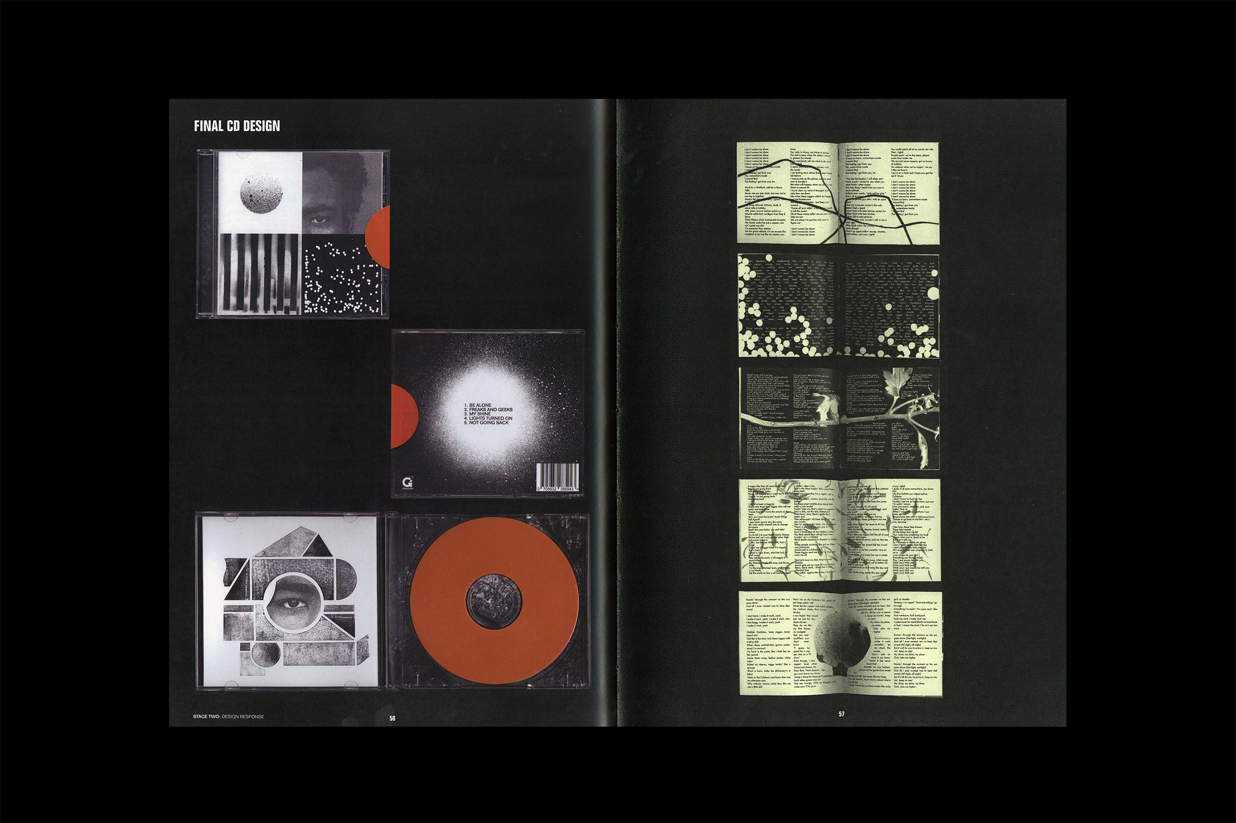
Mission Overview:
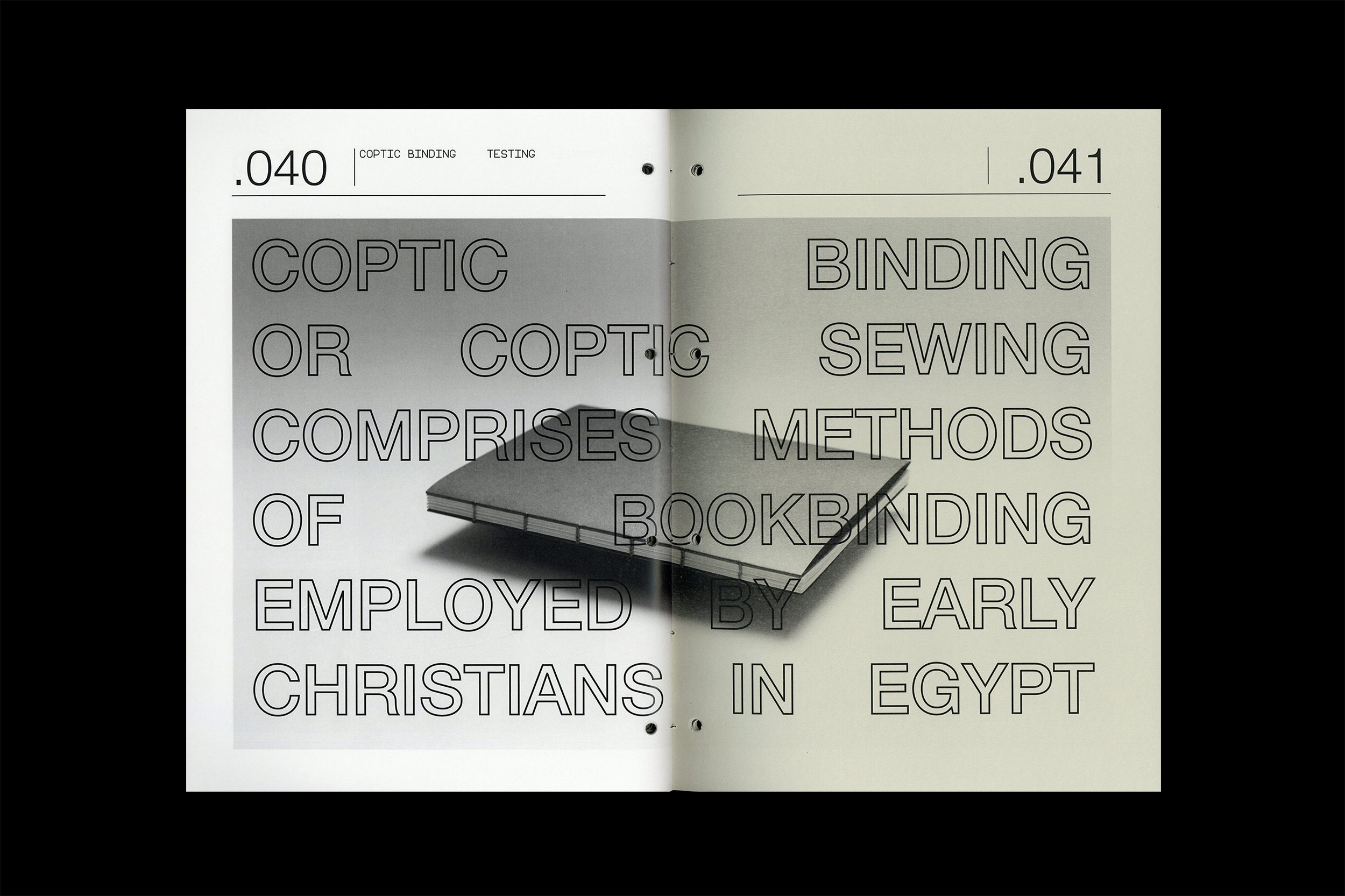
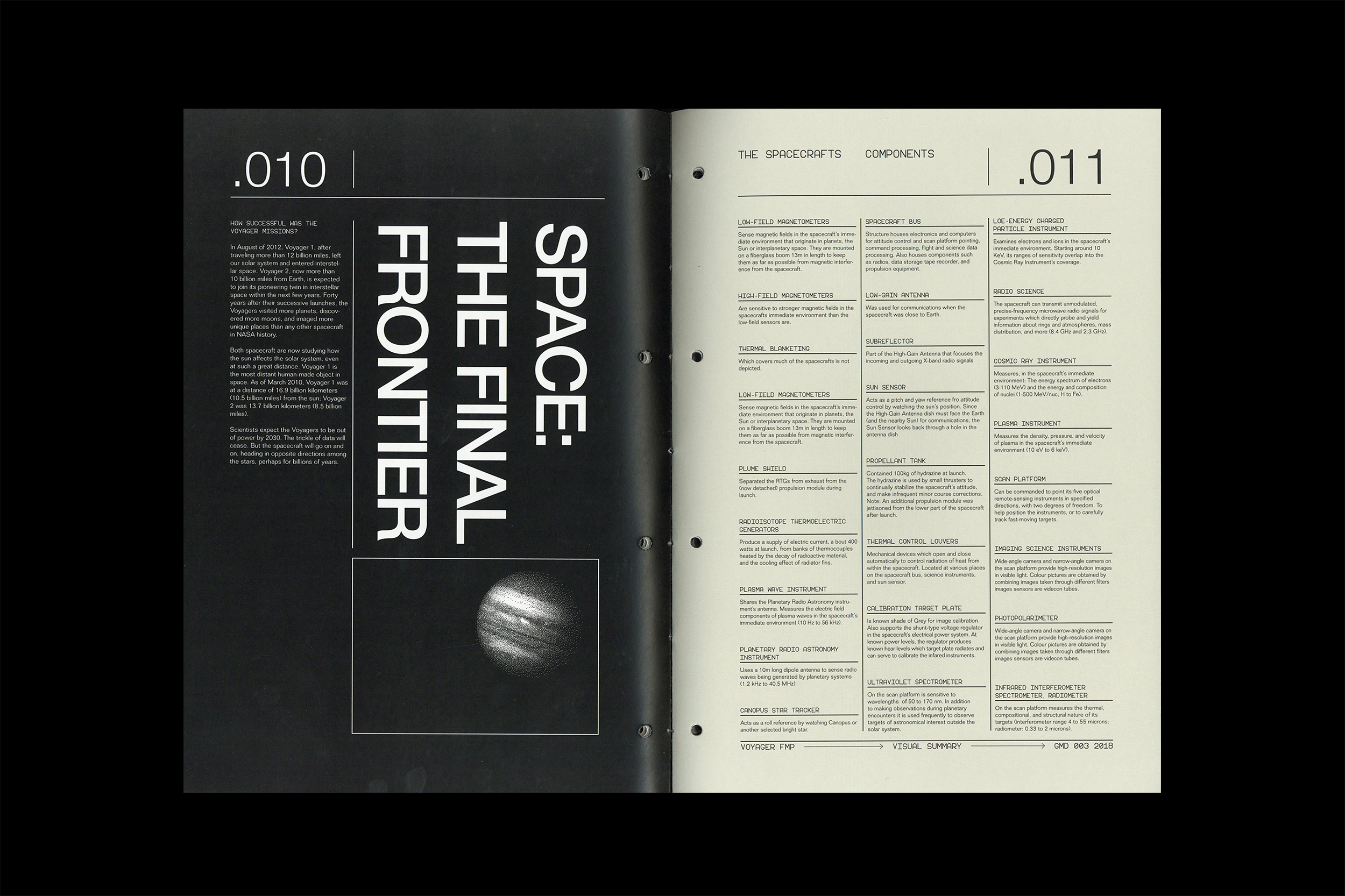
This 112 page coptic
bound publication looks at the entire mission from the initial plans and
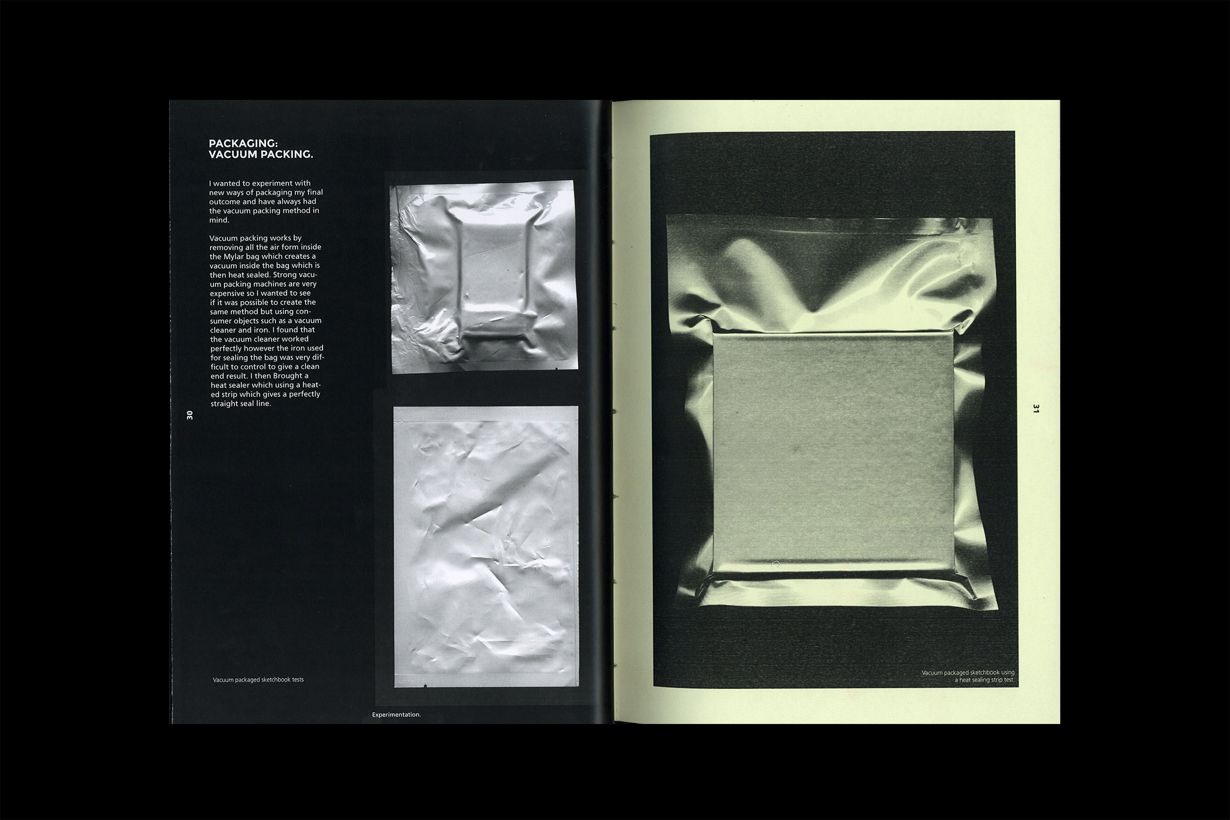
discussions, to the spacecrafts current location and statistics. Printed on
120gsm Munken, embossed and vacuum sealed cover
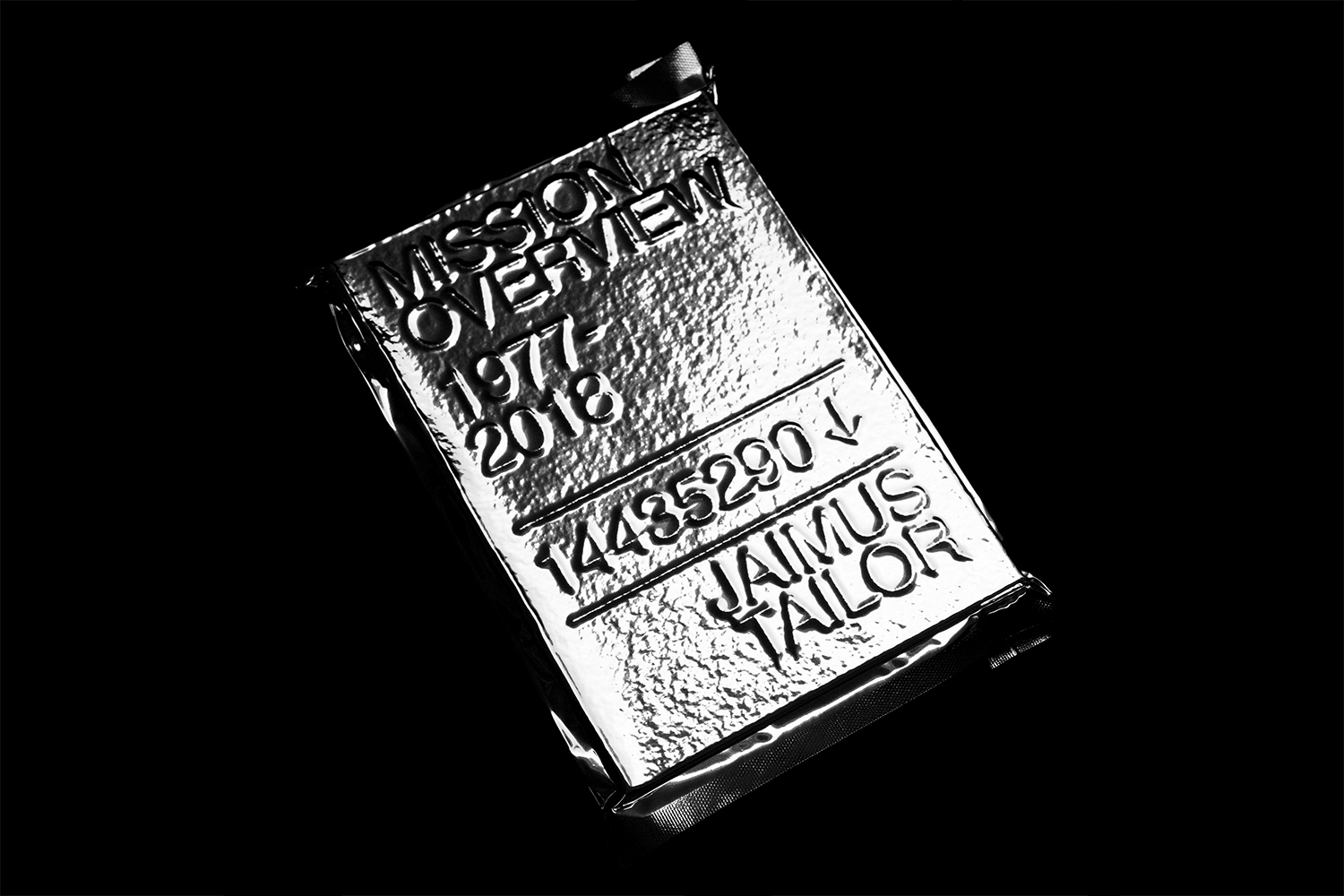
Mission Overview, with unopened vaccum seal.
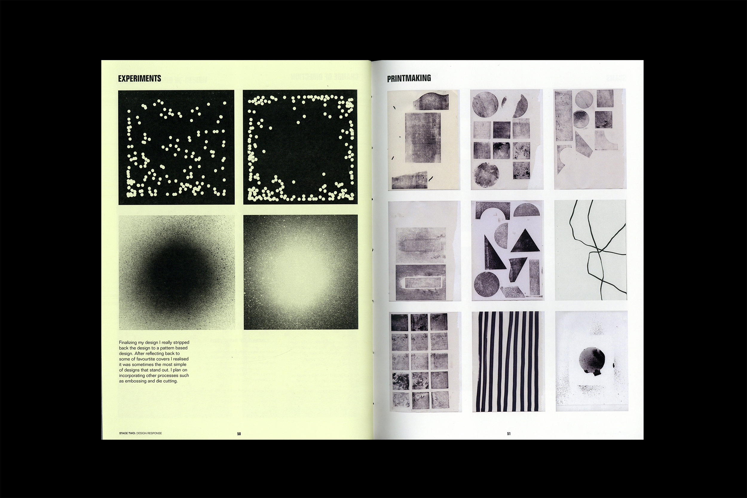
Process:
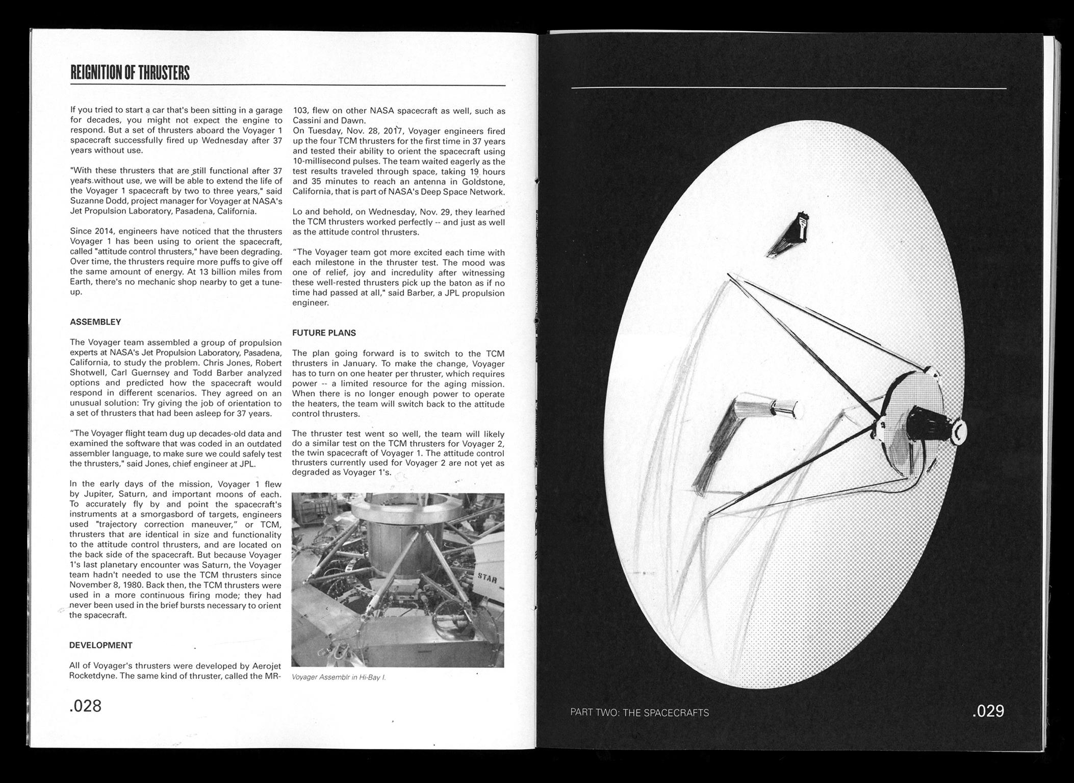
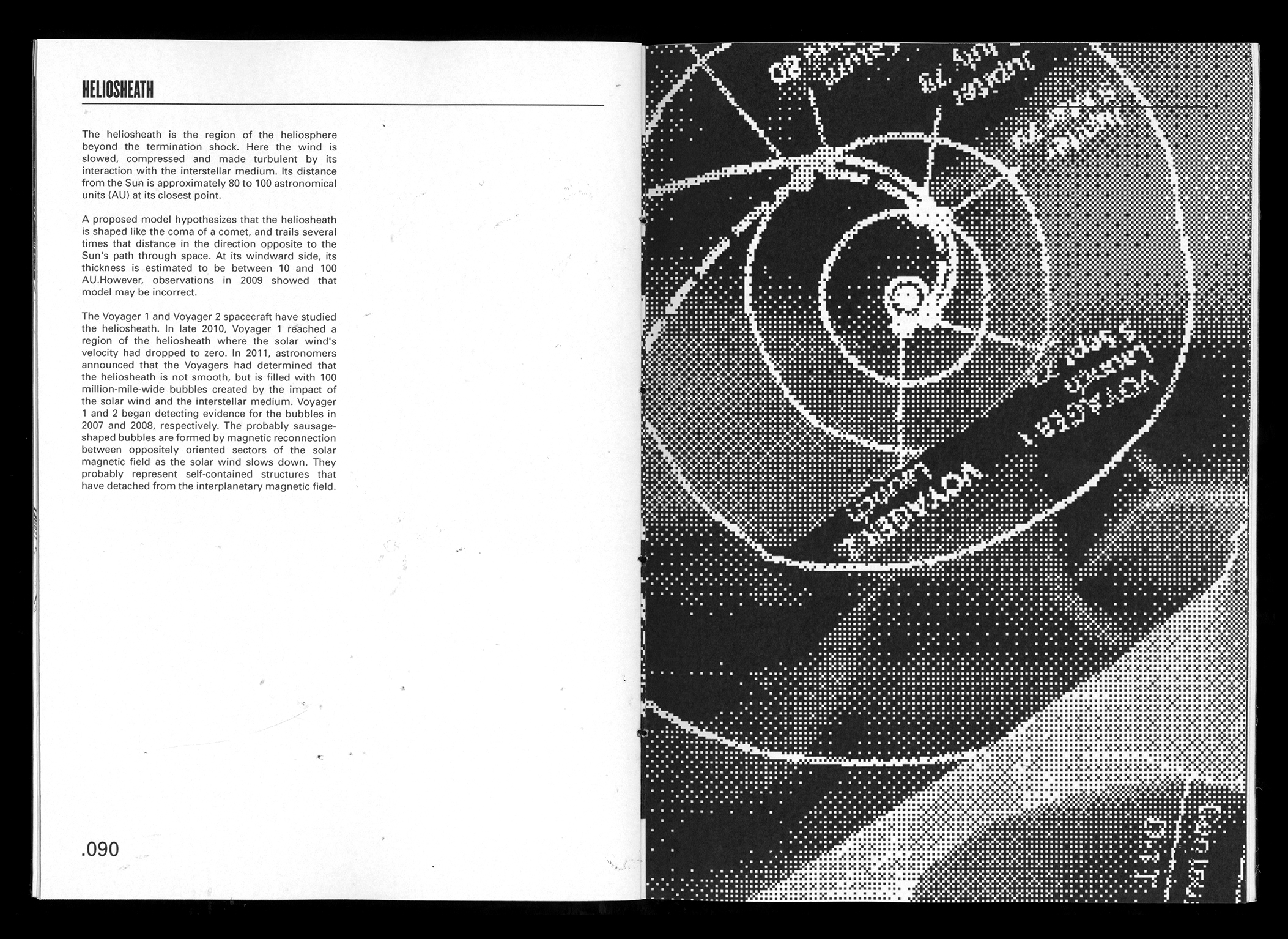
The coptic bound publication and foil vaccum wrapping was inspired by the space food that astronauts transport with them when on missions. A strong use of bitmap and greyscale aligns the publication to space exploration and references back to iconic NASA manuals and leaflets.
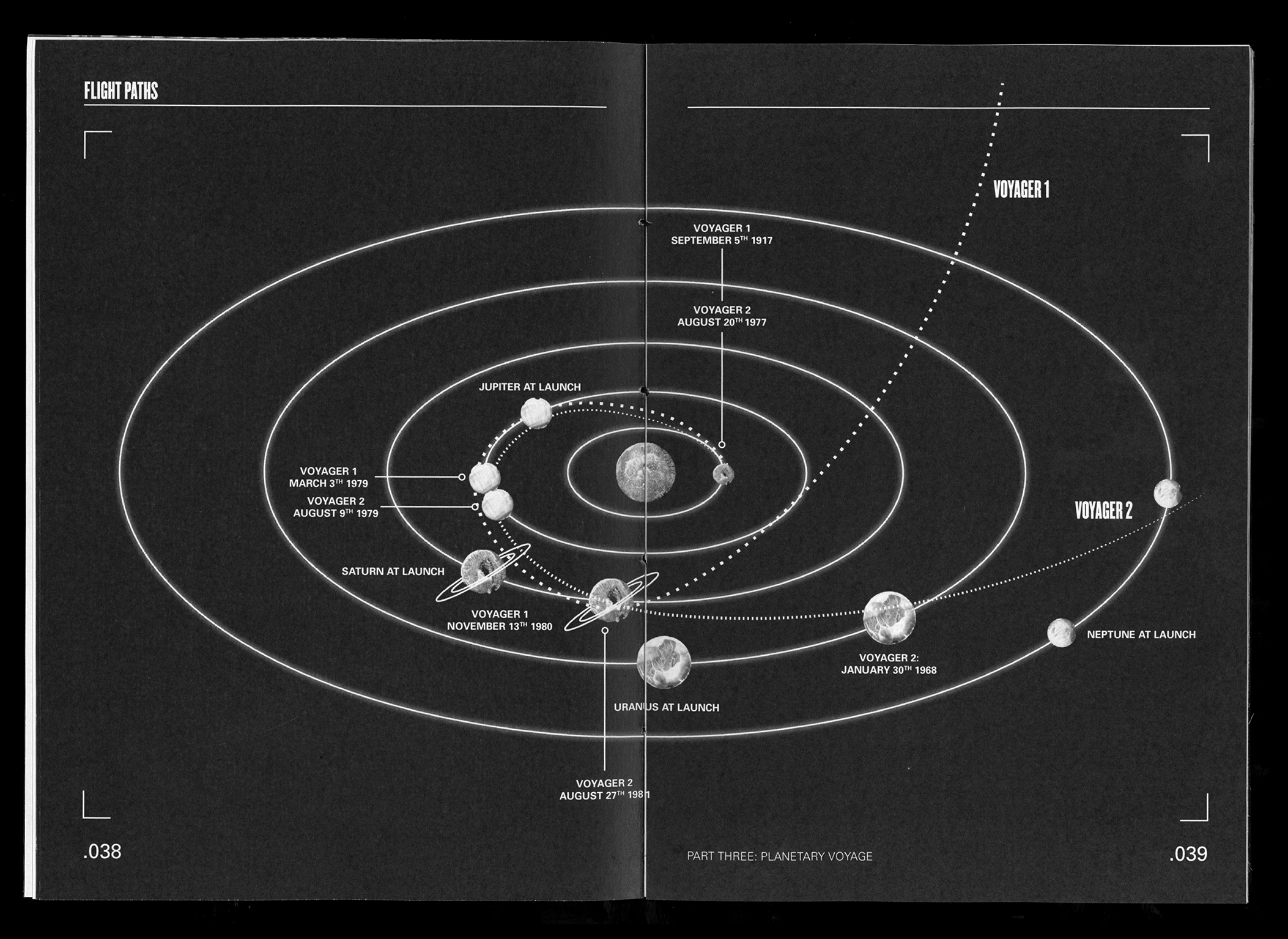
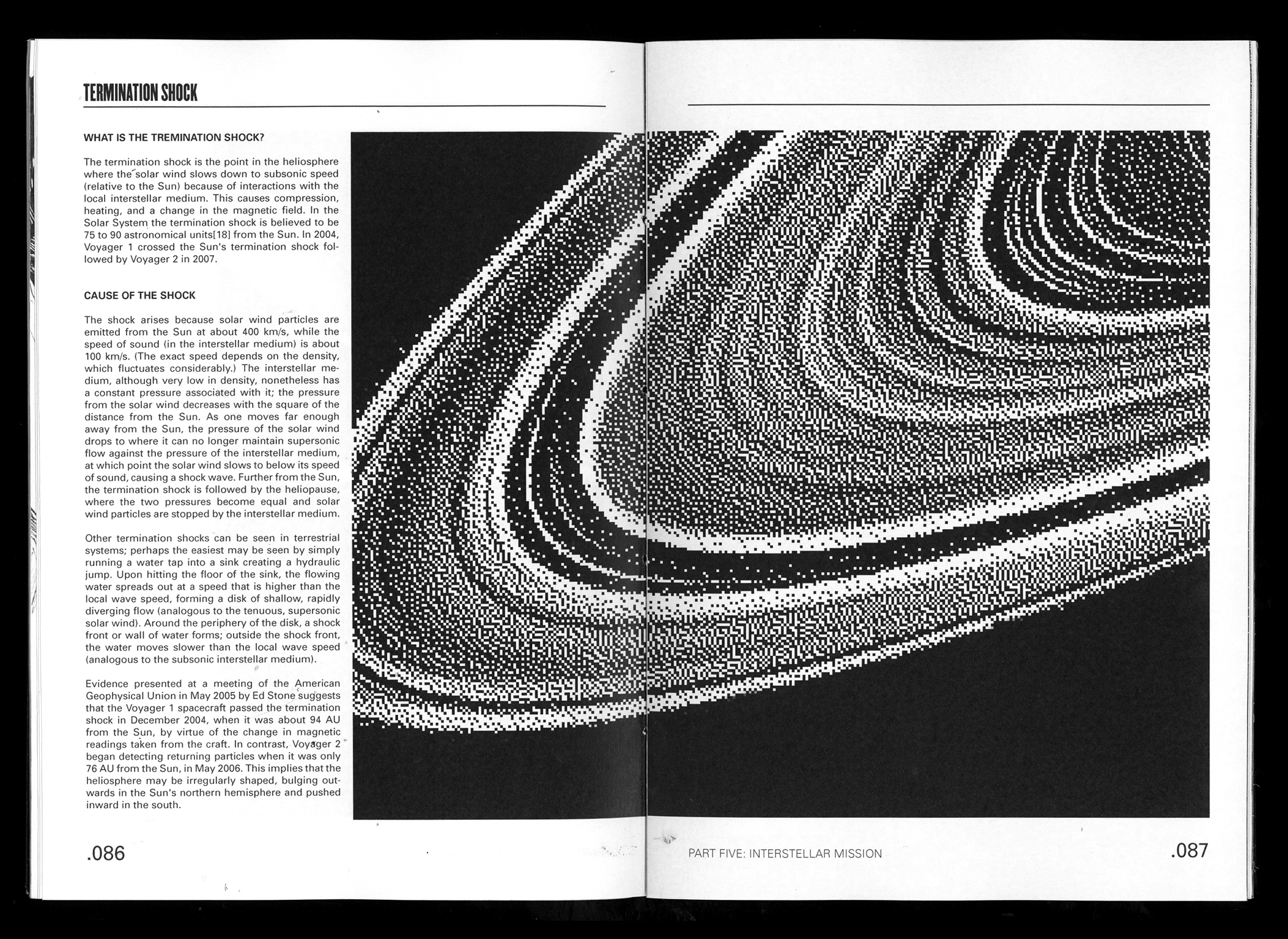
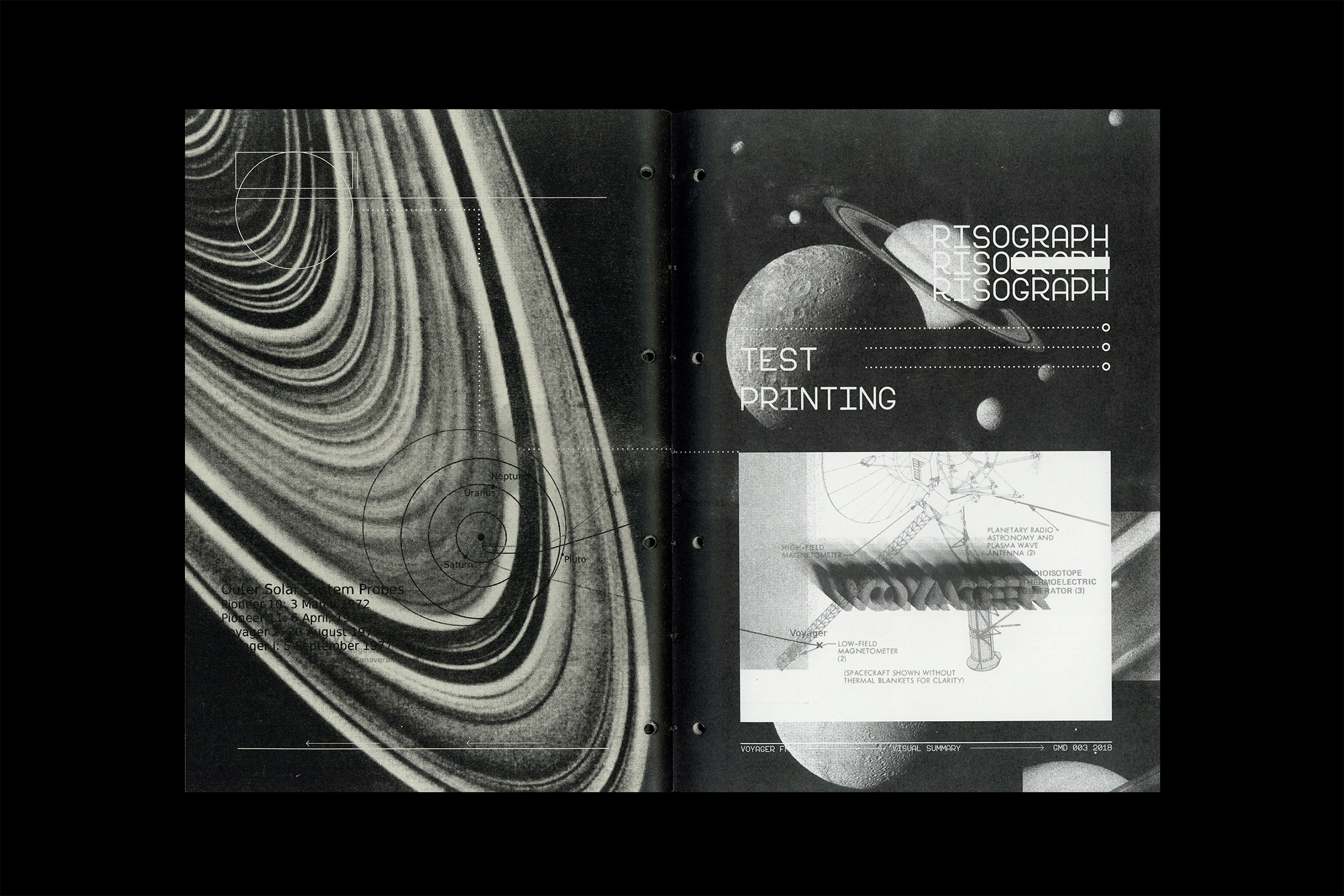
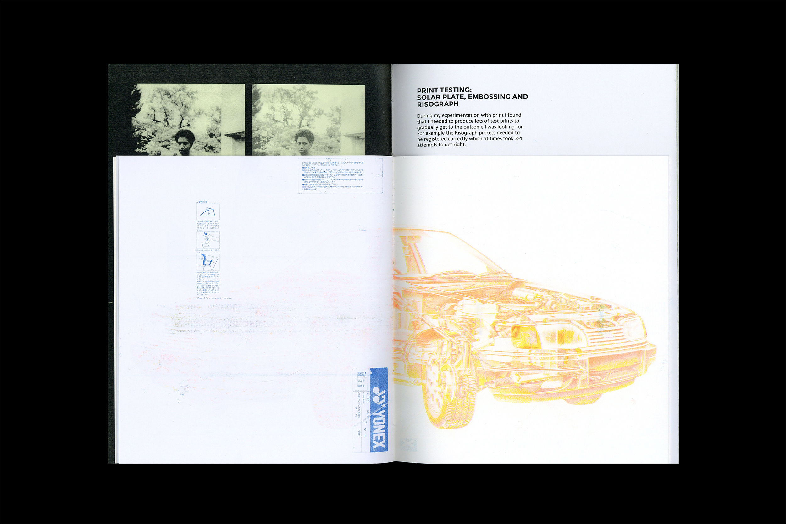
Risograph Experiment:
An abstract publication
created using a series of images and diagram from the JPL
Voyager webpage. Two layer pink and blue risograph print, perfect
bound.

Cover of the risograph publication.
![]() Back cover of the publication.
Back cover of the publication.
![]() Spine of the publication.
Spine of the publication.
 Back cover of the publication.
 Spine of the publication.
Presentation:
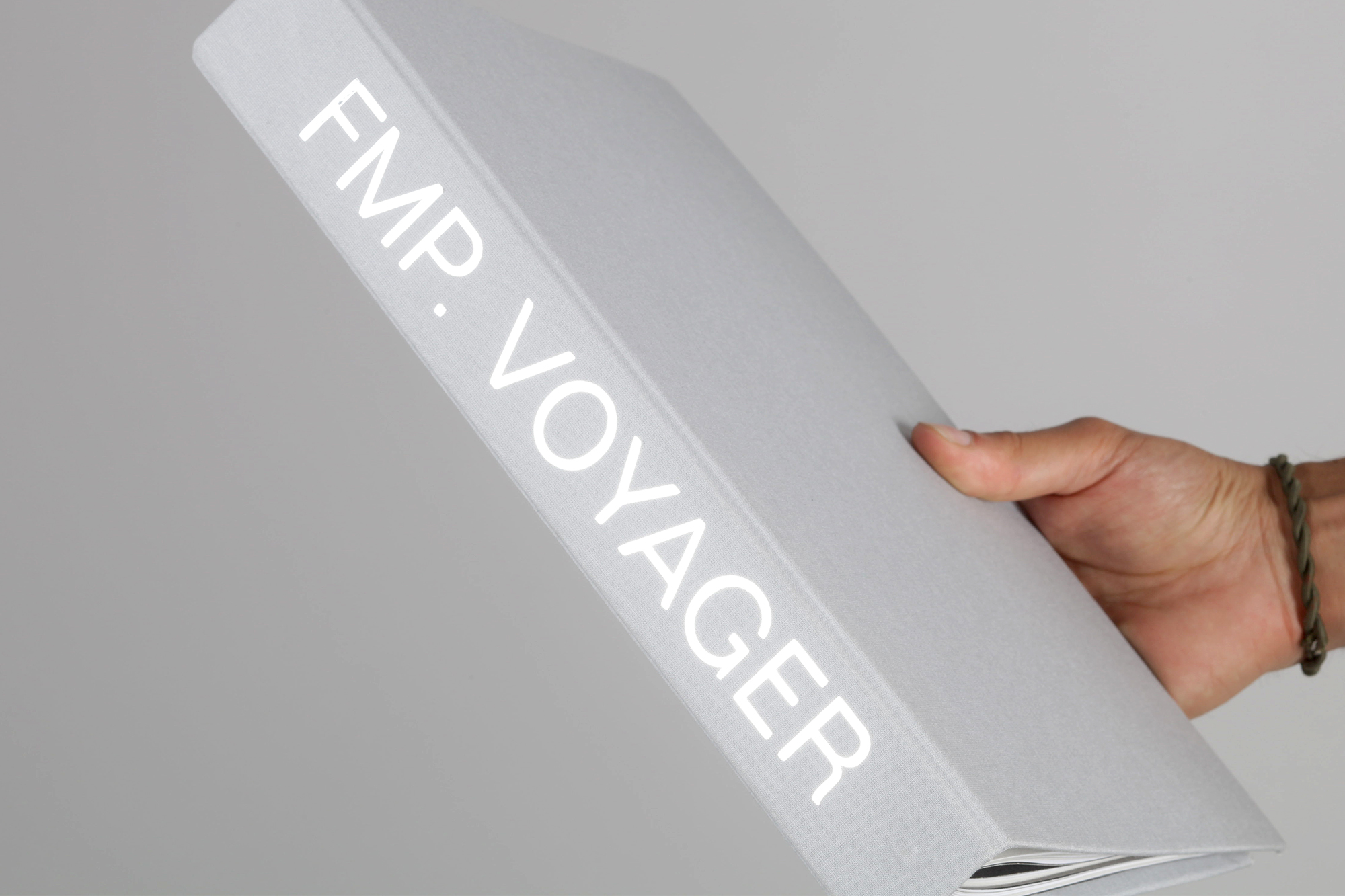
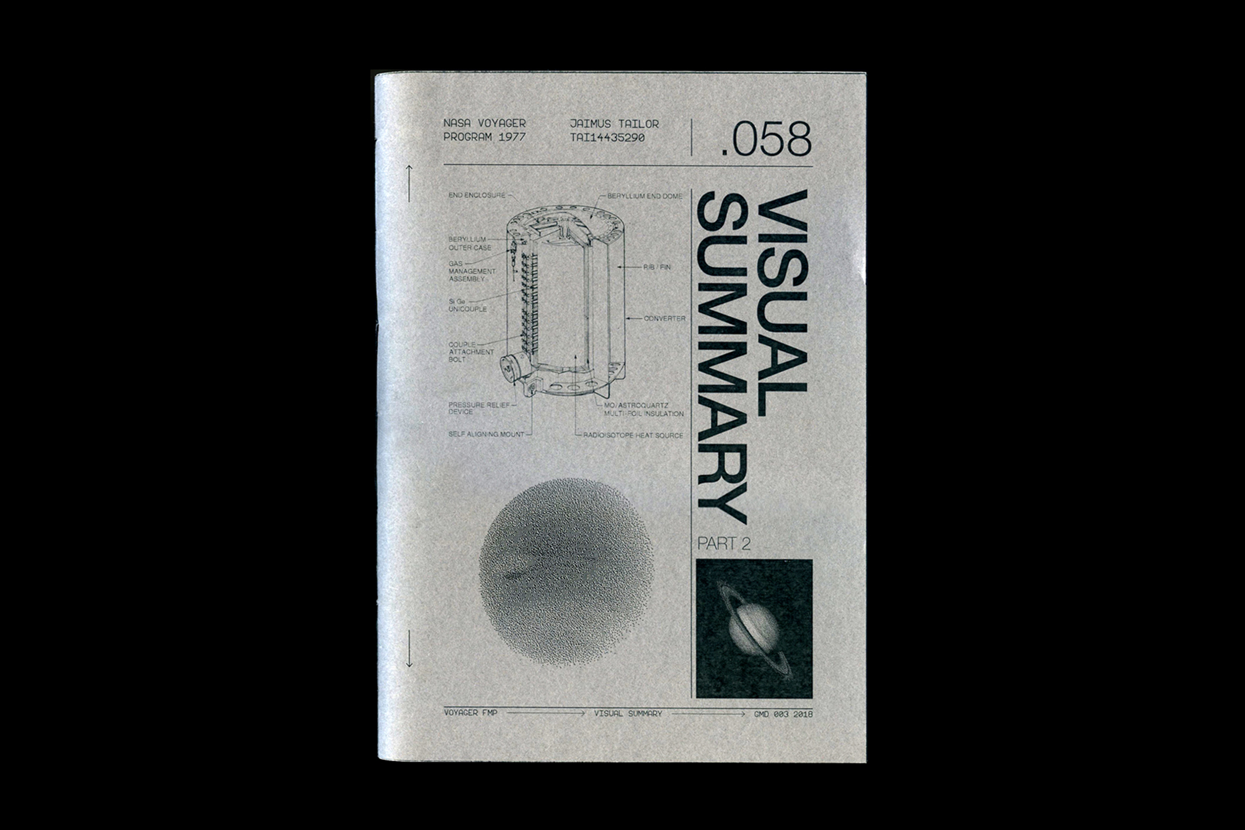
The final presentation is presented in a ring bound documentation that includes; part one and two visual summaries, ten Voyager themed stamps and the Mission Overview publication. The ring binder is bookcloth wrapped and chrome vinyl heatpressed.

MODE—NO.LASER/FFFORM FMP
FORM FOLLOWS FUNCTION
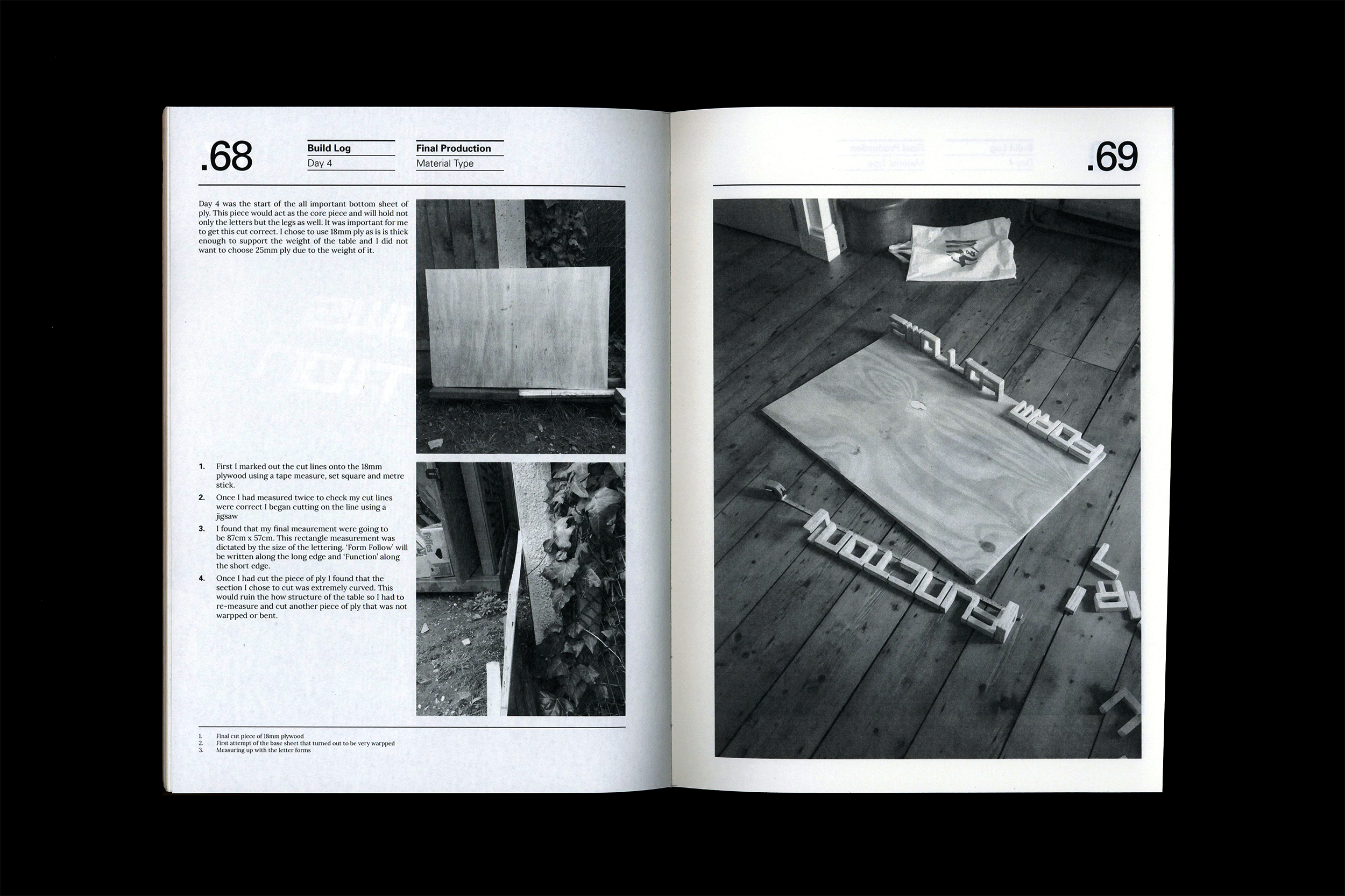
Material Type was the name of the brief set for one of my graphic and media design final major projects. The brief encouraged us to explore typography through physical mediums. Choosing a quote or statement and enhancing and portraying the meaning through physical forms, materials and texture.
Louis Sullivan:
Sullivan is known for steel-frame constructions, considered some of the earliest skyscrapers. Sullivan’s famous axiom, “form follows function,” became the touchstone for many architects. This means that the purpose of a building should be the starting point for its design.
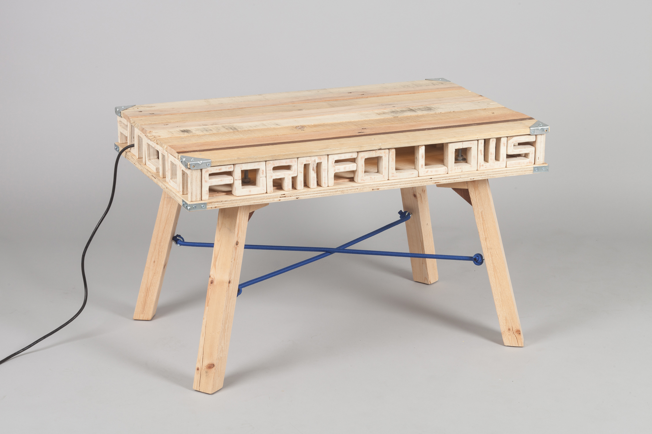
Fully assembled coffee table.
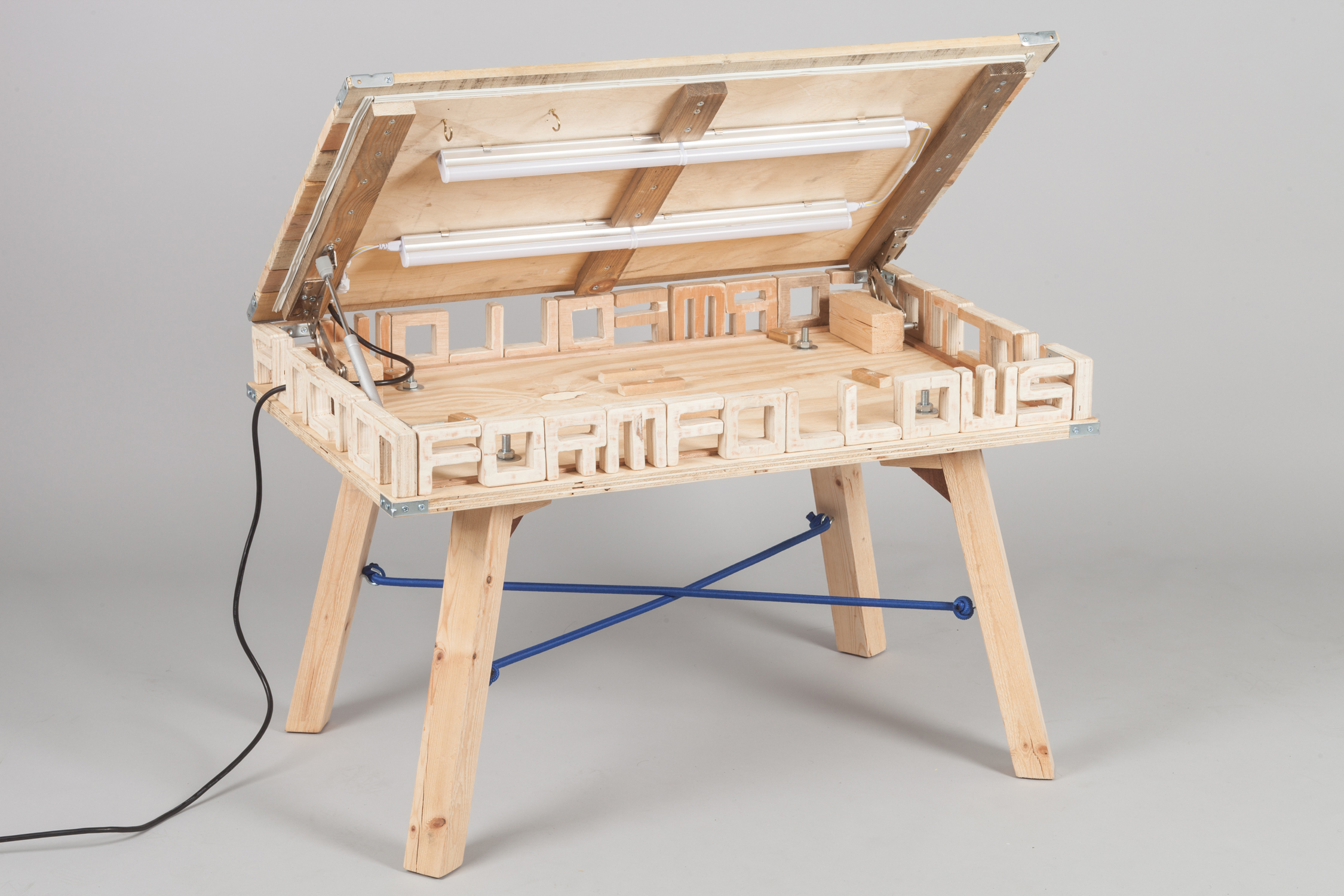
Open view of coffee table.
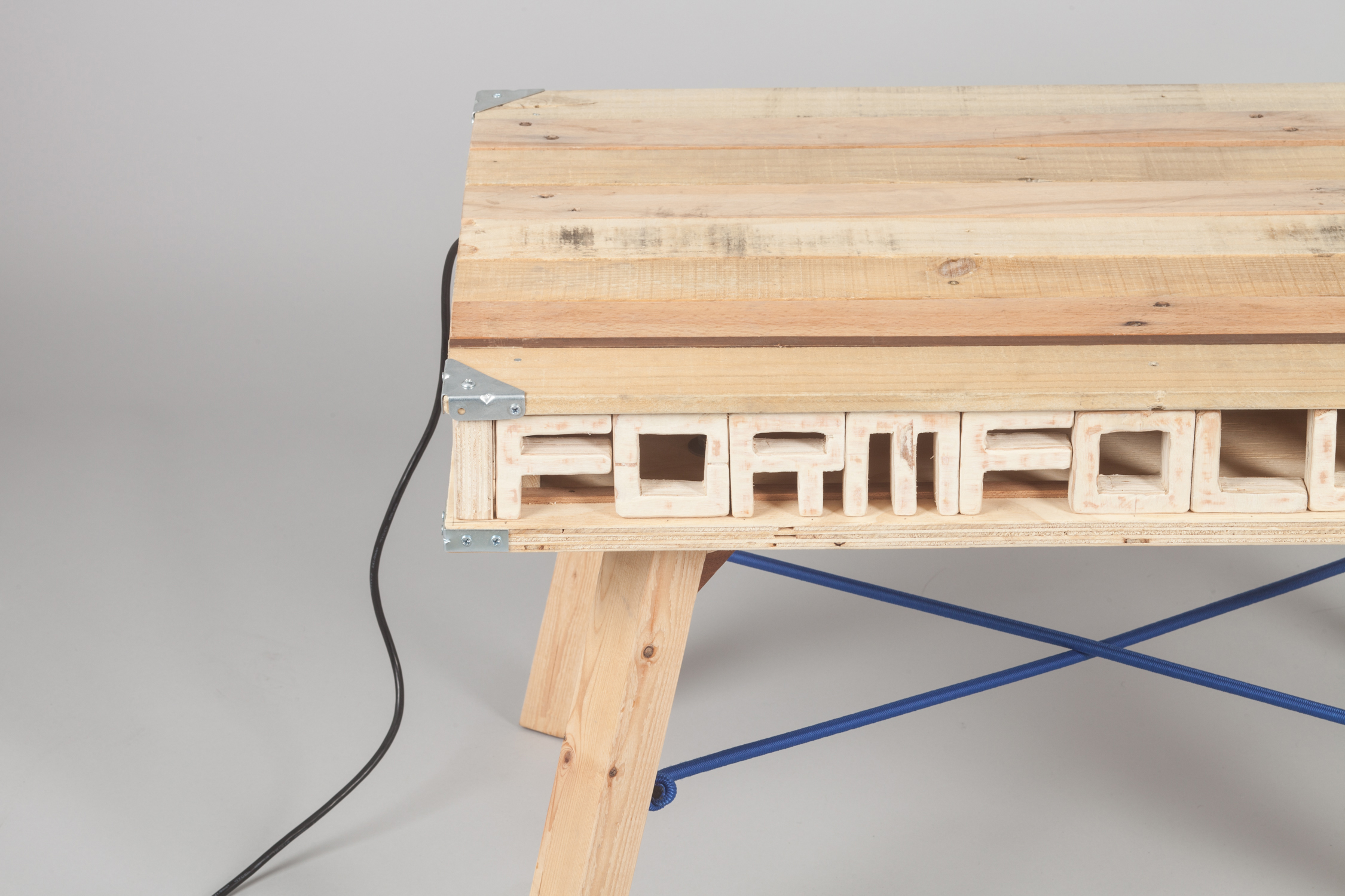
Corner detail of coffee table.
 Corner detail of coffee table.
Fitted with 4ft of LED tube lights.
Process:
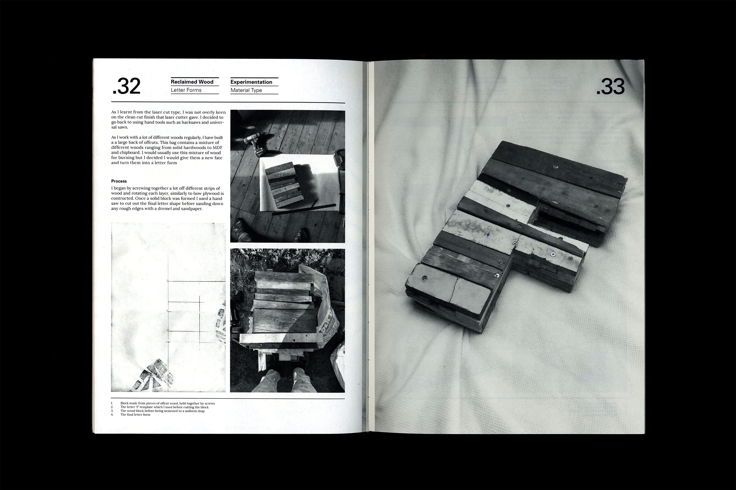
All the materials used in the build of the coffee table were reclaimed waste materials, therefore the table was almost free to produce with the only cost being small metal hardware and LED lighting.
I wanted this table to be a homage to handmade craft and to limit the use of CAD and CNC. Each letter form was hand cut and finished with hand tools.
The entire process was photographically recorded and produced into a 156 page editorial which can be seen below.
Rationale:
Spirit and thought can be seen in every piece of furniture. The time spent and process behind every cut and imperfection enhances the viewers understanding of the object insight.
The rationale behind the piece was to create an object that lacks perfection yet still functions, sparks interest and differs from the crowd while paying homage to DIY aesthetics.

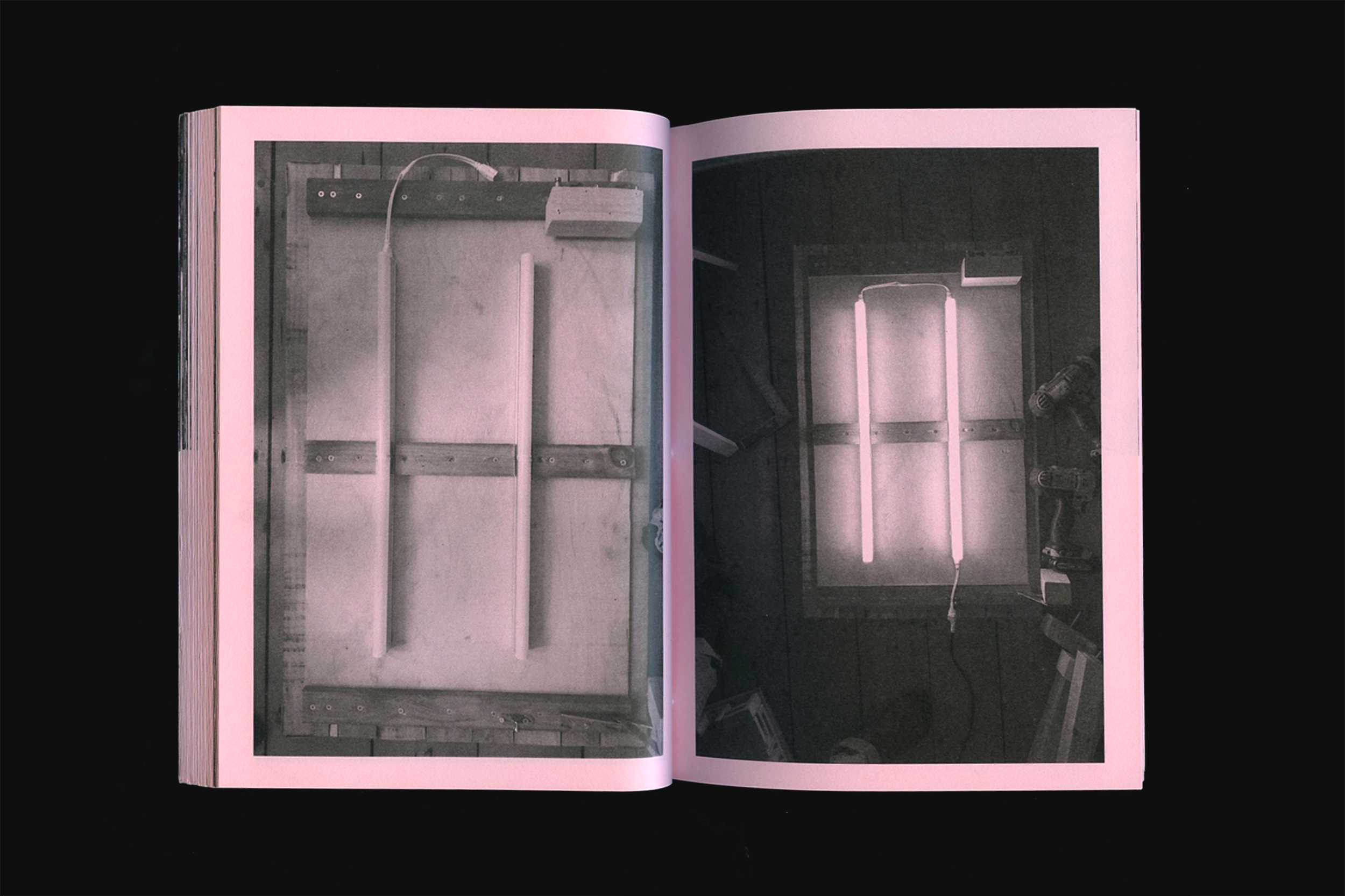
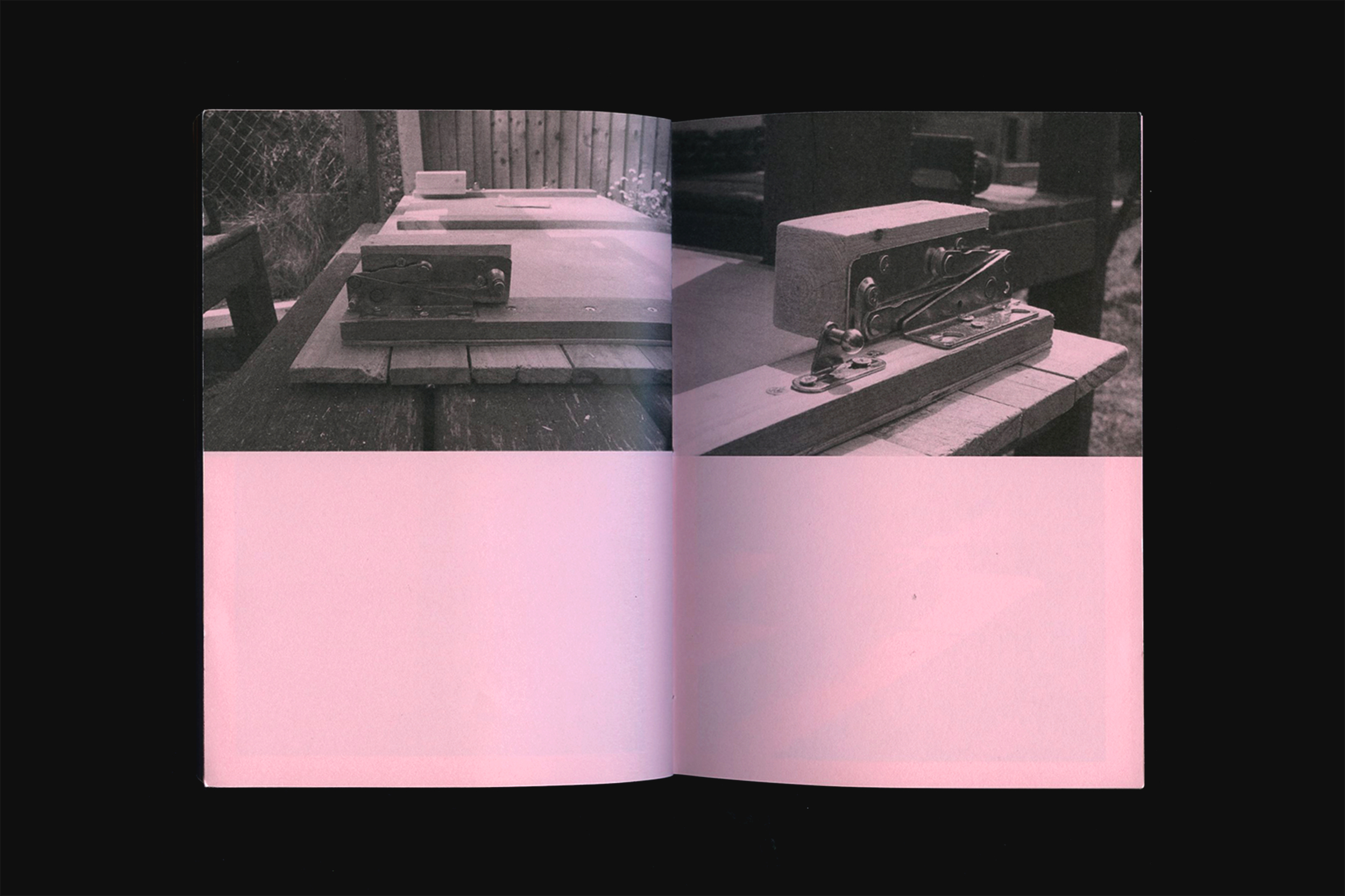
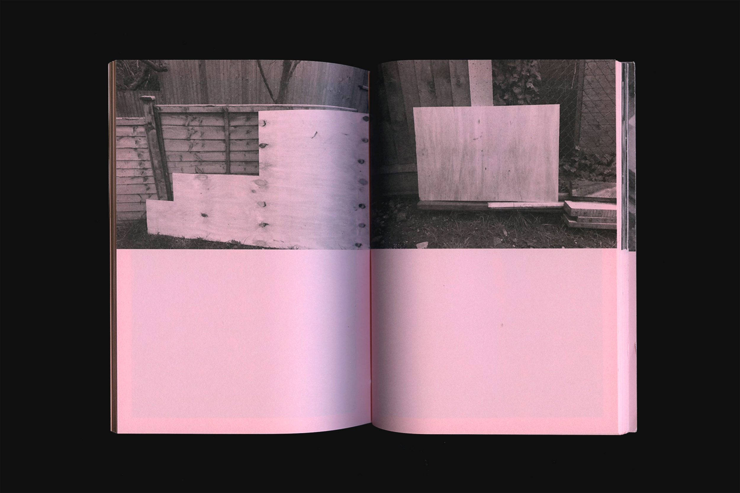
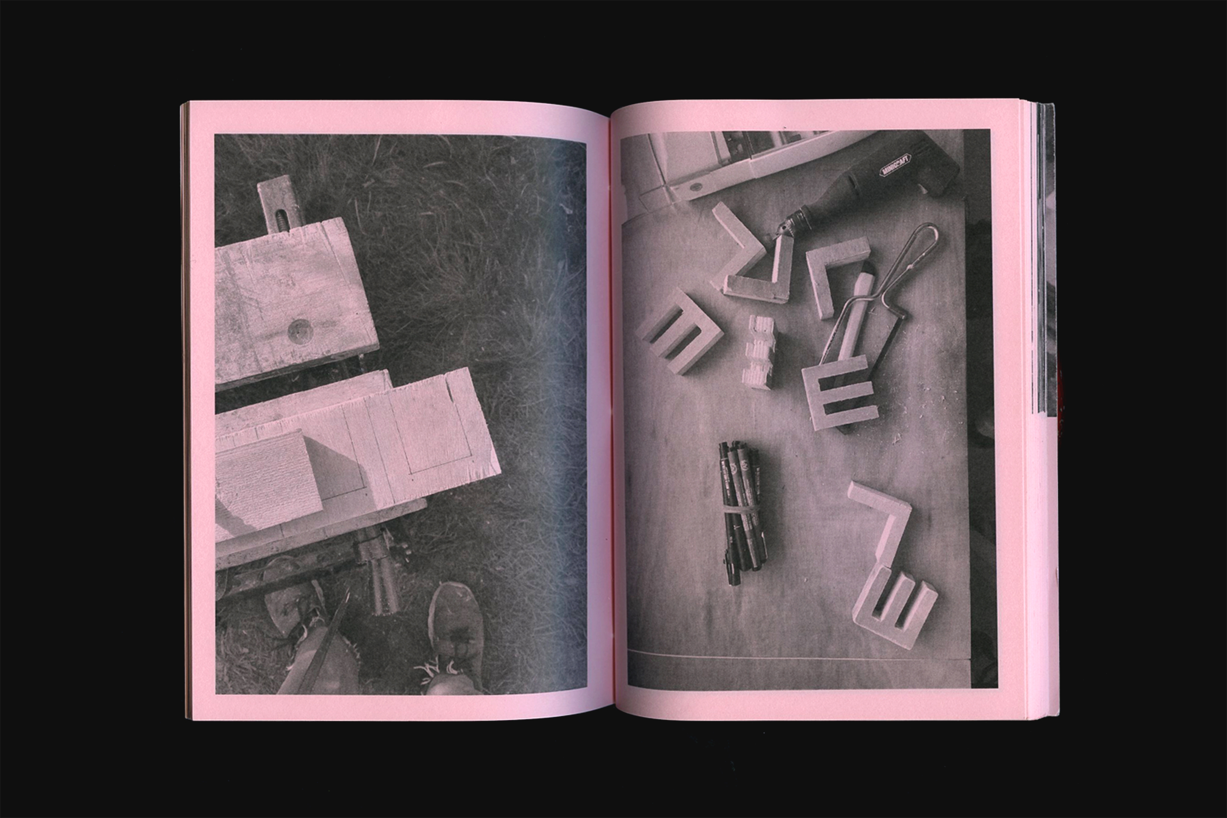
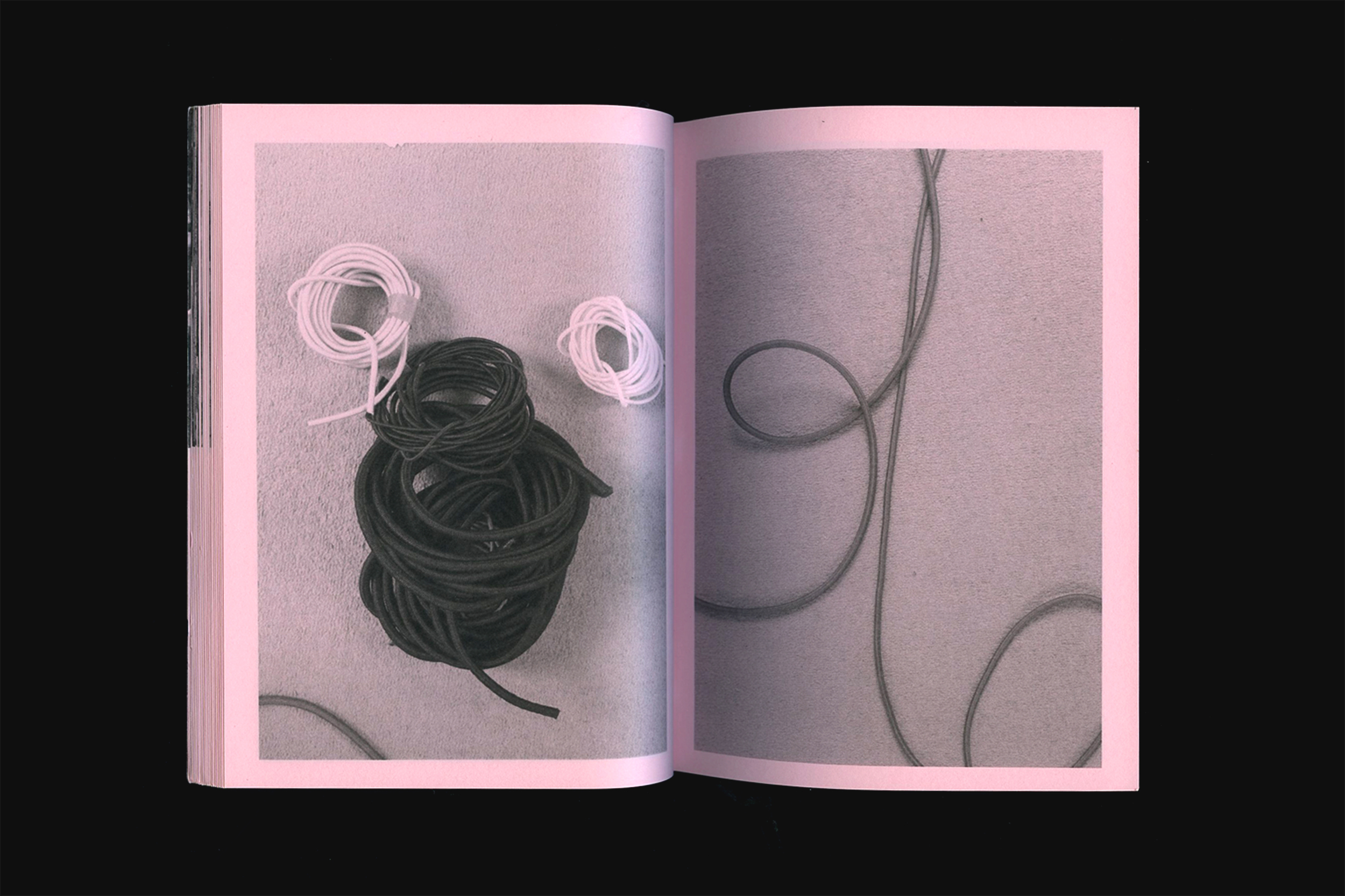
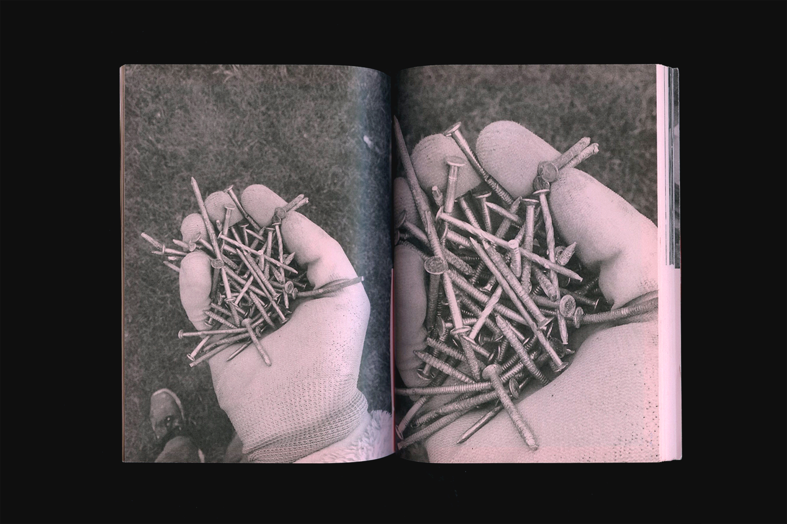
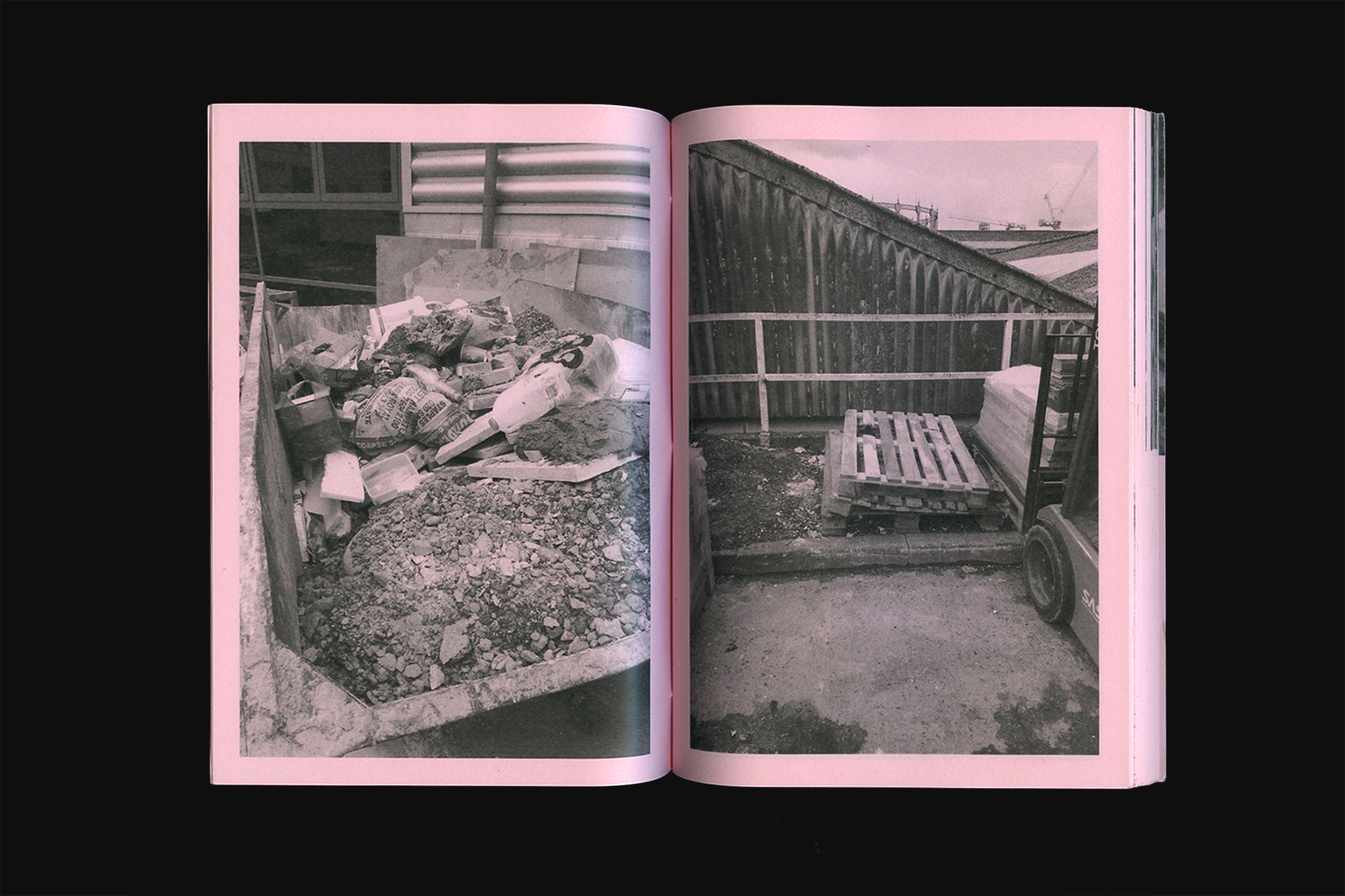
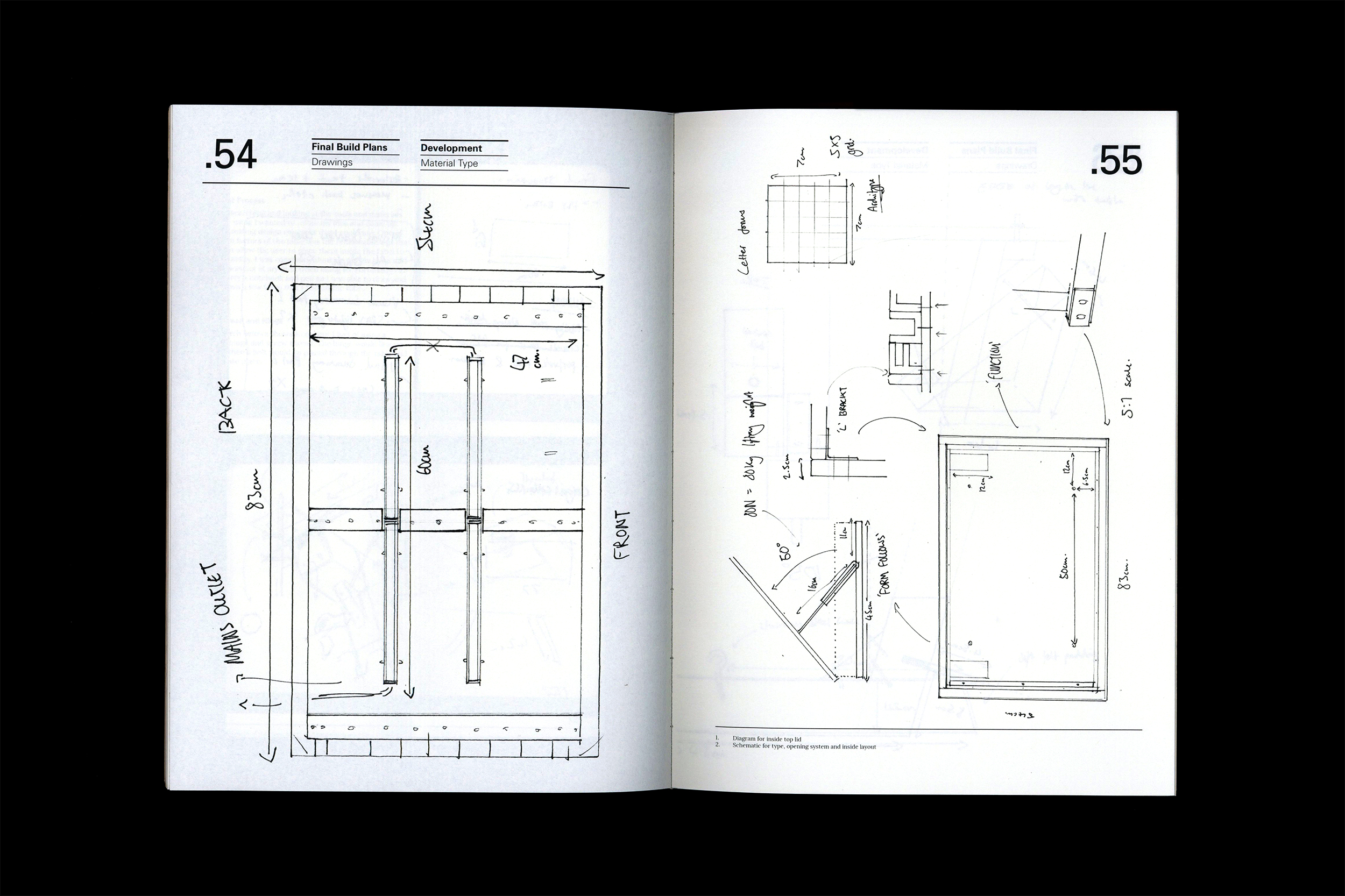
156 page editiorial that showcases the entire build
from raw materials to finished outcome.
from raw materials to finished outcome.
MODE—RE.ID.DEV2017
VISUAL SUMMARIES
Throughout my graphic design degree we were to produce a visual summary for each project brief. The document would showcase our research, ideas and development for the project and would be presented in a bound publication. Below are some examples of the visual summaries produced during my second and third year.


A collection of Visual Summaries produced during
my second and third year of university.
my second and third year of university.
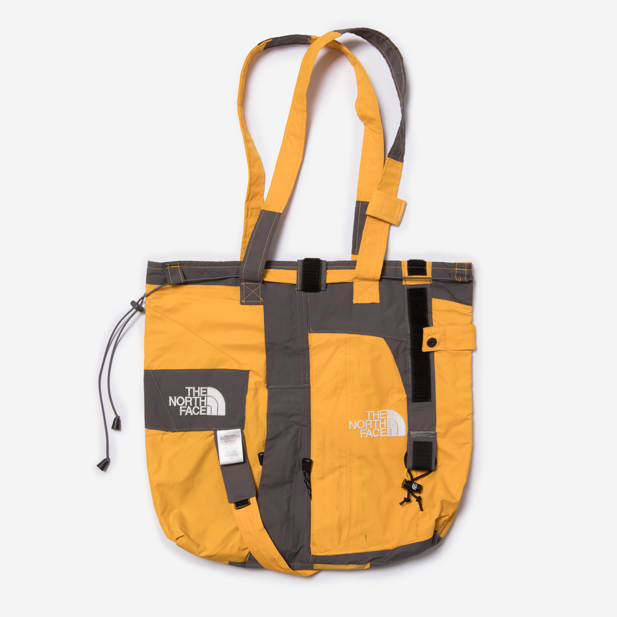
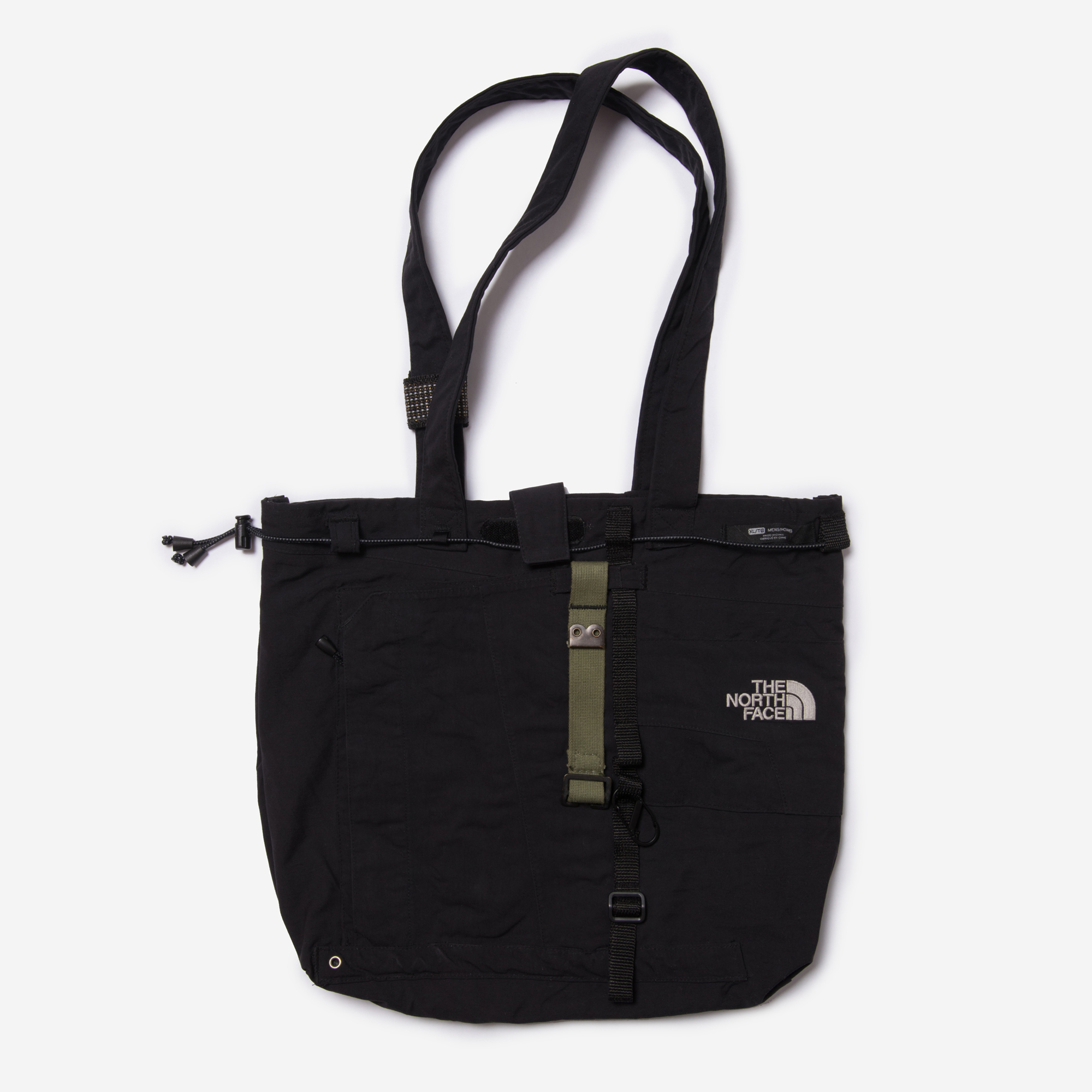
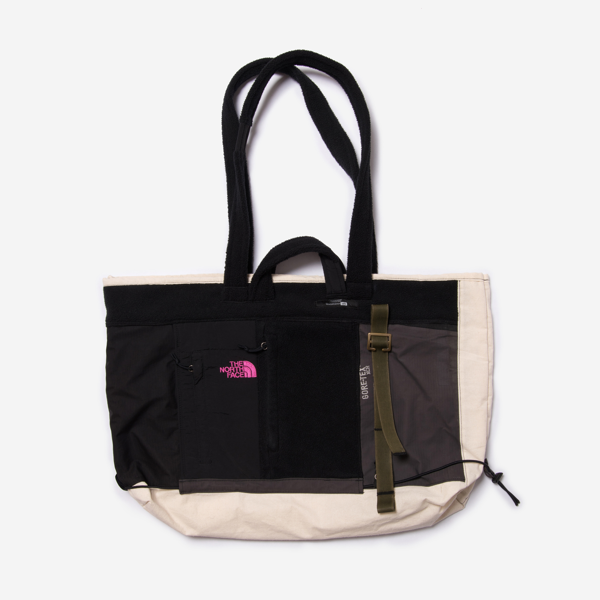
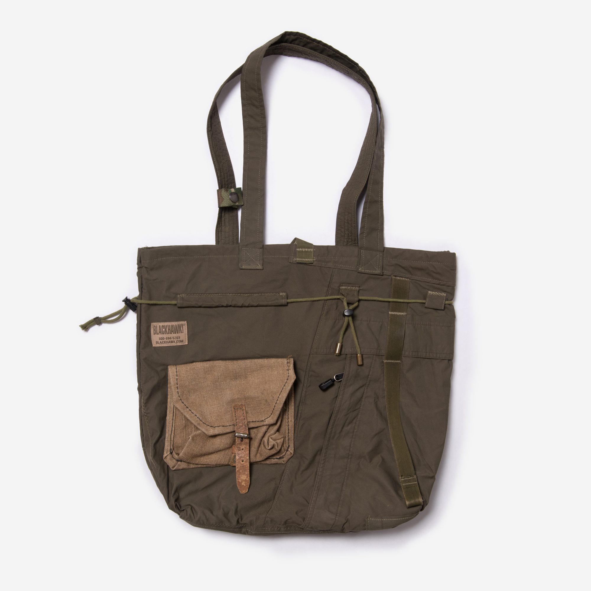
MODE—FOR.THE.GREATER.GOOD
GREATER GOODS
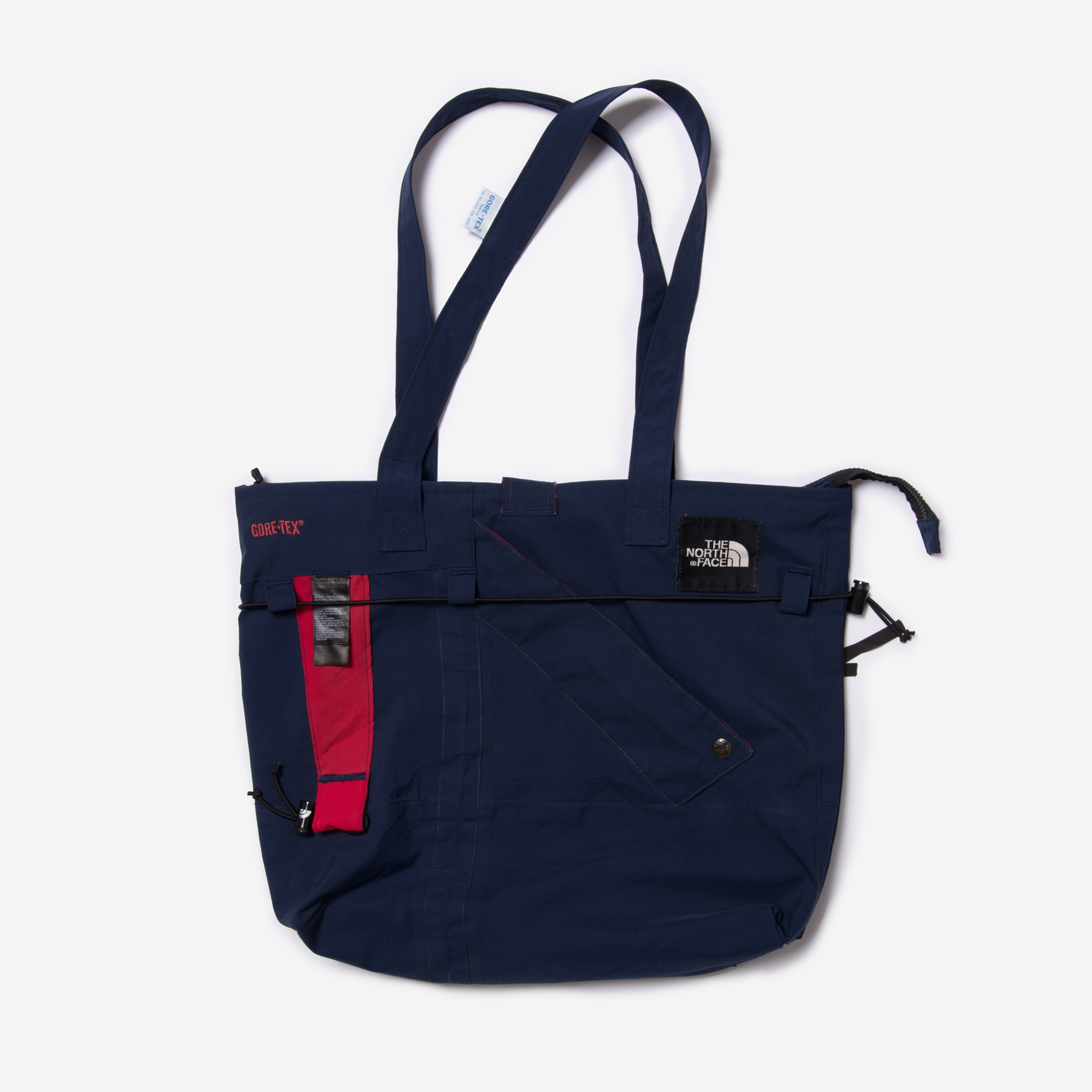
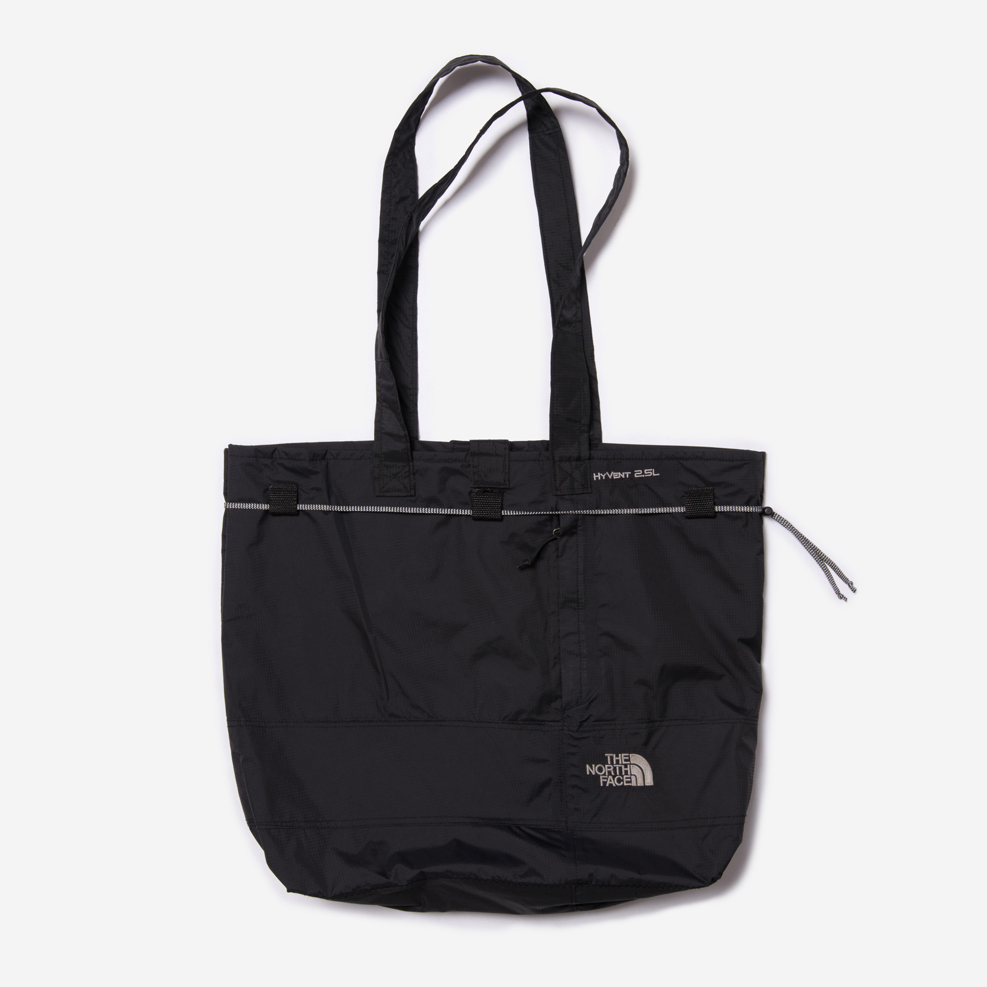
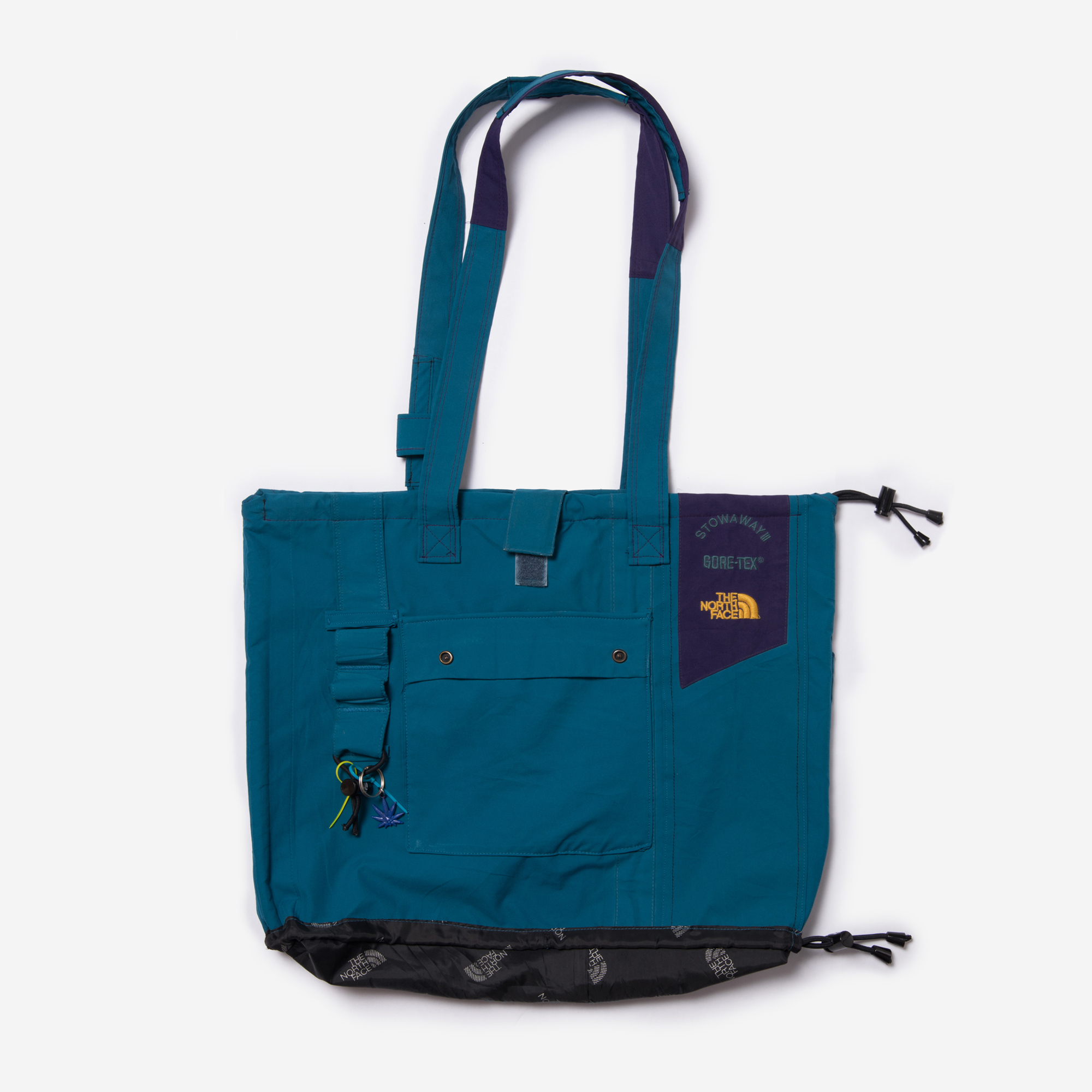
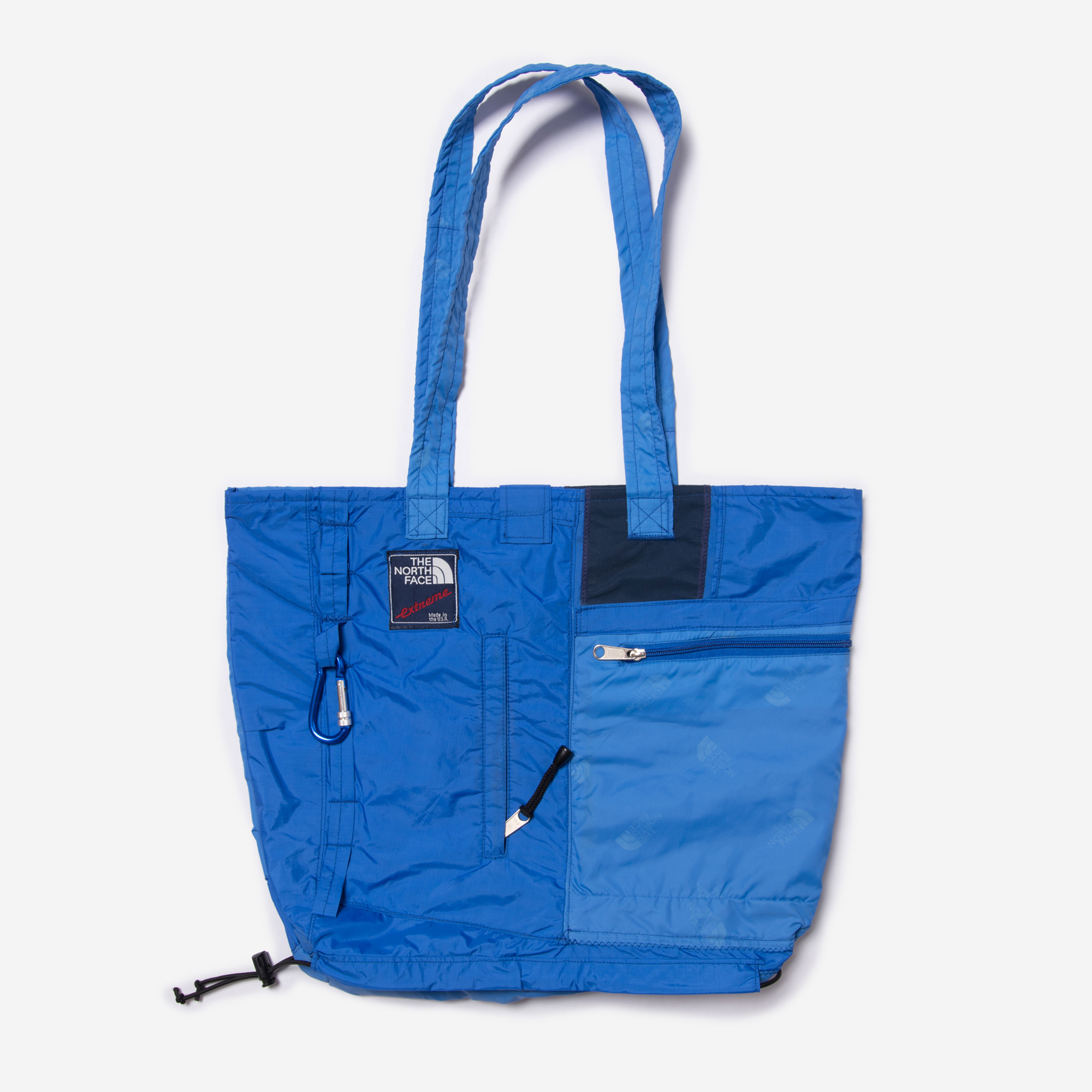
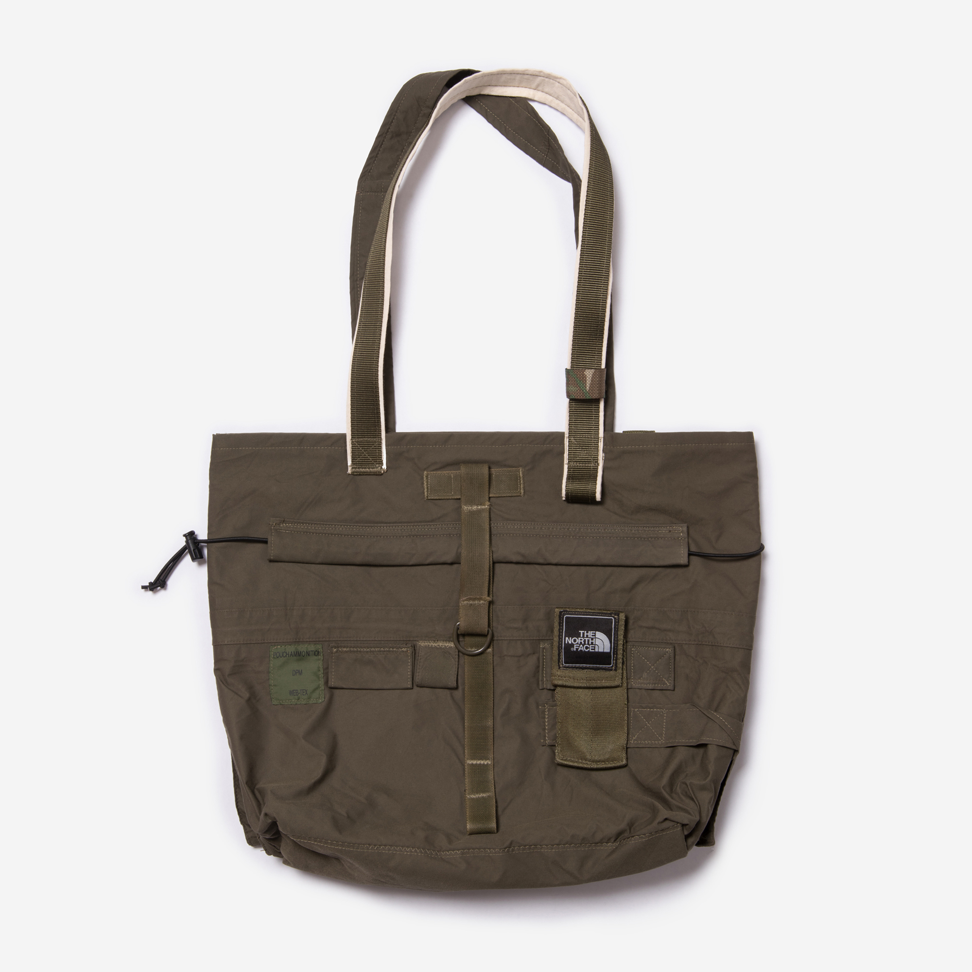
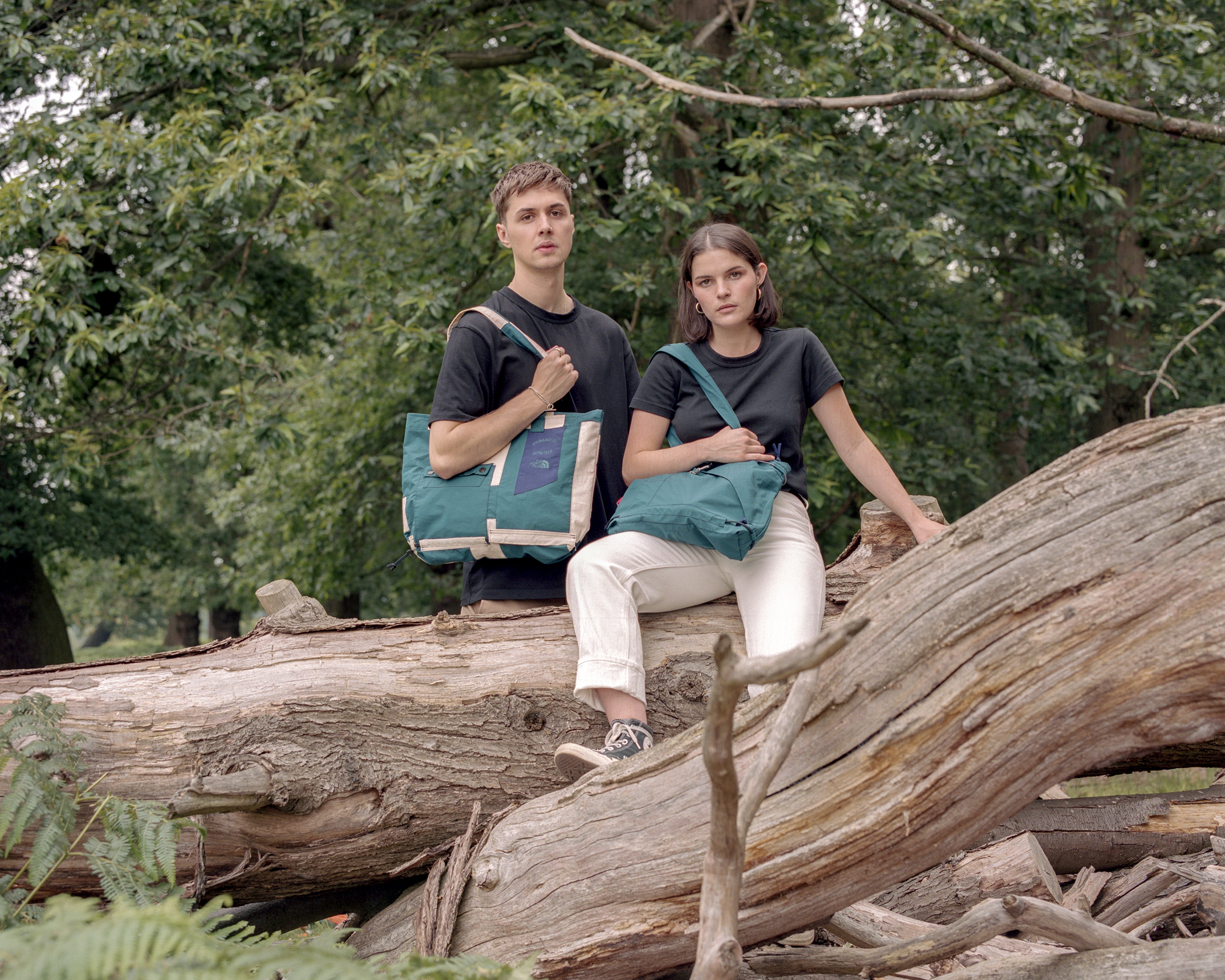
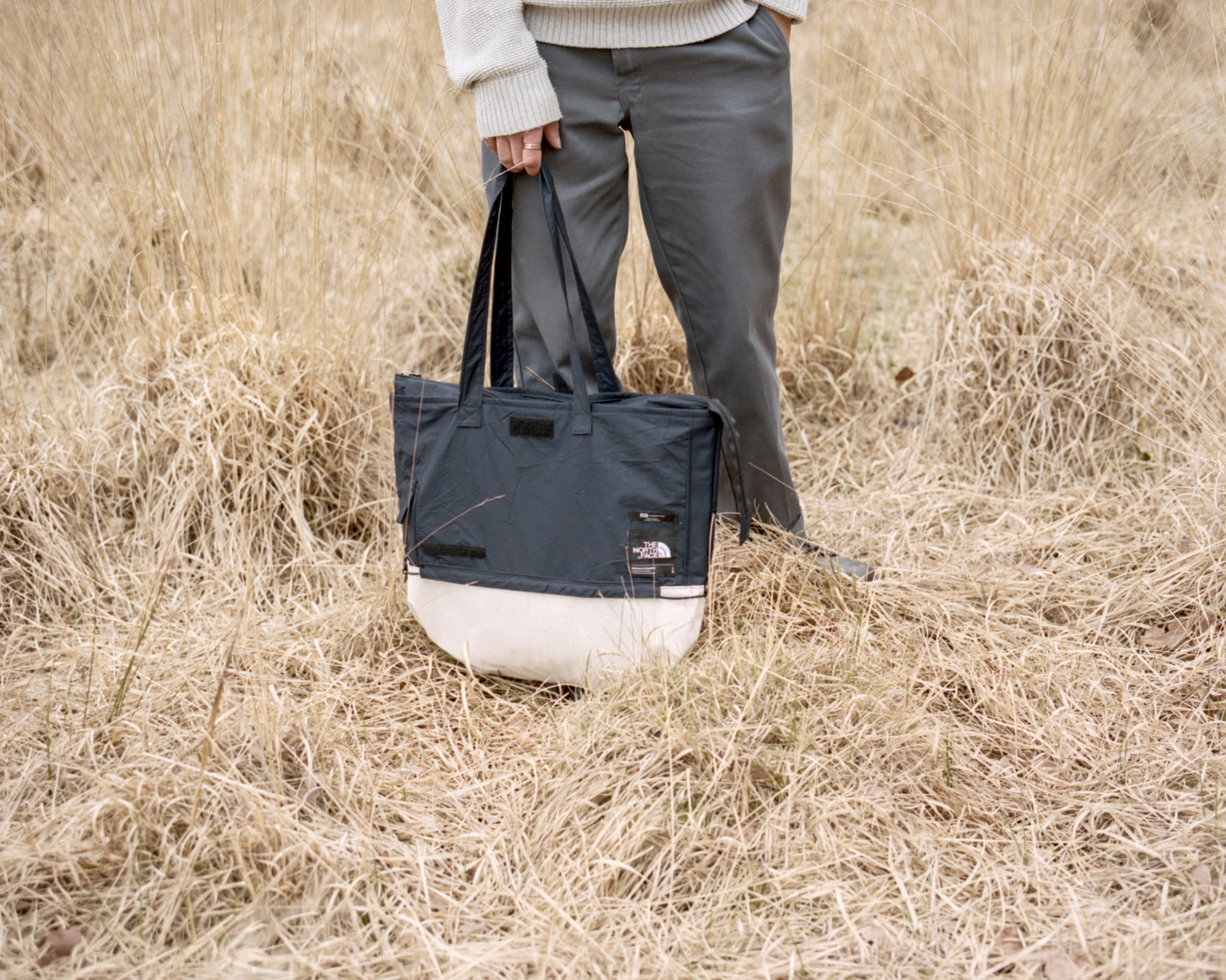
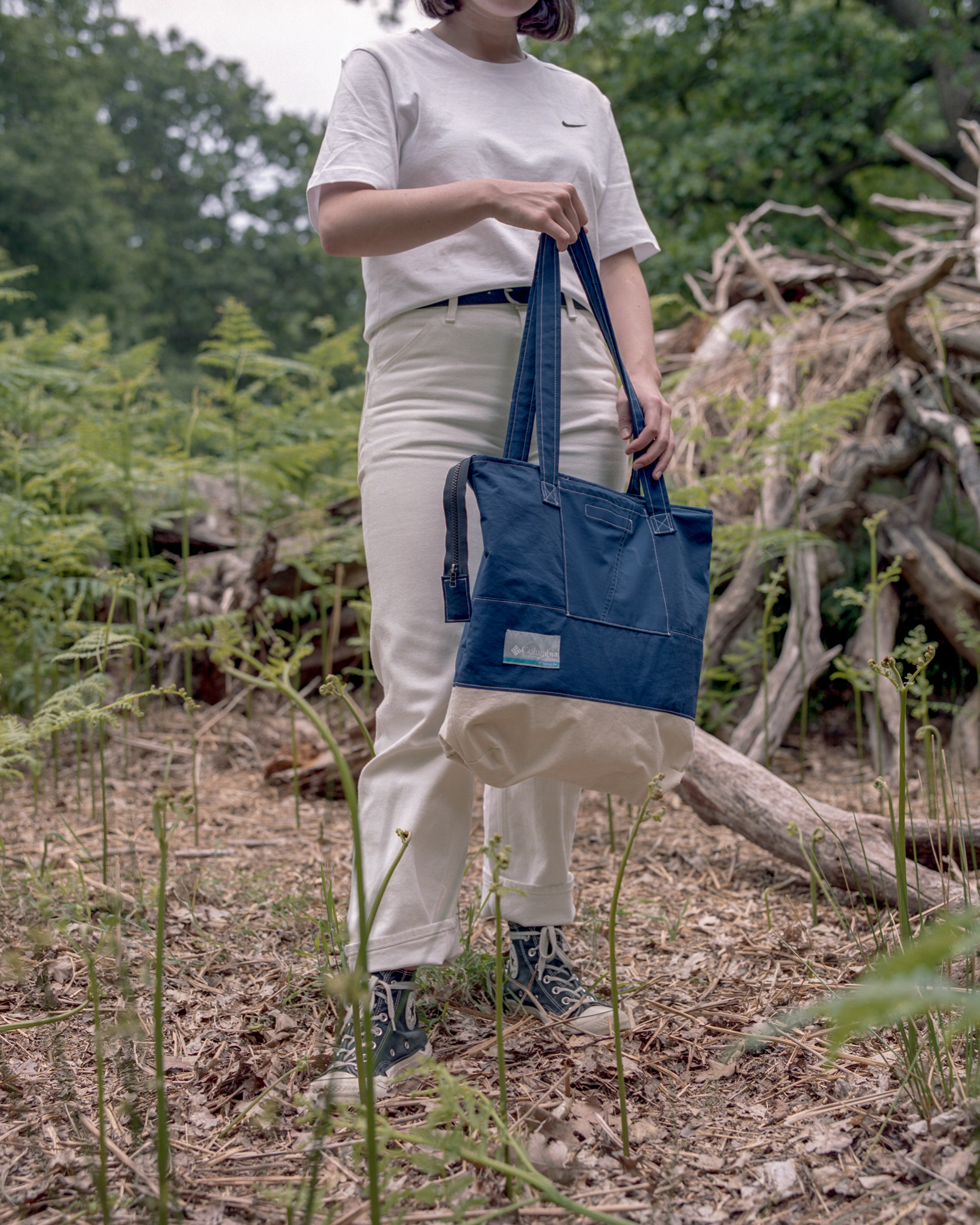
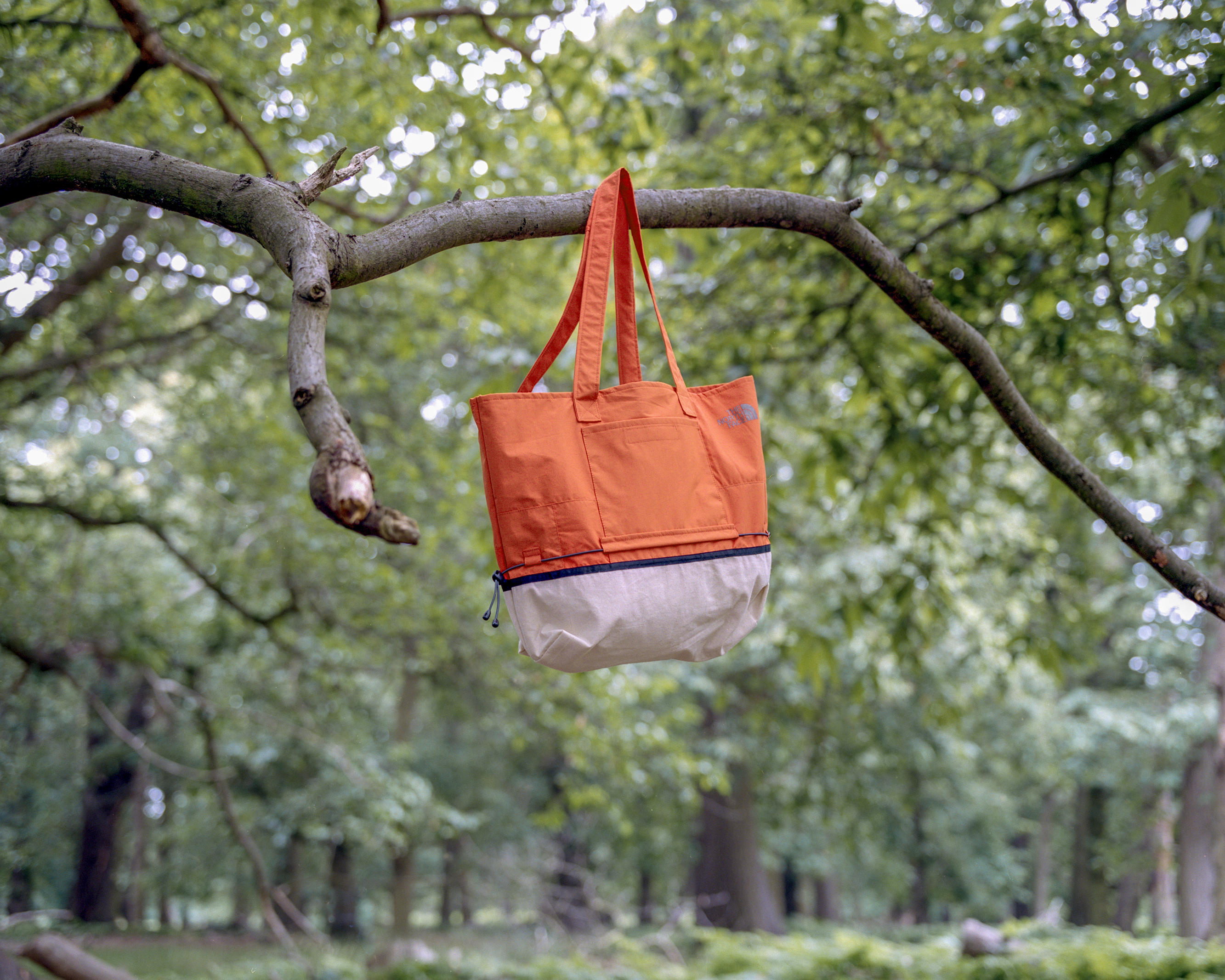
Founded in 2018 Greater Goods is a London based design project which is dedicated to sustainability and the nature of upcycling. Our aim is to encourage and promote the use of reclaimed materials and to show the importance of recycling in the current climate. Our strong focus on practical and functional design has been translated to a range of mediums from woodwork and carpentry to textiles and fashion.
︎ www.greatergoods.online
︎ Instagram
︎ info@greatergoods.online
︎ www.greatergoods.online
︎ info@greatergoods.online
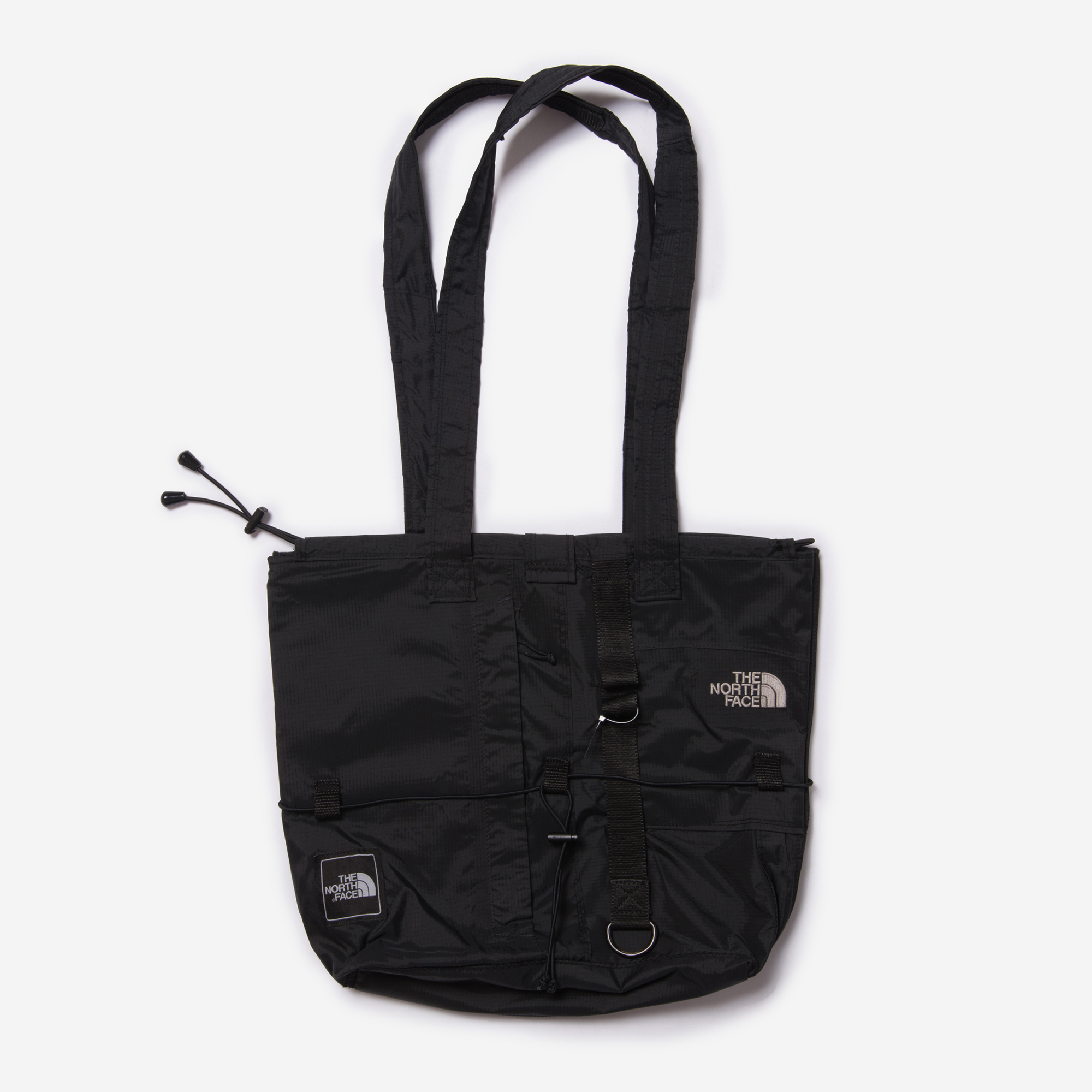
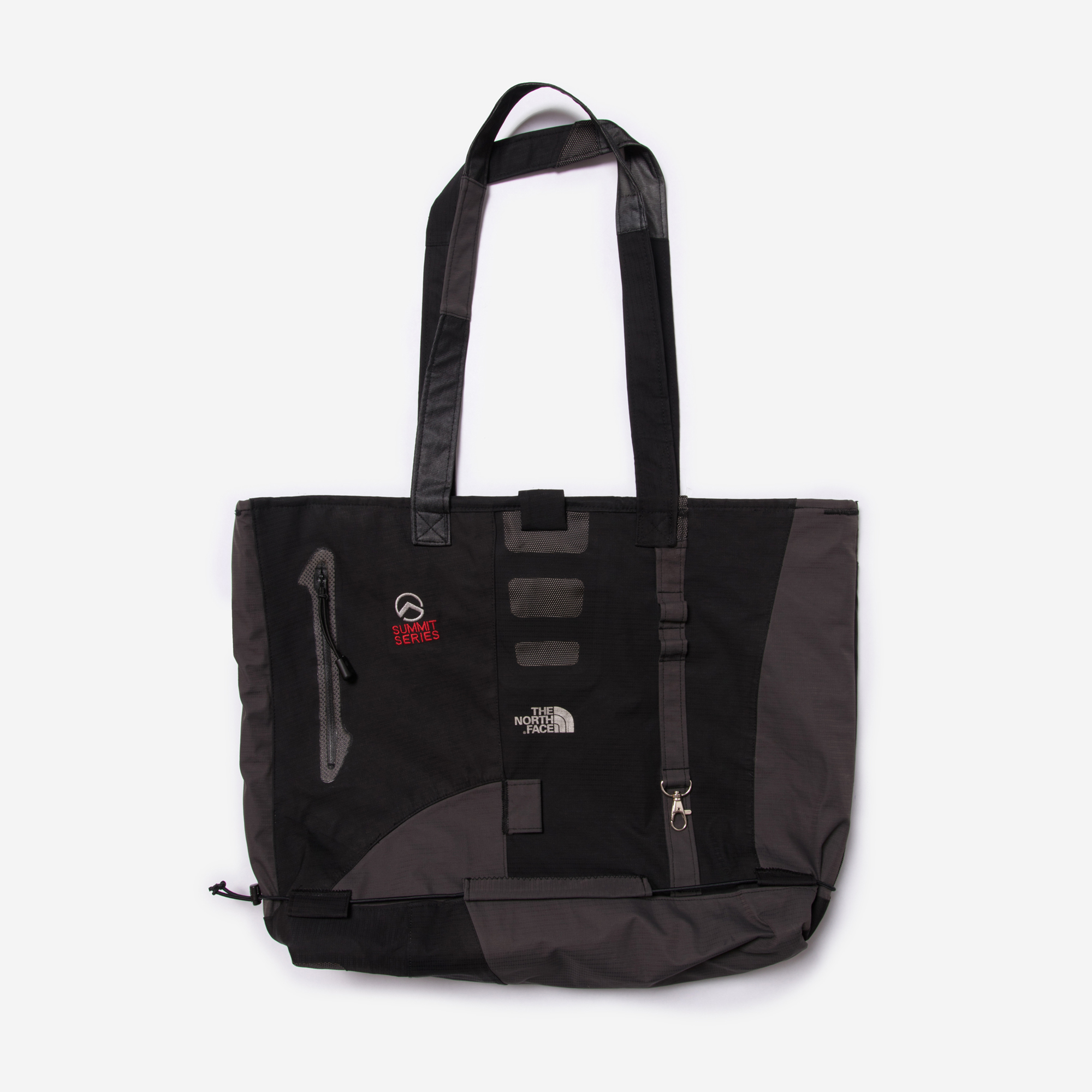
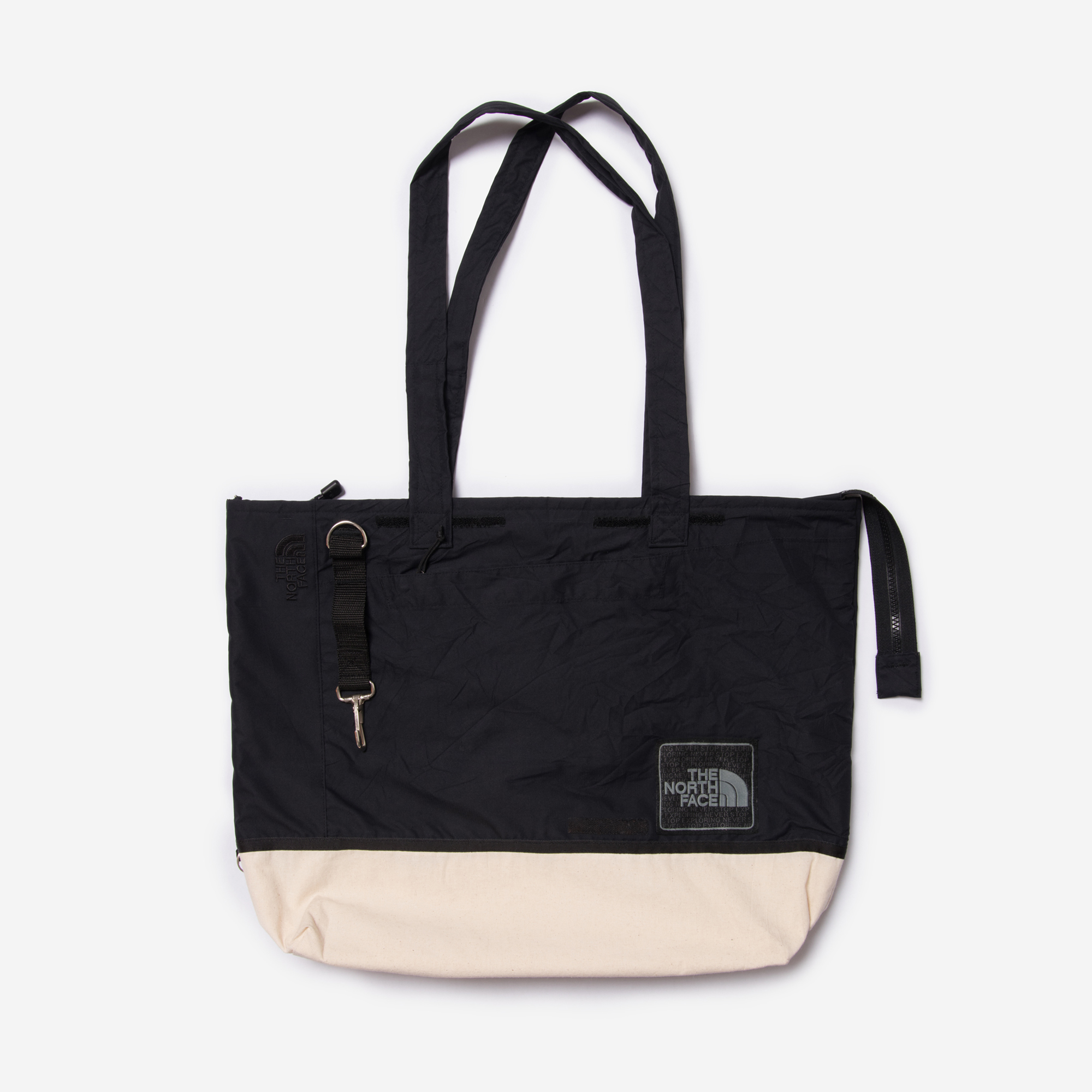
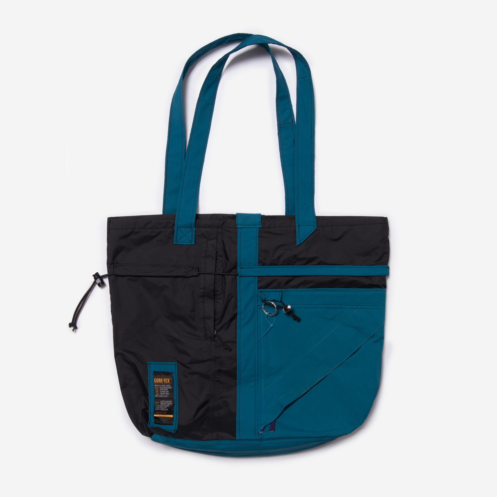
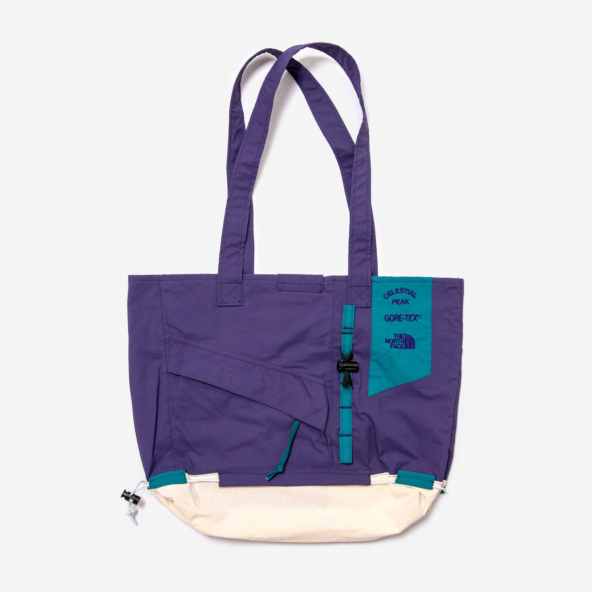
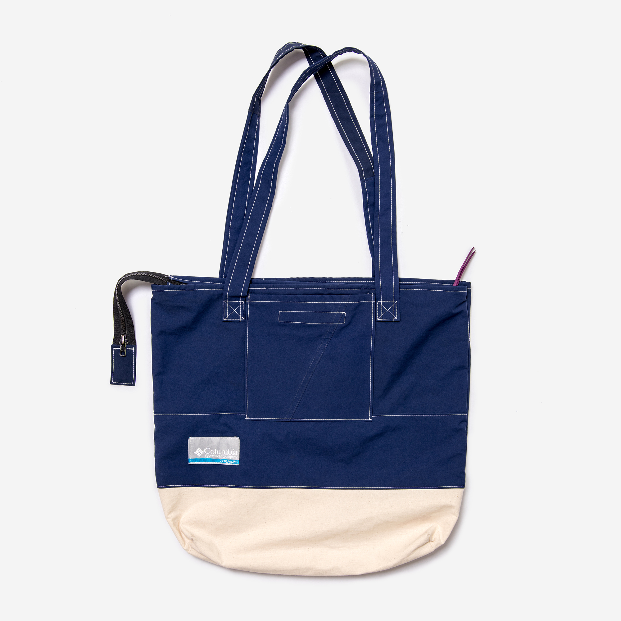
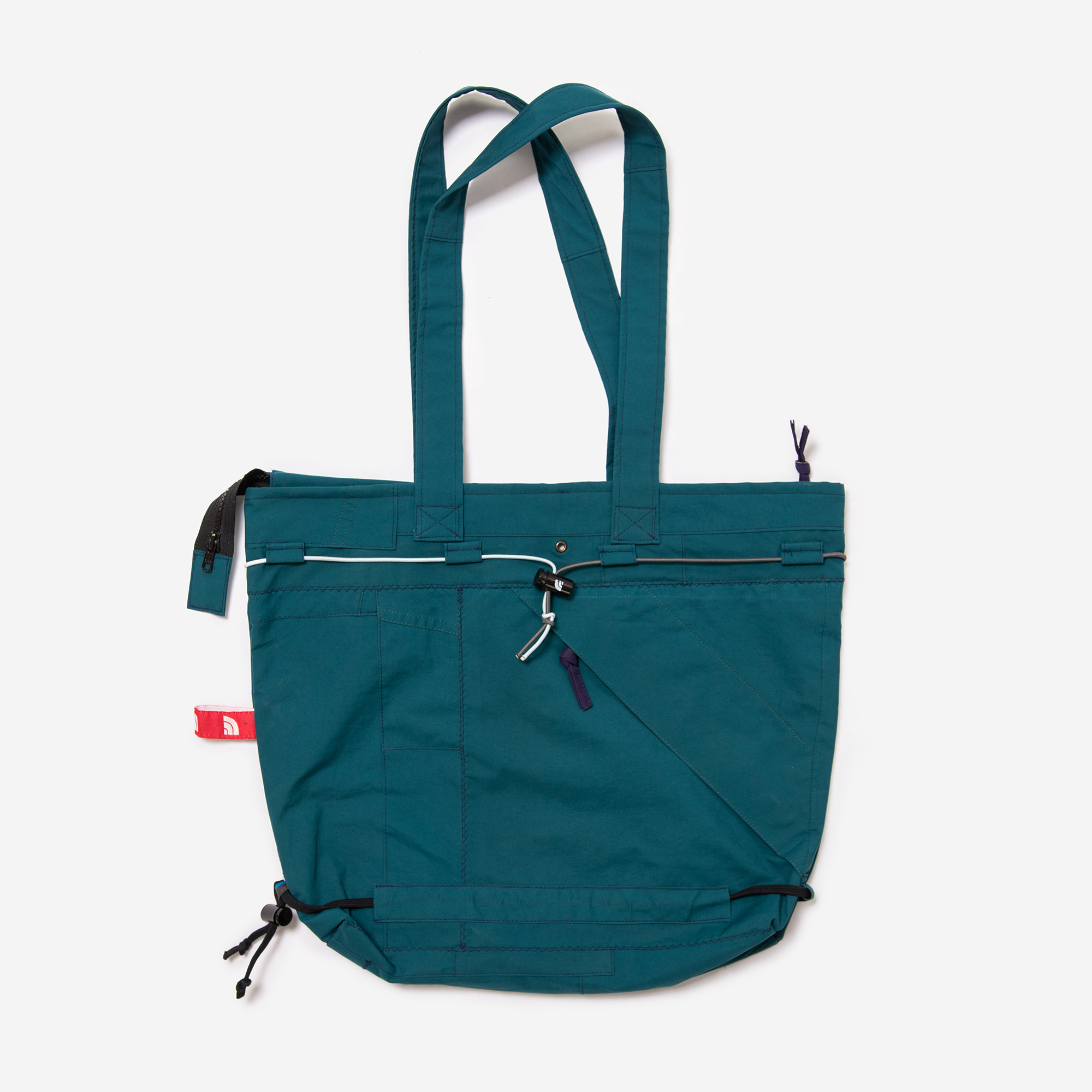
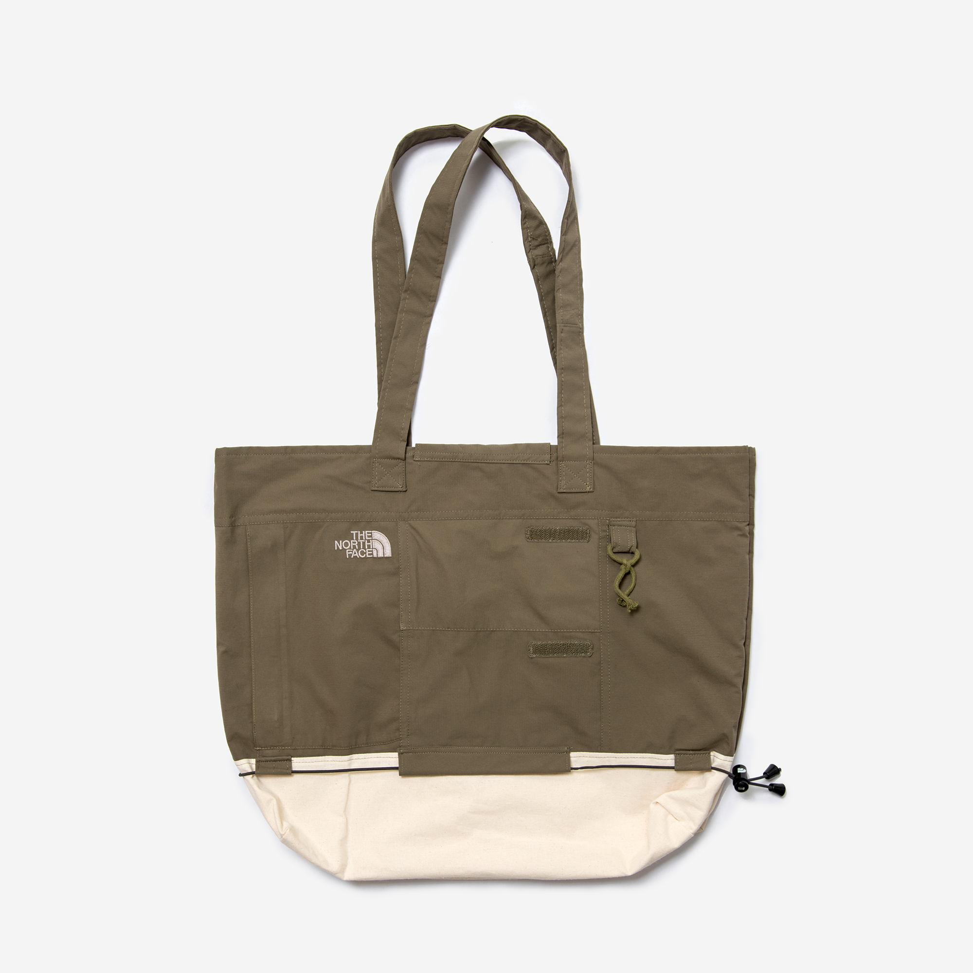
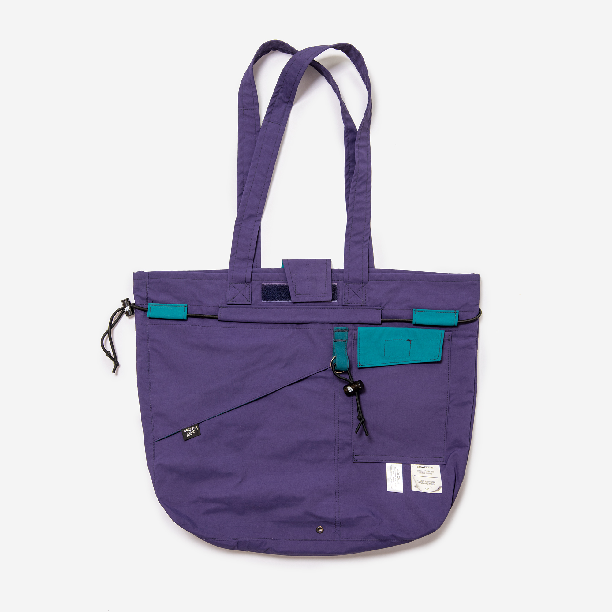
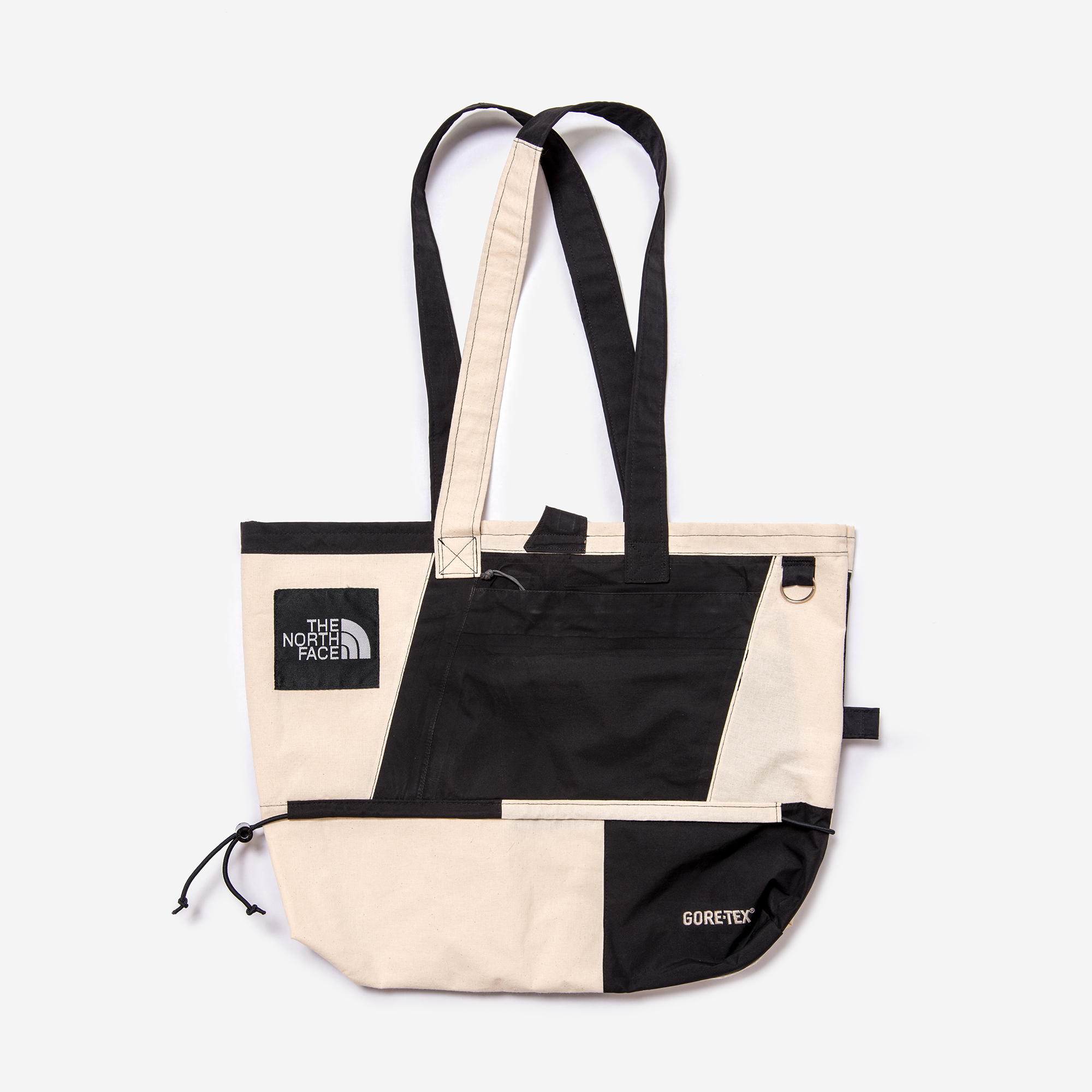
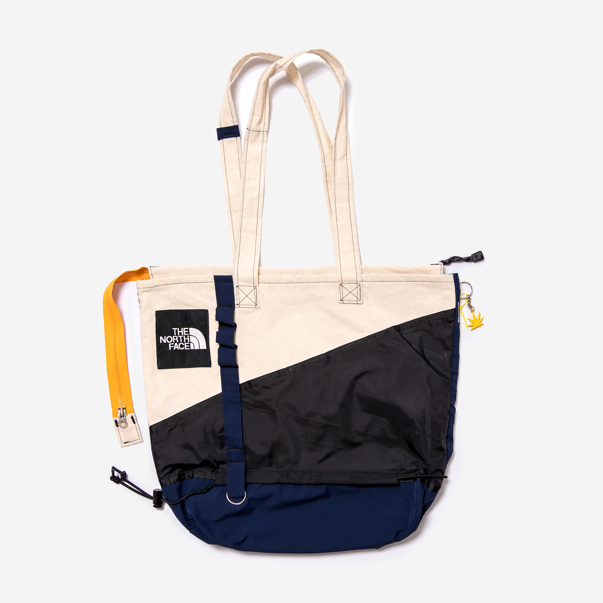
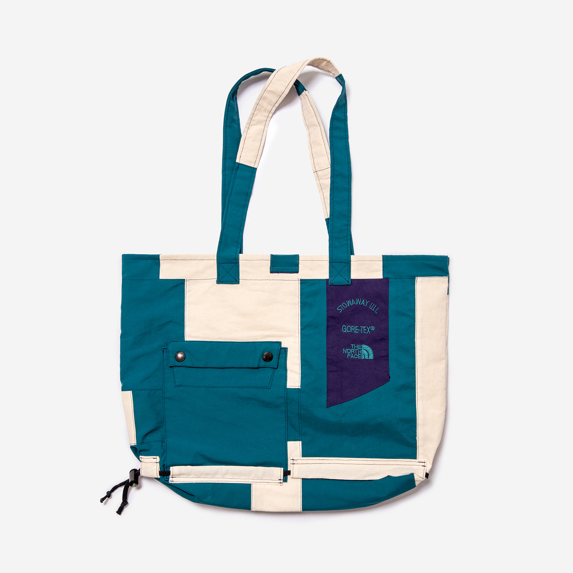
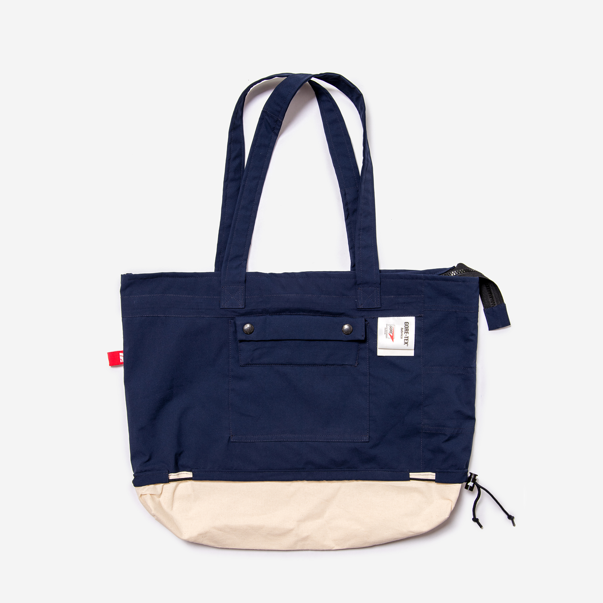
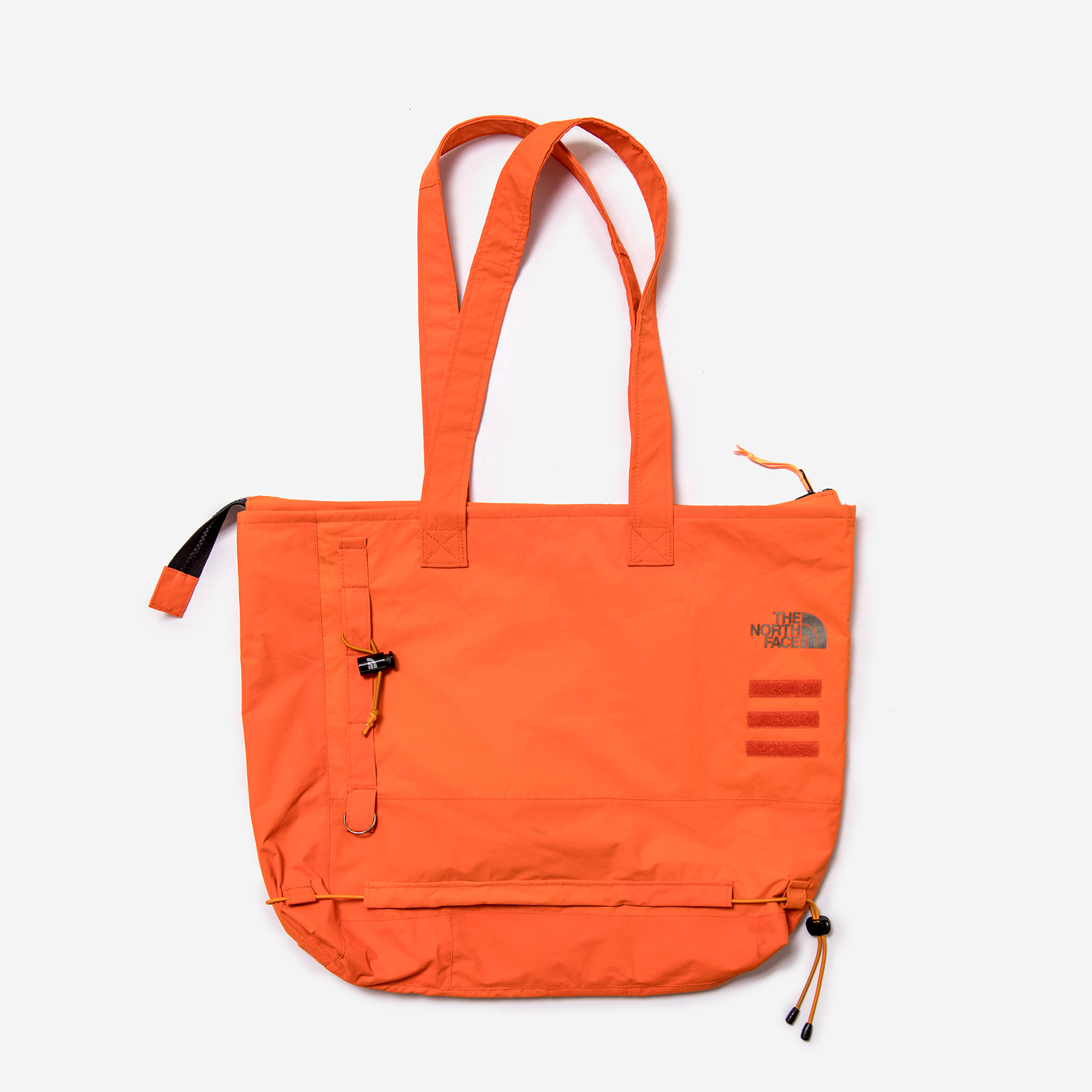
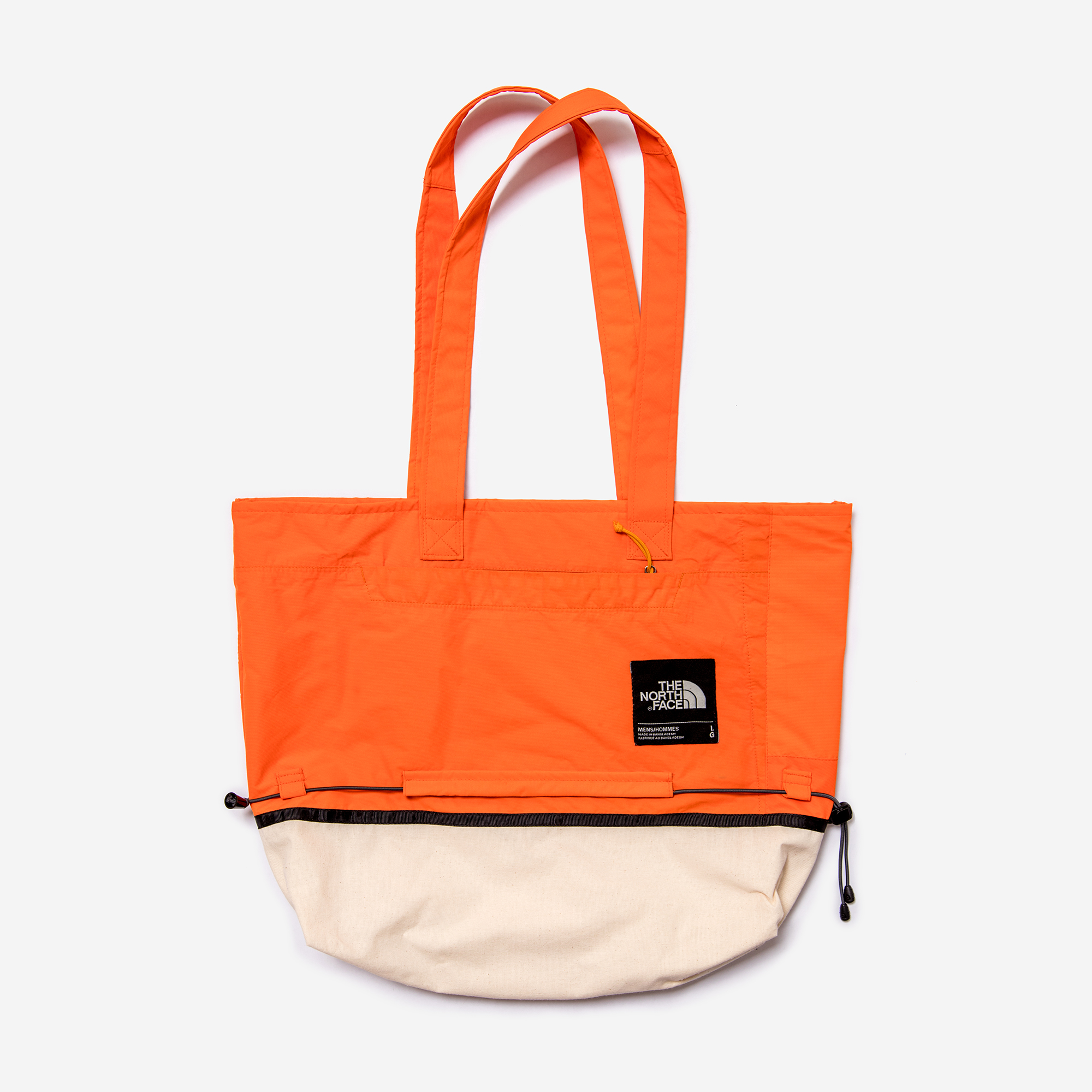
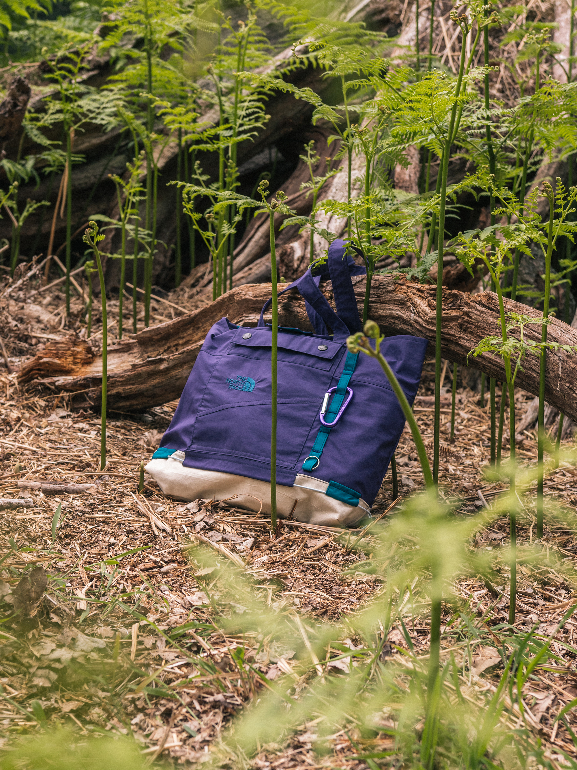
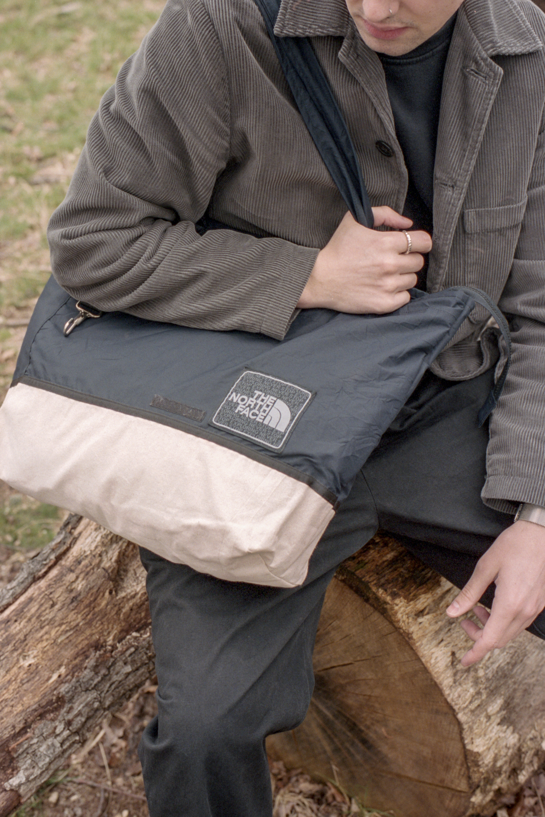
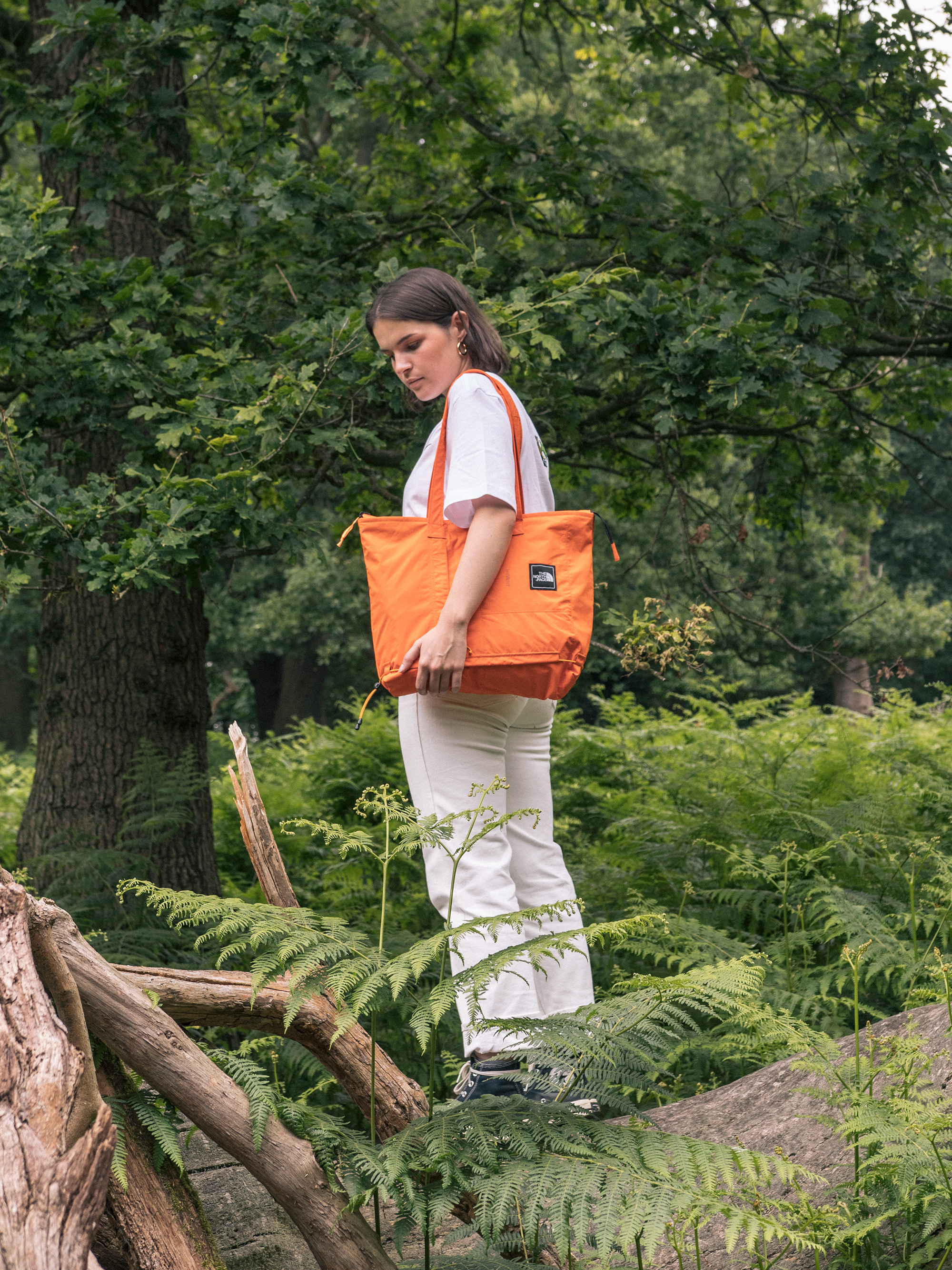
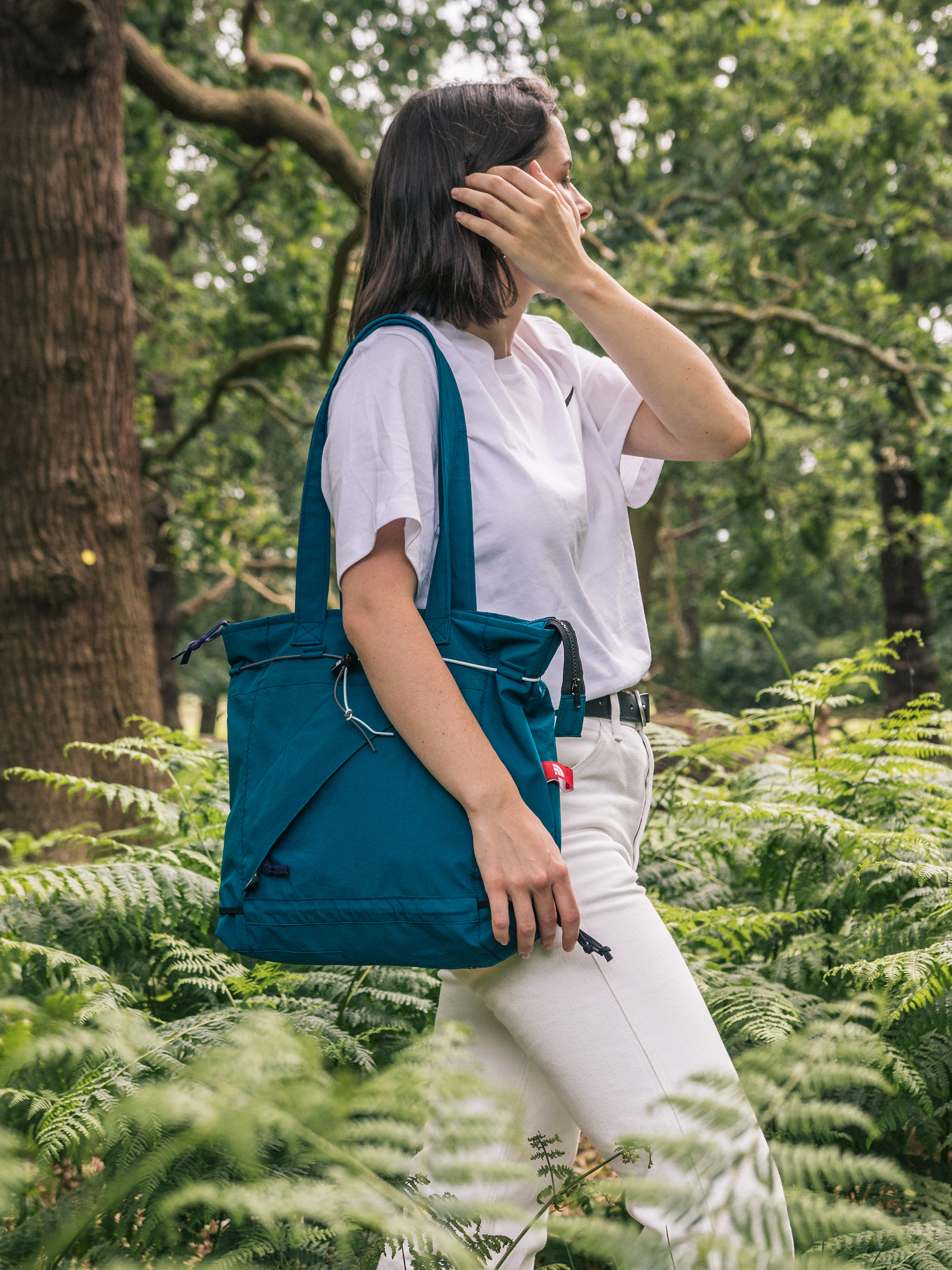
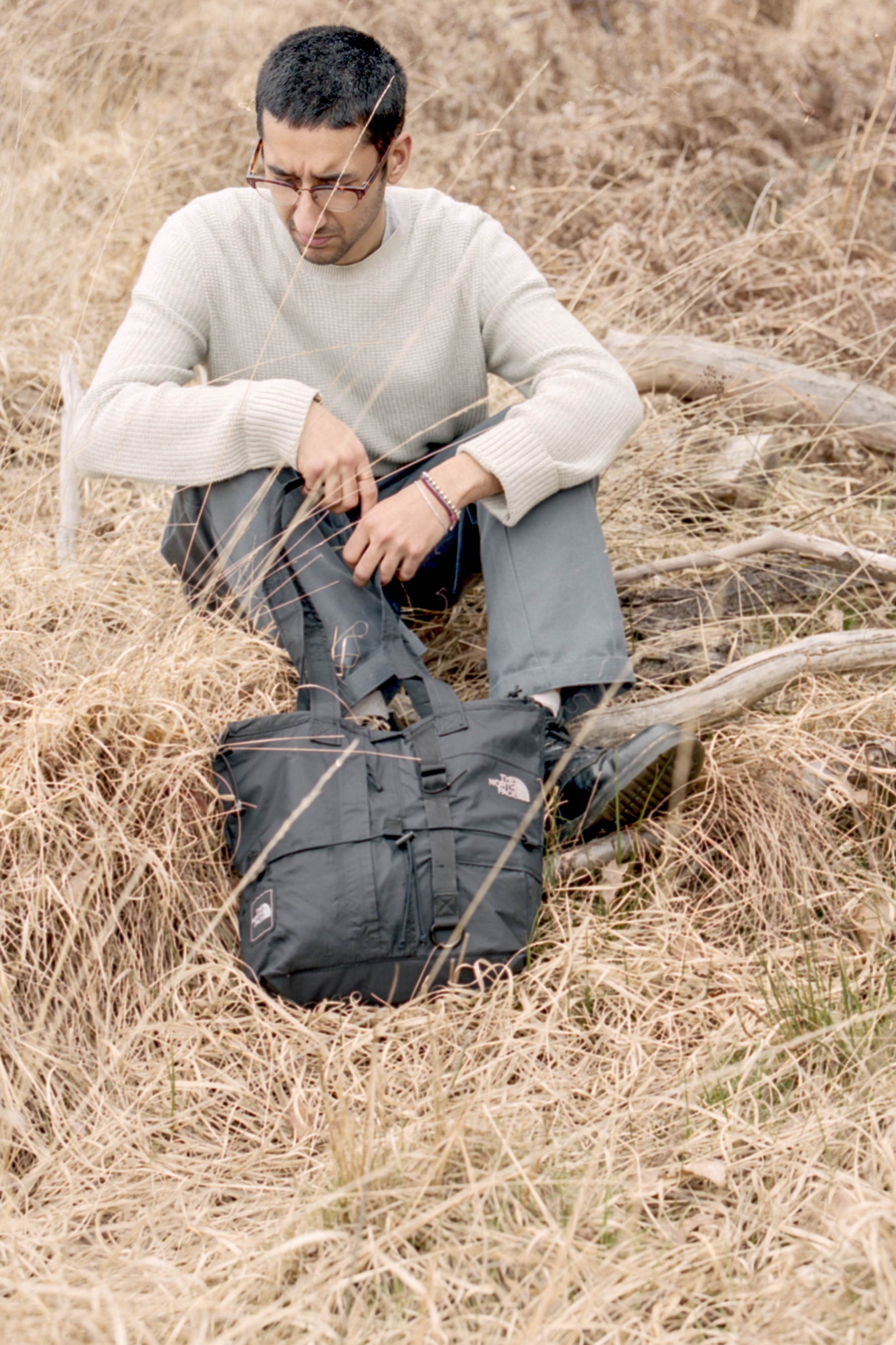
Tote Bag Project
The collection focuses on reconstructing and repurposing worn and damaged outerwear garments into fully functional tote bags that are built to withstand daily use. Each constructed from recycled garments as well as elements of military surplus in an effort to reduce man-made waste and breathe new life into forgotten materials. The bags feature unique patinas and finishes depending on how the garments were treated and used. Each bag is unique in every aspect from shape, size, colour, detailing and materials, often dictated by the materials used whether it be Gore-Tex or canvas.
︎ Hypebeast (Collection one)
︎ Hypebeast (Collection Two)
︎ Basement Approved (Interview)
︎ Hypebeast (Collection one)
︎ Hypebeast (Collection Two)
︎ Basement Approved (Interview)
︎


︎
![]()
![]()
![]()
![]()
![]()
![]()
![]()
![]()
![]()
![]()
![]()
![]()
![]()
![]()
![]()
︎


Photography and Art Direction by Jaimus Tailor and Hayden West.